Bembo vs Jenson
Bembo was influenced by Jenson.
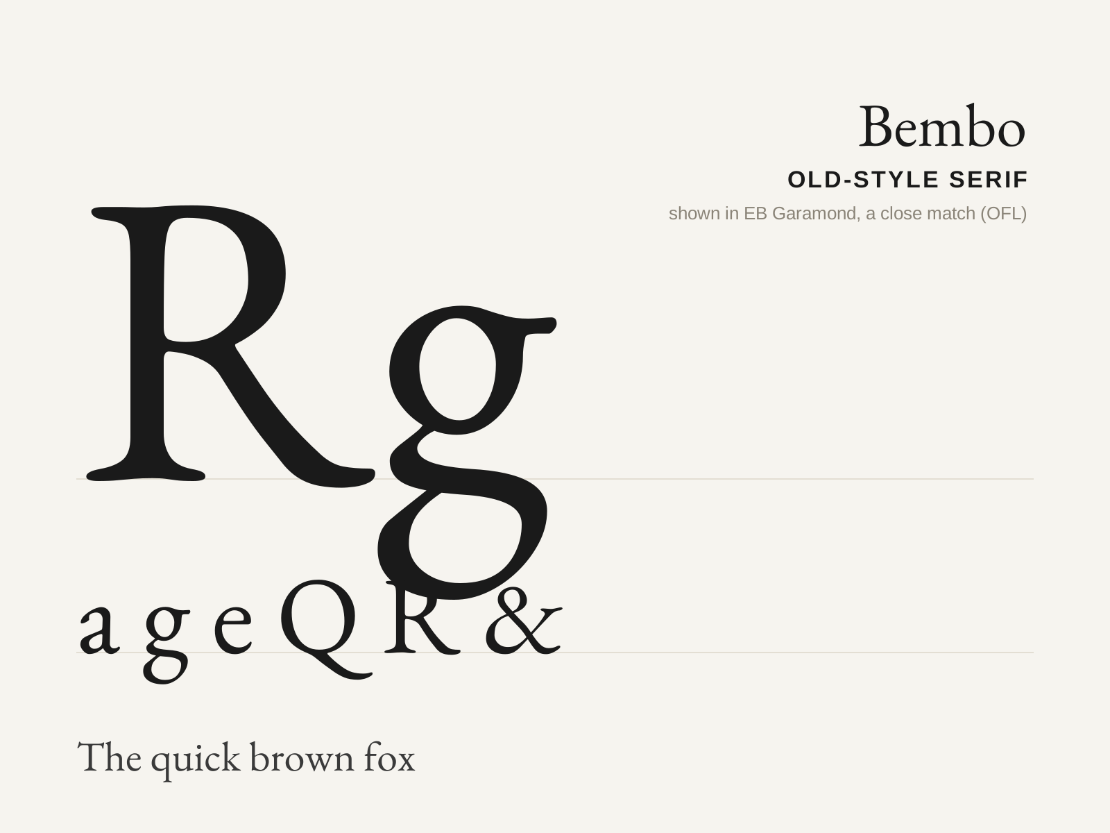
Bembo
The refined Aldine old-style cut by Francesco Griffo for Aldus Manutius in 1495 — lighter and more even than Jenson, and the direct ancestor of the entire Garalde line. Monotype's 1929 revival made it a modern book classic.
- Moderate contrast, inclined (oblique) stress
- Crisp, bracketed serifs lighter than Jenson's
- Small x-height with long, elegant ascenders
- Slightly slanted serifs on the ascenders
- Even, harmonious, bright text color
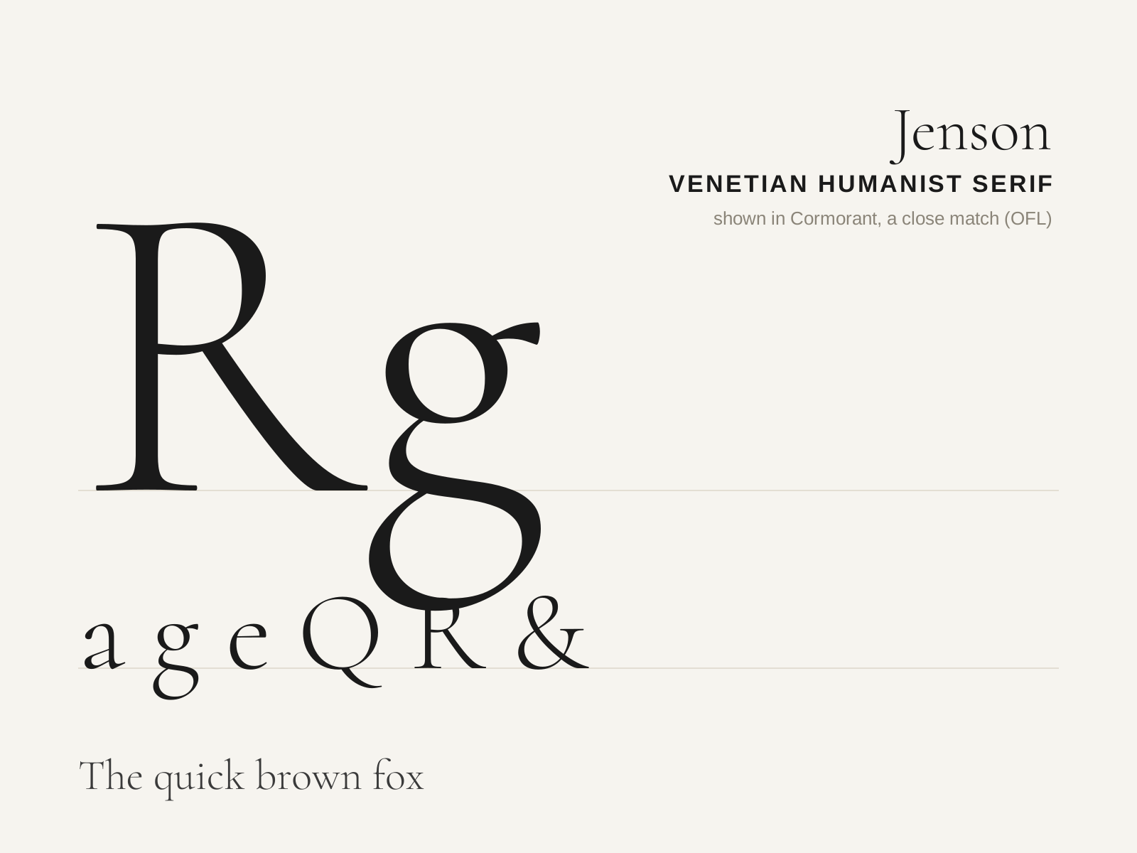
Jenson
Nicolas Jenson's 1470 Venetian roman — the archetypal humanist serif and, for many, the most beautiful roman type ever cut. Warm, even, and unmistakably drawn from the broad-nib pen.
- Steeply inclined (oblique) axis of stress
- Modest stroke contrast, dark warm color
- Sloping bar on the lowercase 'e'
- Sturdy, blunt, heavily bracketed serifs
- Short ascenders/descenders, generous round bowls
At a glance
| Bembo | Jenson | |
|---|---|---|
| Era | 1495 | 1470 |
| Discipline | Typography | Typography |
| Region | Venice, Italy | Venice, Italy |
| Family | Serif | Serif |
| Formal traits | old-style, bracketed-serif, oblique-stress, moderate-contrast | humanist, old-style, bracketed-serif, oblique-stress |
More comparisons
Advertisement