Art Nouveau (Graphic) vs Plakatstil
Plakatstil arose as a reaction against Art Nouveau (Graphic) — stripped away Art Nouveau's ornament and line to the bare product and name.

Art Nouveau (Graphic)
The poster and print language of the Belle Époque — sinuous 'whiplash' line, idealized women wreathed in flowers and flowing hair, ornamental borders, and hand-drawn lettering fused into a single decorative whole.
- Sinuous 'whiplash' lines and organic plant/vine motifs
- Idealized female figures framed by flowing hair and flowers
- Hand-drawn lettering integrated with the illustration
- Decorative borders, halos, and arabesque framing devices
- Flat, muted lithographic colour — gold, ochre, sage, rose
Plakatstil
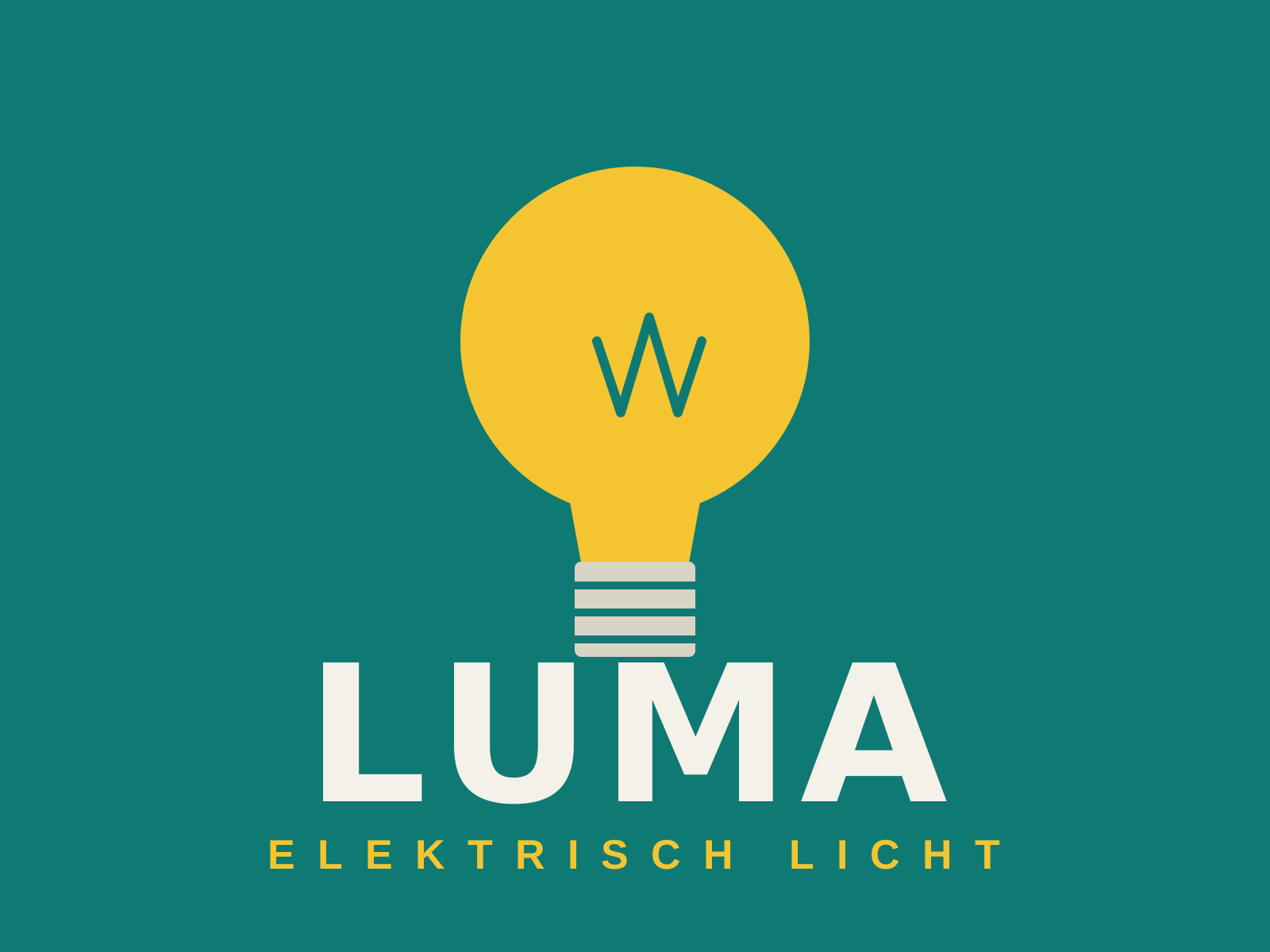
A radically reductive German poster style that strips the advertisement to a single product, a brand name, and a flat field of color — the 'object poster' that founded modern advertising design.
- Single isolated product as the subject
- Flat, unmodulated background color
- Bold custom brand logotype
- Elimination of ornament and depth
- High-contrast legibility at a glance
At a glance
| Art Nouveau (Graphic) | Plakatstil | |
|---|---|---|
| Era | 1890–1910 | 1905–1920s |
| Discipline | Graphic Design | Graphic Design |
| Region | France, Austria, Belgium, United States | Germany |
| Family | Art Nouveau, Belle Époque | Modernist, Poster |
| Formal traits | organic-line, ornamental, hand-lettered | flat-color, reductive, custom-lettering, high-contrast |
More comparisons
Advertisement