Arts & Crafts Book Design vs Humanist (Venetian) Serif
Humanist (Venetian) Serif is the cross-discipline counterpart of Arts & Crafts Book Design — Morris's Kelmscott revival reached back to humanist and incunabula letterforms.

Arts & Crafts Book Design
A reform movement in book design led by William Morris's Kelmscott Press, reviving dense medieval page architecture with hand-drawn borders, woodcut ornament, and unified type-and-image craft.
- Dense medieval-revival text blocks
- Wide foliate woodcut borders
- Hand-drawn historicist typefaces
- Blackletter and roman incunabula models
- Integrated type, ornament, and illustration
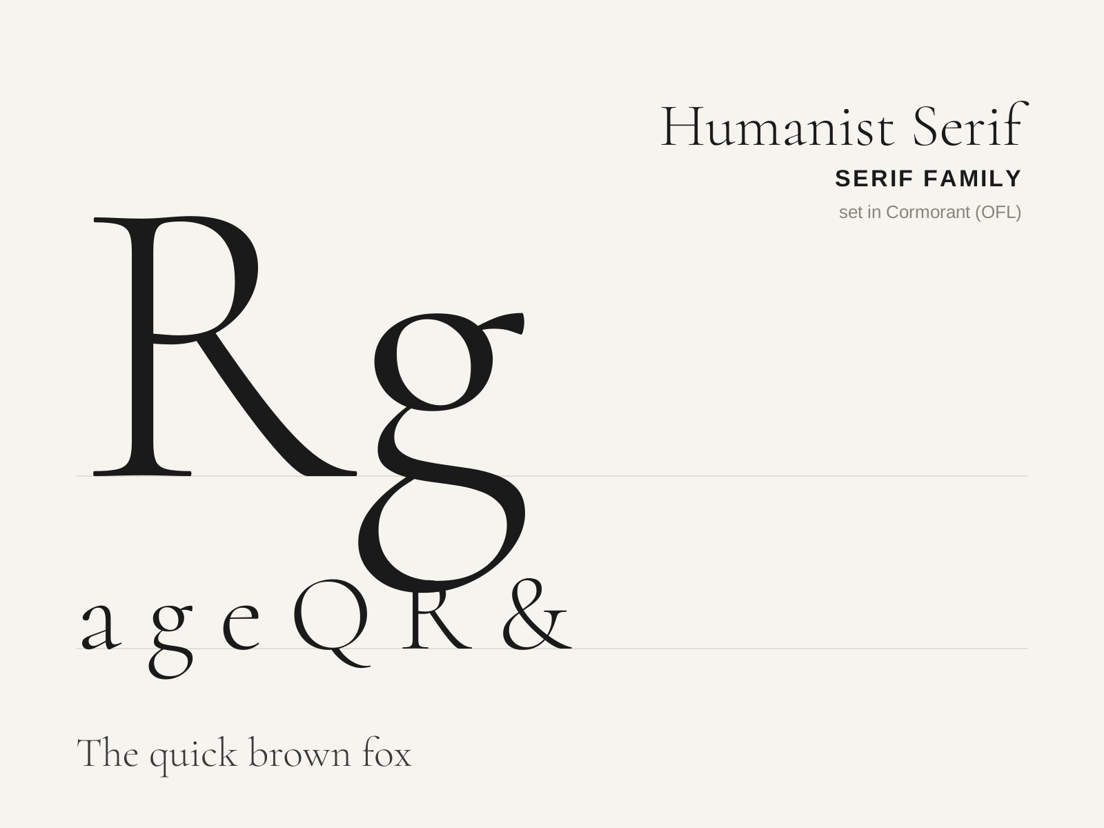
Humanist (Venetian) Serif
The earliest roman printing types, cut in Renaissance Italy to imitate the humanist scribal hand. Warm, sturdy, and unmistakably pen-formed, with a strongly slanted stress and a sloping crossbar on the lowercase e.
- Steeply inclined (oblique) axis of stress
- Low to moderate stroke contrast, heavy overall color
- Sloping bar on the lowercase 'e'
- Heavily bracketed, often blunt asymmetric serifs
- Short ascenders/descenders with sturdy, rounded proportions
At a glance
| Arts & Crafts Book Design | Humanist (Venetian) Serif | |
|---|---|---|
| Era | 1860s–1900s | 1460s–1490s |
| Discipline | Graphic Design | Typography |
| Region | Britain, United States | Italy, Venice |
| Family | Arts & Crafts, Revival | Serif |
| Formal traits | hand-lettered, foliate-border, historicist, medieval-revival | humanist, old-style, bracketed-serif, oblique-stress |
More comparisons
Advertisement