Bauhaus Graphic Design vs Futura
Futura is the cross-discipline counterpart of Bauhaus Graphic Design.

Bauhaus Graphic Design
The functional, geometric graphic language forged at the Bauhaus — lowercase sans-serif type, asymmetric layouts, primary colors, and the marriage of typography with photography into a rational visual system.
- Geometric sans-serif type, often lowercase only
- Asymmetric layouts on a horizontal-vertical structure
- Integration of typography with photography (typophoto)
- Primary colors with black, white, and bold rules
- Functional, grid-organized white space
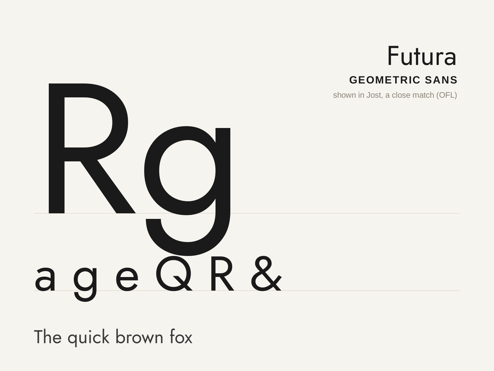
Futura
Paul Renner's 1927 geometric sans — letterforms built from near-perfect circles, triangles, and straight lines, the Bauhaus ideal of rational, modern type made commercial.
- Letterforms built from circles, triangles, and lines
- Near-perfect circular bowls (o, b, d, p, q)
- Single-story a and a simple, open-tailed g
- Sharply pointed apexes on A, M, N, V, W
- Long ascenders rising above the cap height
At a glance
| Bauhaus Graphic Design | Futura | |
|---|---|---|
| Era | 1919–1933 | 1927 |
| Discipline | Graphic Design | Typography |
| Region | Germany | Germany |
| Family | Modernism, Bauhaus | Sans-serif |
| Formal traits | asymmetric, sans-serif, geometric, grid-based | geometric, monoline, low-contrast, pointed-apex |
More comparisons
Advertisement