Bauhaus vs The New Typography
Bauhaus is the cross-discipline counterpart of The New Typography — the Bauhaus workshop produced the New Typography programme.

Bauhaus
The German school that fused art, craft, and industry into a functional modernism — clean geometry, flat roofs, and 'form follows function' applied to the whole designed world.
- Rejection of applied ornament; function expressed as form
- Clean rectilinear geometry and flat roofs
- Glass curtain walls and ribbon windows
- Honest, industrial materials
- Unity of art, craft, and mass production
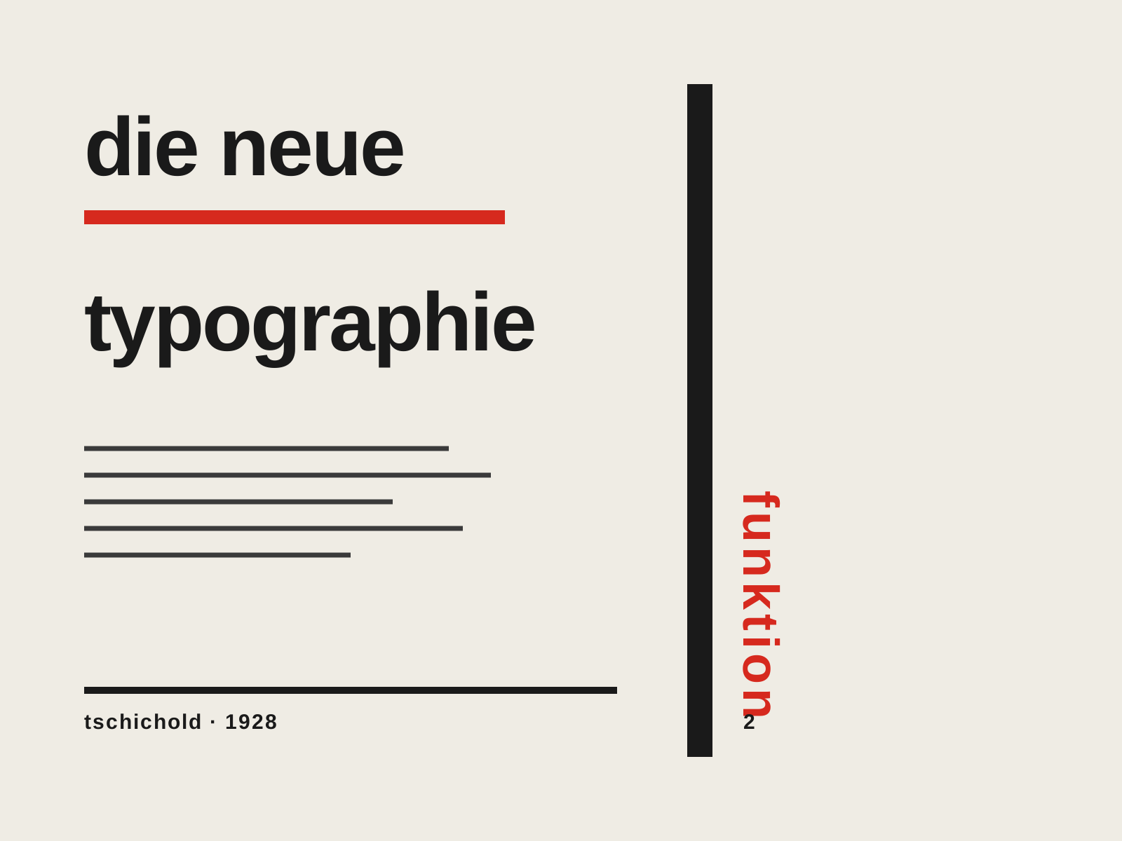
The New Typography
The rigorous modernist program codified by Jan Tschichold — asymmetric layouts, sans-serif type, and the functional grid presented not as art but as a rational set of rules for clear, efficient communication.
- Asymmetric, left-aligned layout replacing centered composition
- Sans-serif (grotesque) type as the modern standard
- Functional grid where every element earns its place
- Active white space and rules directing the eye
- Standardized formats and integration of photography
At a glance
| Bauhaus | The New Typography | |
|---|---|---|
| Era | 1919–1933 | 1925–1935 |
| Discipline | Architecture | Graphic Design |
| Region | Germany | Germany, Switzerland |
| Family | Modernism | Modernism, Typography |
| Formal traits | geometric, minimal, functional, unornamented | asymmetric, sans-serif, grid-based, functional |
More comparisons
Advertisement