Constructivist Graphics vs The New Typography
The New Typography was influenced by Constructivist Graphics — took its asymmetry, rules, and sans-serif from Constructivist practice.

Constructivist Graphics
The hard-edged revolutionary graphics of the Soviet avant-garde — bold red and black diagonals, dynamic photomontage, and sans-serif type marshalled like engineering to build a new socialist visual culture.
- Restricted red, black, and white palette
- Bold diagonals and overlapping geometric planes
- Dynamic photomontage integrated with type
- Heavy sans-serif, often Cyrillic, lettering
- Composition treated as load-bearing construction
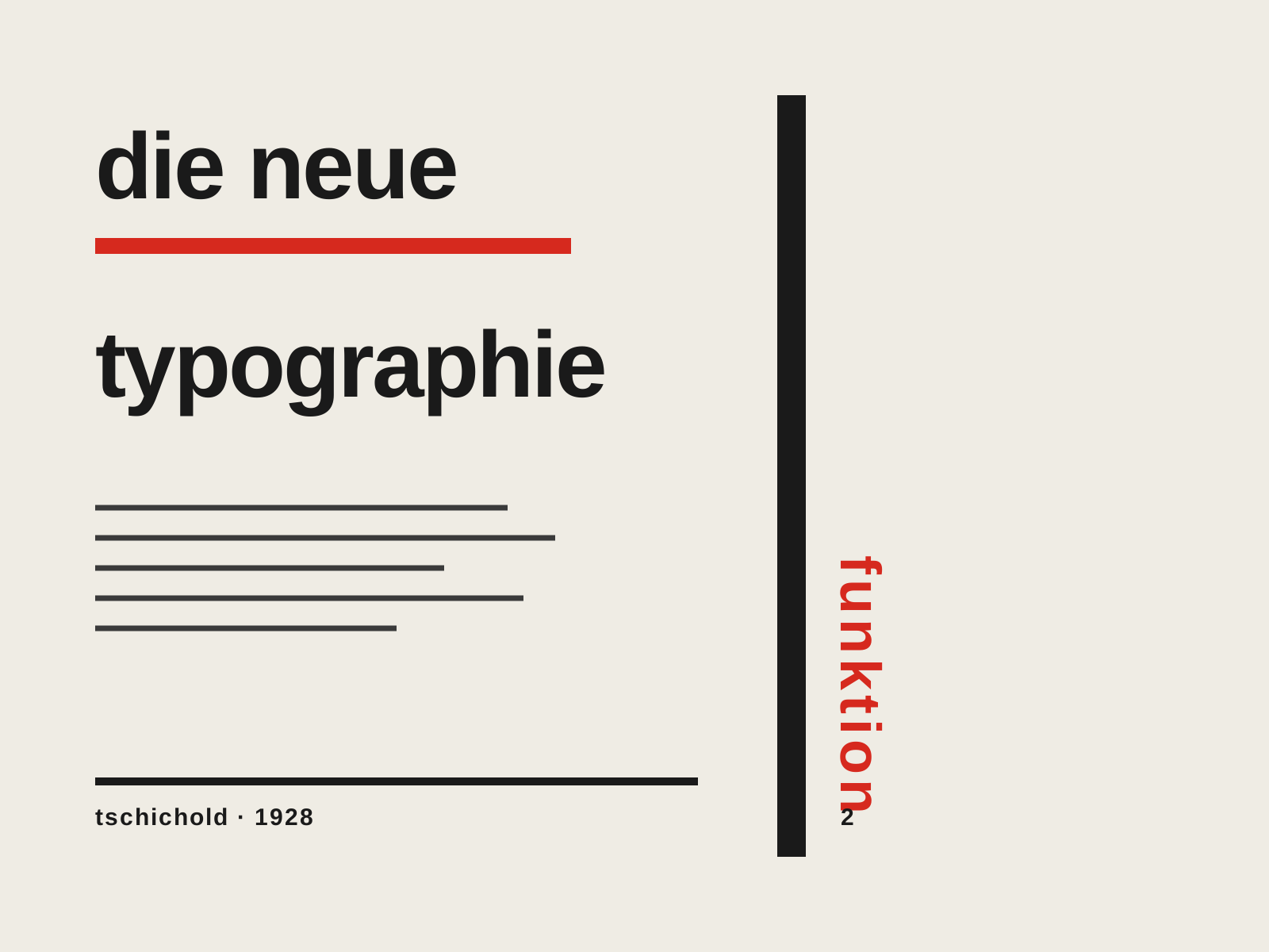
The New Typography
The rigorous modernist program codified by Jan Tschichold — asymmetric layouts, sans-serif type, and the functional grid presented not as art but as a rational set of rules for clear, efficient communication.
- Asymmetric, left-aligned layout replacing centered composition
- Sans-serif (grotesque) type as the modern standard
- Functional grid where every element earns its place
- Active white space and rules directing the eye
- Standardized formats and integration of photography
At a glance
| Constructivist Graphics | The New Typography | |
|---|---|---|
| Era | 1919–1934 | 1925–1935 |
| Discipline | Graphic Design | Graphic Design |
| Region | Soviet Union | Germany, Switzerland |
| Family | Avant-Garde, Modernism | Modernism, Typography |
| Formal traits | diagonal-dynamism, geometric, photomontage, red-black-white | asymmetric, sans-serif, grid-based, functional |
More comparisons
Advertisement