Fraktur vs Gothic Architecture
Fraktur is the cross-discipline counterpart of Gothic Architecture.
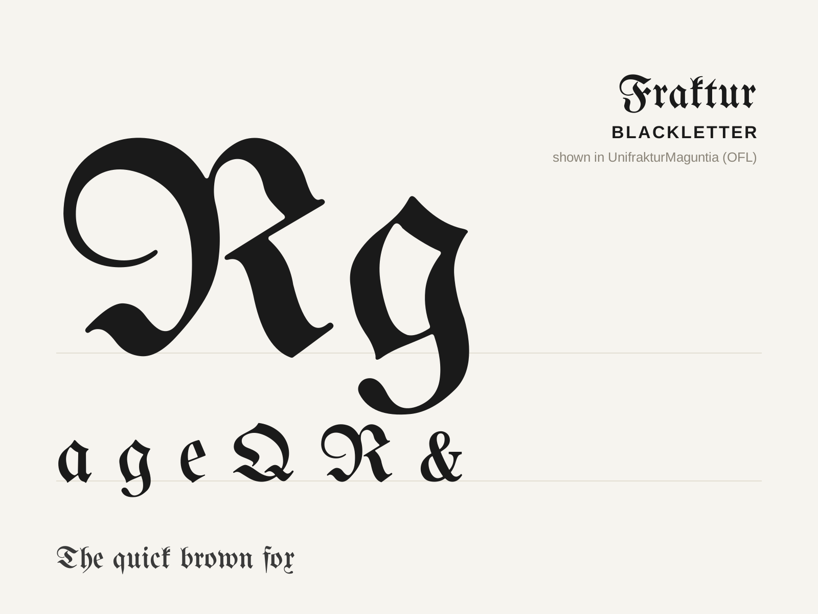
Fraktur
The quintessential German blackletter, a broken script whose name comes from the Latin for 'fractured' — its curves literally broken into angular strokes. For four centuries it was simply how German was printed.
- Curves broken into angular segments by the broad nib
- Capitals with curved 'elephant-trunk' decorative strokes
- Lowercase mixing broken bowls with bulbed hairline strokes
- High stroke contrast and condensed vertical proportions
- Pointed, diamond-tipped terminals throughout

Gothic Architecture
The soaring medieval architecture of cathedrals — pointed arches, rib vaults, and flying buttresses dissolving walls into walls of stained glass and skeletal stone.
- Pointed (ogival) arches in place of round ones
- Ribbed vaults concentrating loads onto piers
- Flying buttresses carrying thrust outside the walls
- Walls opened into stained glass and rose windows
- Soaring verticality, tracery, and richly carved portals
At a glance
| Fraktur | Gothic Architecture | |
|---|---|---|
| Era | c. 1513–present | c. 1140–1500 |
| Discipline | Typography | Architecture |
| Region | Germany, Austria, German-speaking Europe | France, Western Europe |
| Family | Blackletter | Medieval, Gothic |
| Formal traits | broken-script, high-contrast, condensed, vertical-stress | pointed-arch, vertical, skeletal, ornamental |
More comparisons
Advertisement