Franklin Gothic vs Trade Gothic
Trade Gothic was influenced by Franklin Gothic.
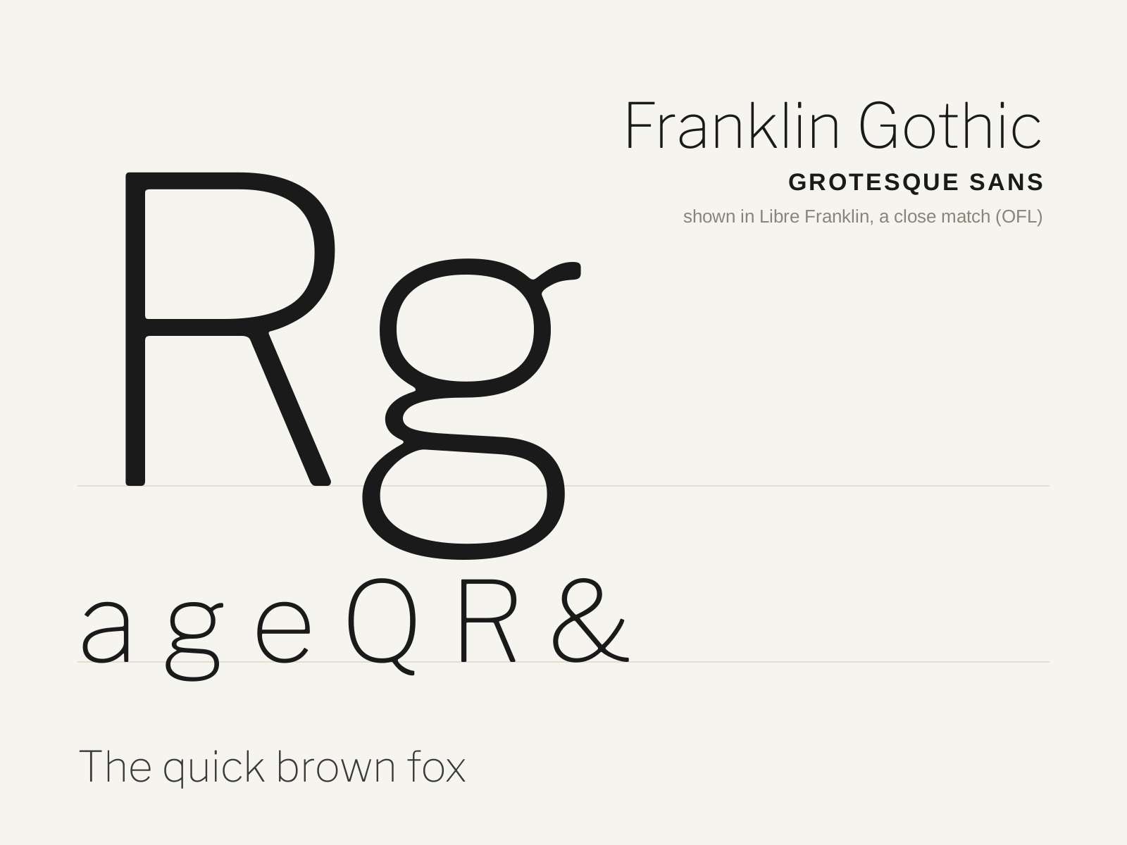
Franklin Gothic
Morris Fuller Benton's 1902 American grotesque — a bold, sturdy 'Gothic' that became the voice of newspaper headlines and advertising for a century. Muscular where the Swiss sans are cool.
- Bold, sturdy weight with visible stroke contrast
- Double-story a with a generous, open bowl
- Double-story g with a distinctive ear
- Slightly narrowed, energetic capitals
- Curved R leg with a sturdy junction
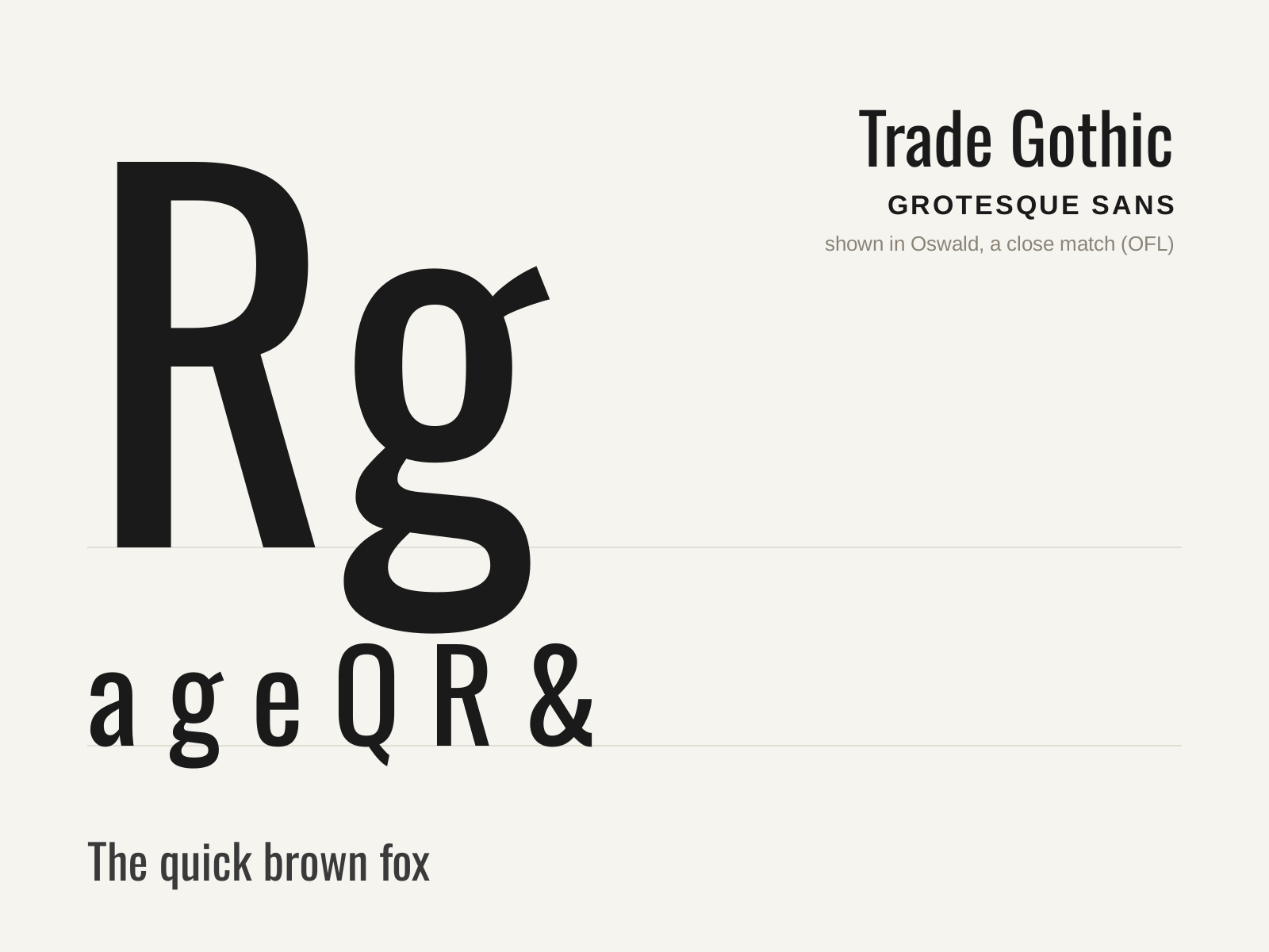
Trade Gothic
Jackson Burke's 1948 Linotype grotesque — a clean, slightly condensed American Gothic prized for newspaper and advertising work, especially its punchy Bold Condensed No. 20.
- Slightly condensed, economical proportions
- Modest stroke contrast, plainspoken forms
- Double-story a and double-story g
- Strong, much-used Bold Condensed No. 20
- Family of mixed, non-systematic weights
At a glance
| Franklin Gothic | Trade Gothic | |
|---|---|---|
| Era | 1902 | 1948 |
| Discipline | Typography | Typography |
| Region | United States | United States |
| Family | Sans-serif | Sans-serif |
| Formal traits | grotesque, gothic, double-story-g, low-contrast | grotesque, gothic, condensed, double-story-g |
More comparisons
Advertisement