Garalde (Old-style) vs Sabon
Sabon was influenced by Garalde (Old-style) — carries the warm old-style colour of the garalde class.
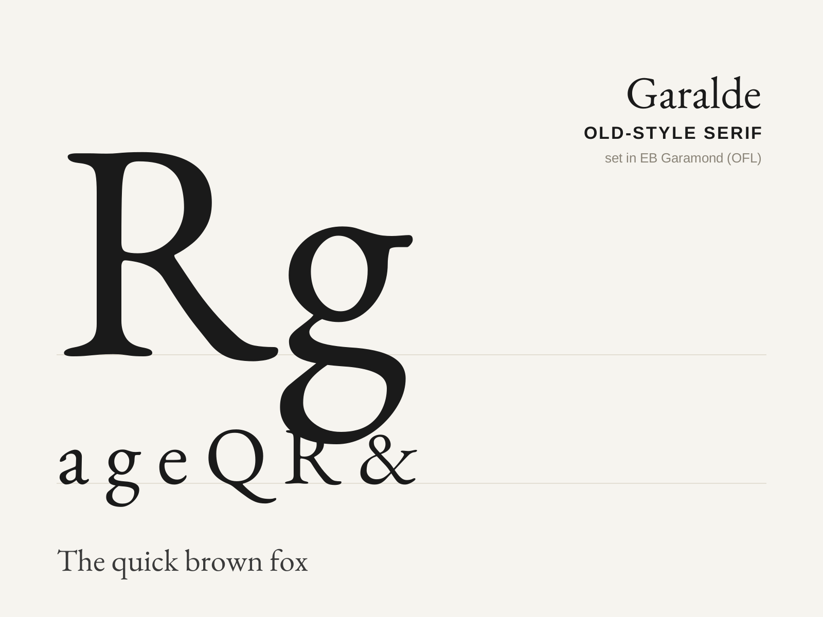
Garalde (Old-style)
The classic old-style serif — humanist roots refined by Aldus Manutius and the French punchcutters, with moderate stroke contrast, bracketed serifs, and an inclined stress that recalls the broad-nib pen.
- Moderate contrast between thick and thin strokes
- Fully bracketed serifs flowing into the stems
- Angled (oblique) stress, from the broad-nib pen
- Slanted, pen-formed serifs on the ascenders
- Even, warm text color tuned for long reading

Sabon
Jan Tschichold's 1967 Garamond revival — a refined old-style serif engineered to print identically across hot-metal, Linotype, and Monotype machines. The disciplined modernist's homage to a Renaissance master.
- Garalde old-style structure derived from Garamond
- Fully bracketed serifs flowing smoothly into the stems
- Moderate stroke contrast with an angled humanist stress
- Narrowed, economical set for three-way machine compatibility
- Even, warm book color tuned for long-form reading
At a glance
| Garalde (Old-style) | Sabon | |
|---|---|---|
| Era | 1490s–1700s | 1967 |
| Discipline | Typography | Typography |
| Region | Italy, France | Germany |
| Family | Serif | Old-style Serif, Garalde |
| Formal traits | old-style, bracketed-serif, moderate-contrast, calligraphic | old-style, bracketed-serif, moderate-contrast, calligraphic |
More comparisons
Advertisement