Humanist Sans-serif vs Optima
Optima evolved from Humanist Sans-serif — a serifless roman with humanist proportions and modulated stress.
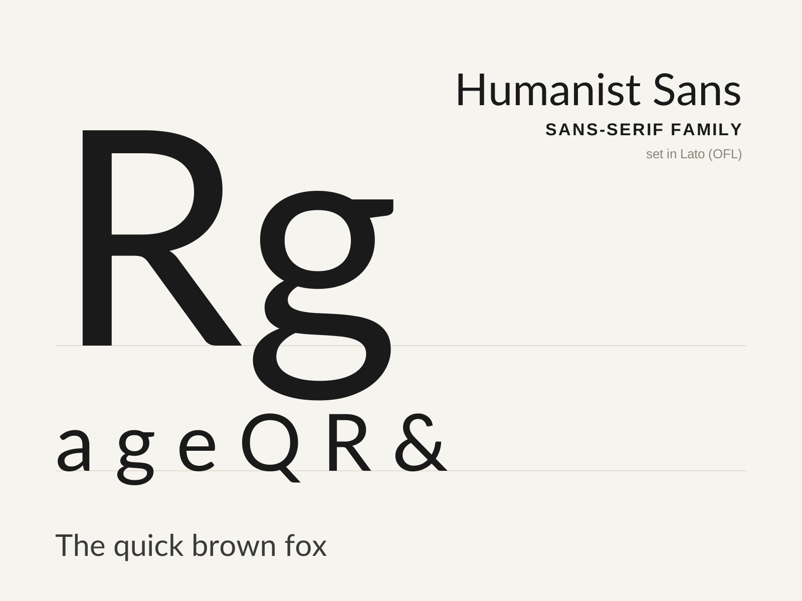
Humanist Sans-serif
Sans-serifs that smuggle the proportions and pen-rhythm of classical roman type into a seriffless skeleton — warmer, more legible, and more individual than the grotesque. Gill Sans and Frutiger are its standard-bearers.
- Varied letter widths echoing classical Roman proportions
- Open apertures on c, e, a, s for legibility
- Slight stroke contrast and calligraphic modulation
- Often a double-story a and g of true two-bowl form
- Humanist 'flick' or pen-formed details on terminals

Optima
Hermann Zapf's 1958 'serifless roman' — a humanist sans whose stems gently flare toward their ends, splitting the difference between sans and serif. Inspired by lettering Zapf sketched on Florentine grave slabs.
- Serifless stems that flare gently at the terminals
- Tapered 'waisted' strokes with modulated, swelling contrast
- Classical Roman capital proportions of varied width
- Calligraphic stress recalling chiselled inscriptional letters
- No bracketed serifs, yet clear thick/thin modulation
At a glance
| Humanist Sans-serif | Optima | |
|---|---|---|
| Era | 1920s–present | 1958 |
| Discipline | Typography | Typography |
| Region | England, Europe, United States | Germany |
| Family | Sans-serif | Humanist Sans, Glyphic |
| Formal traits | humanist, open-aperture, modest-contrast, calligraphic | flared-stems, modulated-contrast, calligraphic, serifless |
More comparisons
Advertisement