Mid-Century Modern vs Mid-Century Modern Graphic Design
Mid-Century Modern Graphic Design is the cross-discipline counterpart of Mid-Century Modern — the graphic counterpart to mid-century modern architecture and product design.

Mid-Century Modern
Warm, livable modernism — clean lines and flat planes opened up with glass walls that dissolve the boundary between indoors and out.
- Clean horizontal lines, flat or low-pitched roofs
- Floor-to-ceiling glass and walls of windows
- Open floor plans and indoor-outdoor flow
- Honest use of wood, stone, and brick
- Integration with the natural site and landscape
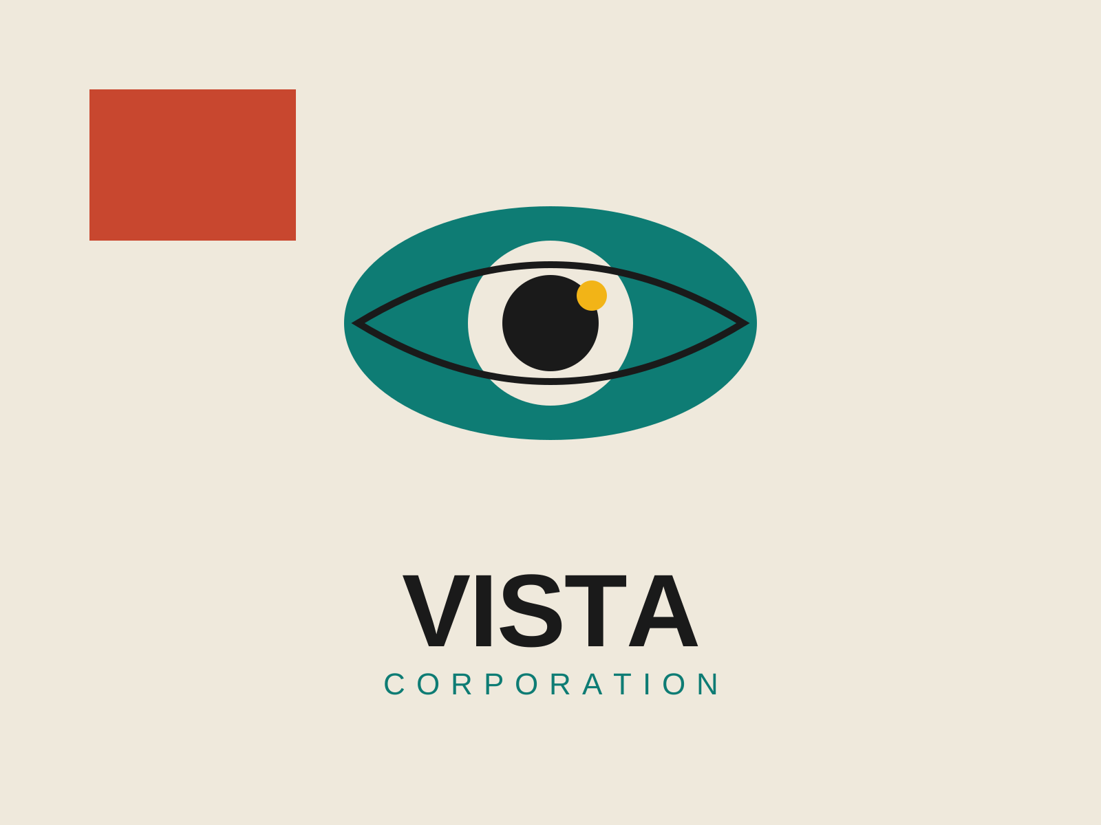
Mid-Century Modern Graphic Design
Postwar American graphic design that married European modernist rigor with Madison Avenue optimism, building the visual language of the corporate logo, the trademark, and the witty conceptual poster.
- Reductive conceptual logos built around a single idea
- Hand-cut paper collage and torn-edge shapes
- Flat unmodeled color blocks with generous white space
- Bold sans-serif type set with dramatic scale contrast
- Geometric simplification of imagery into clean silhouettes
At a glance
| Mid-Century Modern | Mid-Century Modern Graphic Design | |
|---|---|---|
| Era | 1945–1969 | c. 1945–1970 |
| Discipline | Architecture | Graphic Design |
| Region | United States, Scandinavia | United States |
| Family | Modernism | Corporate Modern, Modernist |
| Formal traits | clean-lined, organic, minimal, indoor-outdoor | flat-color, geometric, sans-serif, negative-space |
More comparisons
Advertisement