Mid-Century Modern vs Supergraphics
Supergraphics is the cross-discipline counterpart of Mid-Century Modern.

Mid-Century Modern
Warm, livable modernism — clean lines and flat planes opened up with glass walls that dissolve the boundary between indoors and out.
- Clean horizontal lines, flat or low-pitched roofs
- Floor-to-ceiling glass and walls of windows
- Open floor plans and indoor-outdoor flow
- Honest use of wood, stone, and brick
- Integration with the natural site and landscape
Supergraphics
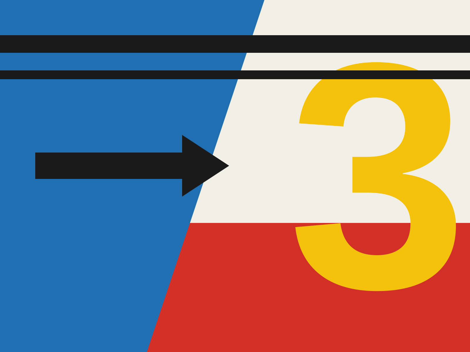
Enormous, bold typographic and geometric forms painted directly onto walls and buildings, scaled to architecture itself. Hard-edged color shapes and giant letters that reshape how a space is perceived.
- Oversized type and geometry at architectural scale
- Flat planes of hard-edged saturated color
- Forms wrapping walls, corners, and whole facades
- Bold stripes, arrows, numerals, and circles
- Graphics that visually restructure the space
At a glance
| Mid-Century Modern | Supergraphics | |
|---|---|---|
| Era | 1945–1969 | 1960s–1970s |
| Discipline | Architecture | Graphic Design |
| Region | United States, Scandinavia | United States |
| Family | Modernism | Modernist |
| Formal traits | clean-lined, organic, minimal, indoor-outdoor | large-scale, flat-color, geometric, architectural |
More comparisons
Advertisement