Akzidenz-Grotesk vs Univers
Univers evolved from Akzidenz-Grotesk — Frutiger's systematic neo-grotesque, Helvetica's 1957 rival.
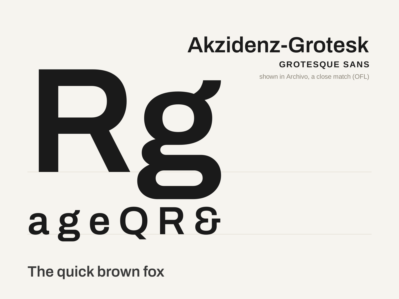
Akzidenz-Grotesk
Berthold's 1896 grotesque — the sober German jobbing sans that, half a century later, became the favored typeface of Swiss modernism and the direct ancestor of Helvetica and Univers.
- Low stroke contrast with subtly squared curves
- Moderate x-height, looser than later neo-grotesques
- Closed aperture on c, e, s
- Curved, tucked leg on the capital R
- Even, sober color suited to jobbing and text
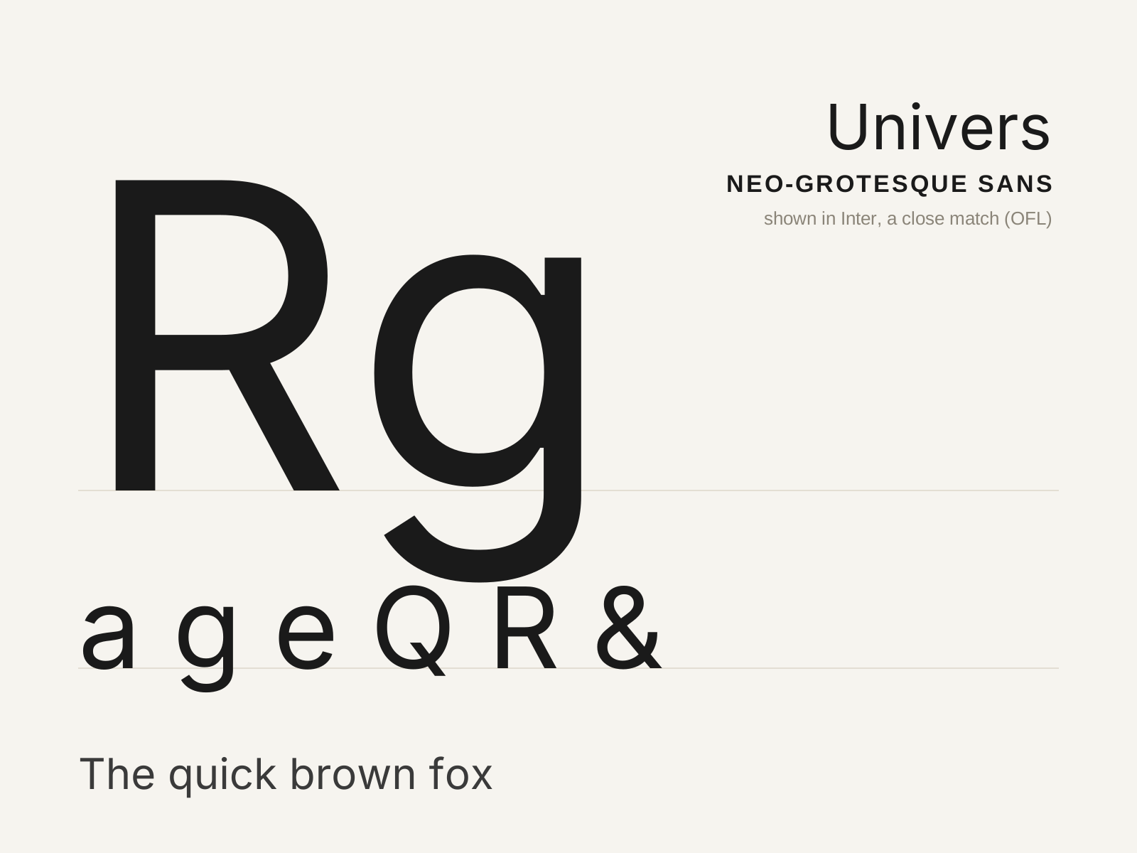
Univers
Adrian Frutiger's 1957 neo-grotesque — the first type family conceived as a rational, numbered system of 21 coordinated weights and widths, a masterpiece of Swiss order released the same year as Helvetica.
- Conceived as a system of 21 numbered weights and widths
- Even, near-monoline strokes with a subtle taper
- Slightly splayed leg on the capital R
- Closed aperture and disciplined neo-grotesque forms
- Marginally lower x-height than Helvetica
At a glance
| Akzidenz-Grotesk | Univers | |
|---|---|---|
| Era | 1896 | 1957 |
| Discipline | Typography | Typography |
| Region | Germany | France, Switzerland |
| Family | Sans-serif | Sans-serif |
| Formal traits | grotesque, low-contrast, closed-aperture, neutral | neo-grotesque, monoline, systematic, high-x-height |
More comparisons
Advertisement