ITC Avant Garde Gothic vs Geometric Sans-serif
ITC Avant Garde Gothic evolved from Geometric Sans-serif.
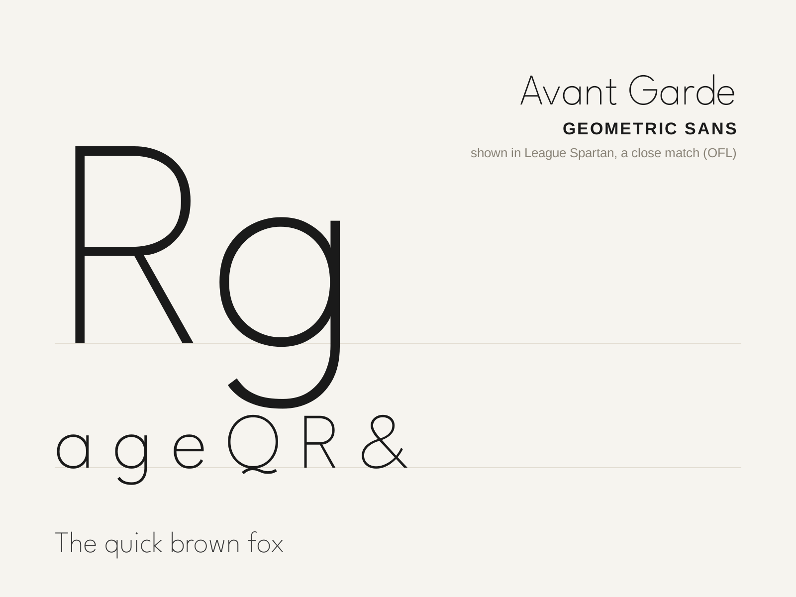
ITC Avant Garde Gothic
Herb Lubalin's 1970 geometric sans, grown from his logotype for Avant Garde magazine — famous (and infamous) for its tightly interlocking ligatures and crisp circular forms. The quintessential look of 1970s graphic design.
- Near-perfect circular bowls and geometric construction
- Single-story a and single-story g
- Sharply pointed apexes on A, M, N
- Extensive interlocking ligatures and angled alternates
- High x-height with crisp, even strokes
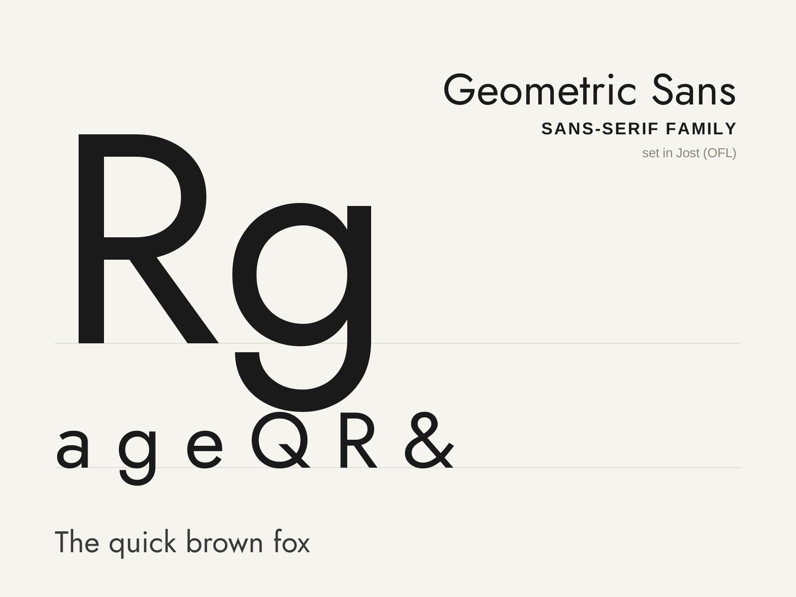
Geometric Sans-serif
Sans-serifs built from compass-and-straightedge primitives — circles, triangles, and straight lines — the Bauhaus dream of a rational, elemental alphabet. Futura is its founding monument.
- Forms built from circles, triangles, and straight lines
- Near-perfect circular bowls (o, b, d, p, q)
- Single-story a, almost always a circle and stem
- Single-story g with a simple open or looped tail
- Sharply pointed apexes on A, M, N, V, W
At a glance
| ITC Avant Garde Gothic | Geometric Sans-serif | |
|---|---|---|
| Era | 1970 | 1920s–1930s |
| Discipline | Typography | Typography |
| Region | United States | Germany, Europe |
| Family | Sans-serif | Sans-serif |
| Formal traits | geometric, single-story-a, ligatured, high-x-height | geometric, monoline, single-story-a, pointed-apex |
More comparisons
Advertisement