ITC Avant Garde Gothic vs Futura
ITC Avant Garde Gothic was influenced by Futura.
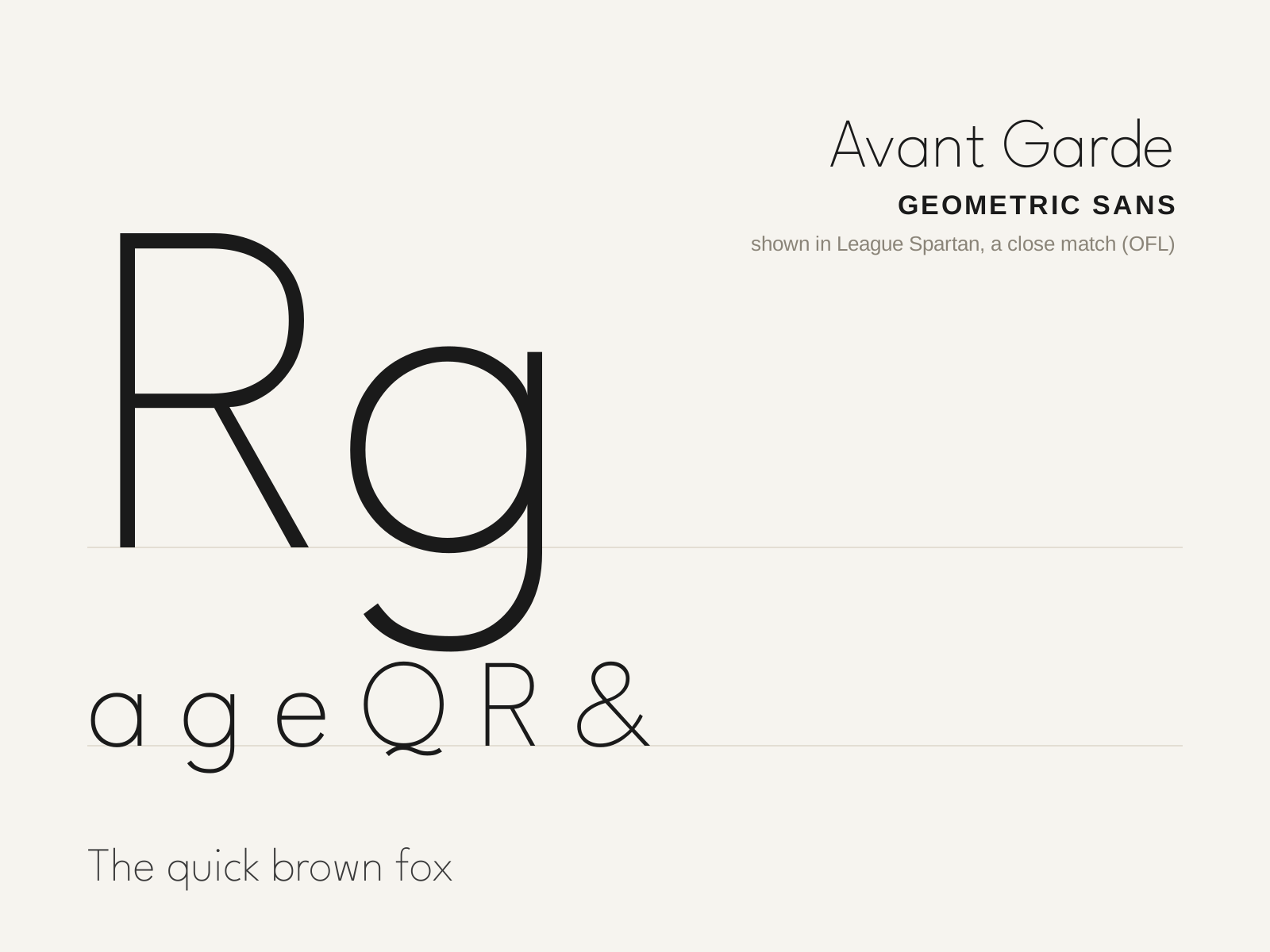
ITC Avant Garde Gothic
Herb Lubalin's 1970 geometric sans, grown from his logotype for Avant Garde magazine — famous (and infamous) for its tightly interlocking ligatures and crisp circular forms. The quintessential look of 1970s graphic design.
- Near-perfect circular bowls and geometric construction
- Single-story a and single-story g
- Sharply pointed apexes on A, M, N
- Extensive interlocking ligatures and angled alternates
- High x-height with crisp, even strokes
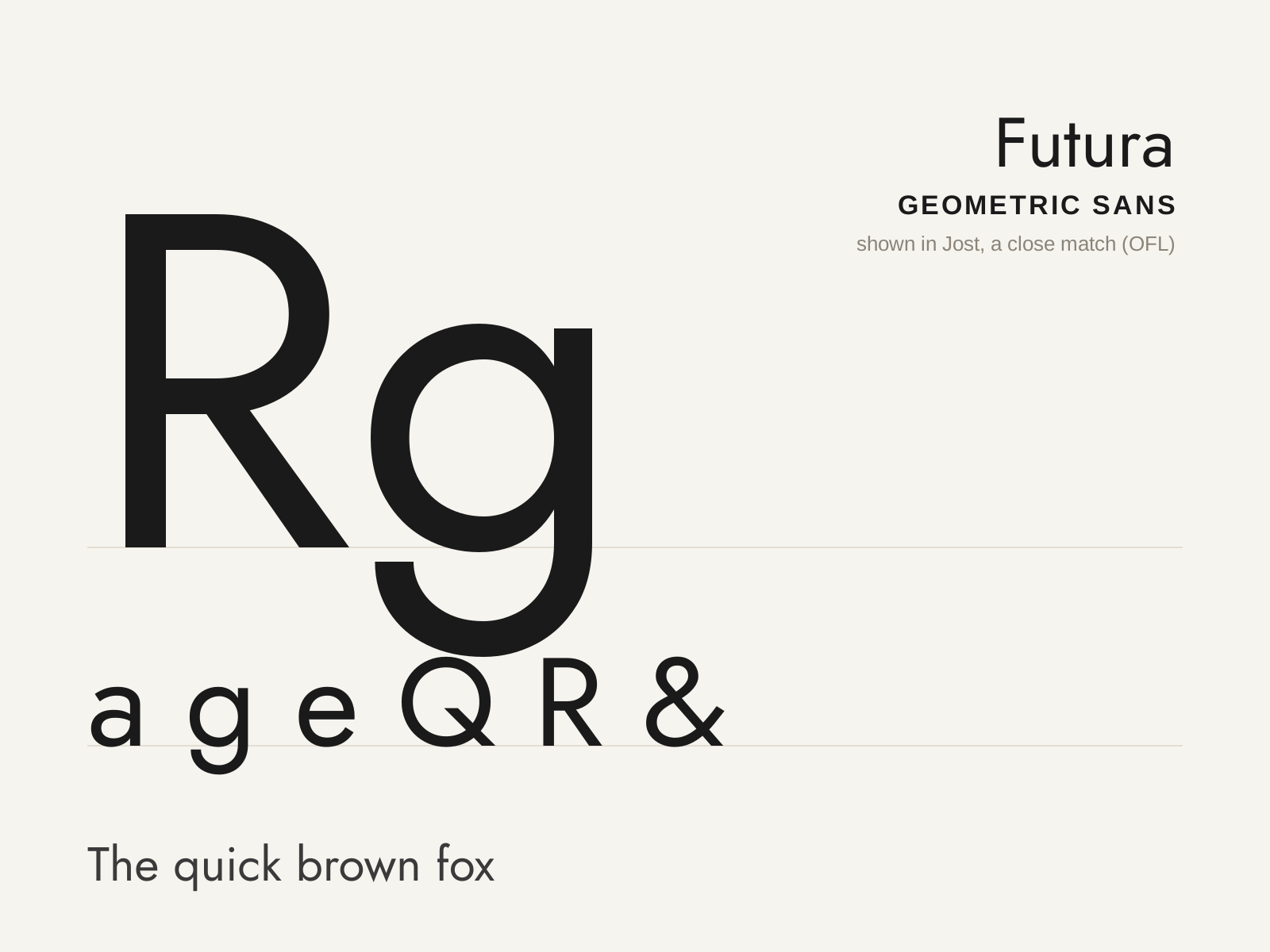
Futura
Paul Renner's 1927 geometric sans — letterforms built from near-perfect circles, triangles, and straight lines, the Bauhaus ideal of rational, modern type made commercial.
- Letterforms built from circles, triangles, and lines
- Near-perfect circular bowls (o, b, d, p, q)
- Single-story a and a simple, open-tailed g
- Sharply pointed apexes on A, M, N, V, W
- Long ascenders rising above the cap height
At a glance
| ITC Avant Garde Gothic | Futura | |
|---|---|---|
| Era | 1970 | 1927 |
| Discipline | Typography | Typography |
| Region | United States | Germany |
| Family | Sans-serif | Sans-serif |
| Formal traits | geometric, single-story-a, ligatured, high-x-height | geometric, monoline, low-contrast, pointed-apex |
More comparisons
Advertisement