Bauhaus Graphic Design vs Mid-Century Modern Graphic Design
Mid-Century Modern Graphic Design was influenced by Bauhaus Graphic Design — Americanized the Bauhaus programme via its emigrating teachers.

Bauhaus Graphic Design
The functional, geometric graphic language forged at the Bauhaus — lowercase sans-serif type, asymmetric layouts, primary colors, and the marriage of typography with photography into a rational visual system.
- Geometric sans-serif type, often lowercase only
- Asymmetric layouts on a horizontal-vertical structure
- Integration of typography with photography (typophoto)
- Primary colors with black, white, and bold rules
- Functional, grid-organized white space
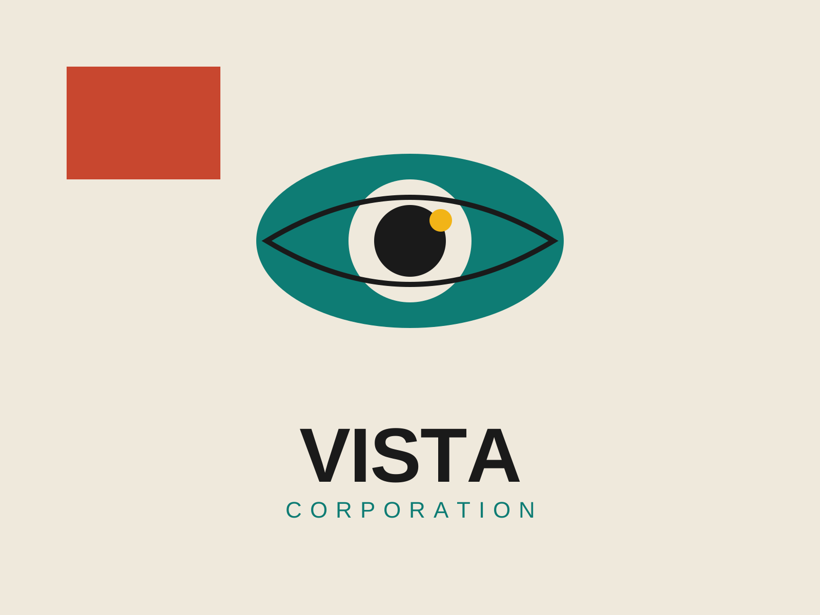
Mid-Century Modern Graphic Design
Postwar American graphic design that married European modernist rigor with Madison Avenue optimism, building the visual language of the corporate logo, the trademark, and the witty conceptual poster.
- Reductive conceptual logos built around a single idea
- Hand-cut paper collage and torn-edge shapes
- Flat unmodeled color blocks with generous white space
- Bold sans-serif type set with dramatic scale contrast
- Geometric simplification of imagery into clean silhouettes
At a glance
| Bauhaus Graphic Design | Mid-Century Modern Graphic Design | |
|---|---|---|
| Era | 1919–1933 | c. 1945–1970 |
| Discipline | Graphic Design | Graphic Design |
| Region | Germany | United States |
| Family | Modernism, Bauhaus | Corporate Modern, Modernist |
| Formal traits | asymmetric, sans-serif, geometric, grid-based | flat-color, geometric, sans-serif, negative-space |
More comparisons
Advertisement