Blackletter vs Incunabula Printing
Incunabula Printing is the cross-discipline counterpart of Blackletter.
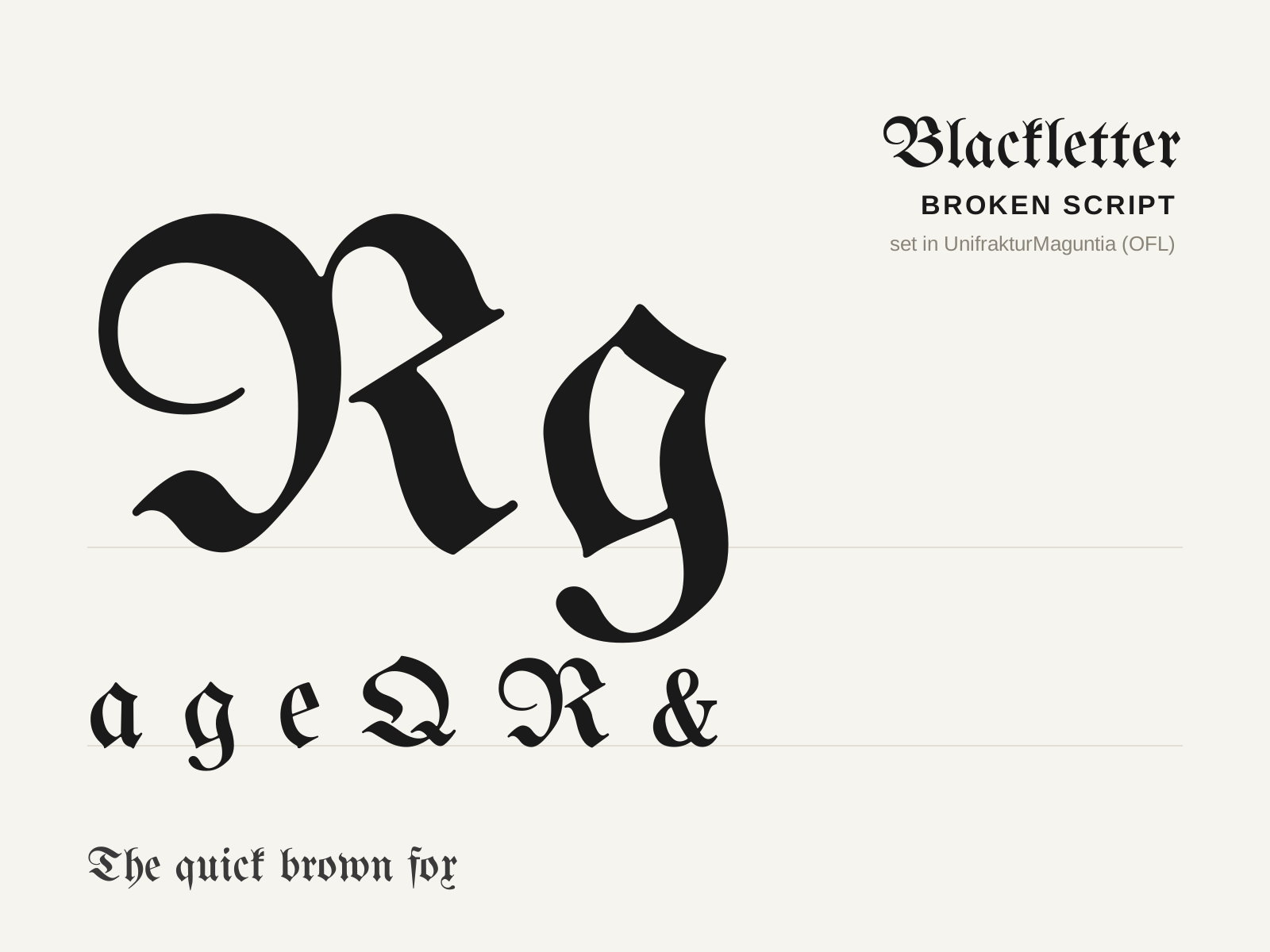
Blackletter
The dense, angular family of broken-pen scripts that carried medieval Europe from manuscript to movable type, all dark vertical strokes and fractured curves. Its descendants — textura, rotunda, schwabacher, and fraktur — range from rigid liturgical density to looser vernacular forms.
- Curves broken into angular straight pen-strokes
- Strong vertical emphasis with minimal letter spacing
- High contrast from a steeply-held broad nib
- Diamond-shaped serifs and terminal feet
- Condensed, narrow counters creating a dark page color

Incunabula Printing
The earliest printed books, from Gutenberg's press to the year 1500, that translate the look of the manuscript into movable metal type. Dense blackletter columns, woodcut initials, and rubricated touches mark a medium learning to be itself.
- Dense blackletter (textura) or early roman type
- Justified two-column page mimicking manuscripts
- Hand-added rubrication and spaces for initials
- Woodcut decorated initials and illustrations
- Heavy ink impression on handmade laid paper
At a glance
| Blackletter | Incunabula Printing | |
|---|---|---|
| Era | c. 1150–present | c. 1450–1500 |
| Discipline | Typography | Graphic Design |
| Region | Germany, Western Europe, England | Germany, Italy, Western Europe |
| Family | Blackletter | Pre-modern, Print |
| Formal traits | broken-script, high-contrast, condensed, vertical-stress | blackletter, woodcut, letterpress, justified-column |
More comparisons
Advertisement