Heraldry vs Incunabula Printing
Incunabula Printing was influenced by Heraldry.
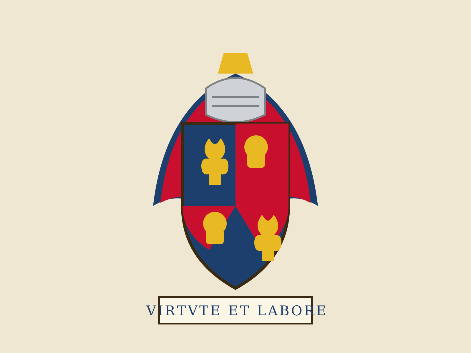
Heraldry
A rigorous medieval system of identity-by-emblem, in which shields are divided and charged according to strict rules and described in a specialized verbal language called blazon. It is design as grammar: a finite vocabulary of tinctures and charges combined into endless unique marks.
- Limited tincture palette of metals and colors
- Rule of tincture forbidding color-on-color
- Stylized charges (lions, eagles, fleurs-de-lis)
- Geometric field divisions and ordinaries
- Verbal blazon that fully specifies each design

Incunabula Printing
The earliest printed books, from Gutenberg's press to the year 1500, that translate the look of the manuscript into movable metal type. Dense blackletter columns, woodcut initials, and rubricated touches mark a medium learning to be itself.
- Dense blackletter (textura) or early roman type
- Justified two-column page mimicking manuscripts
- Hand-added rubrication and spaces for initials
- Woodcut decorated initials and illustrations
- Heavy ink impression on handmade laid paper
At a glance
| Heraldry | Incunabula Printing | |
|---|---|---|
| Era | c. 1150–present | c. 1450–1500 |
| Discipline | Graphic Design | Graphic Design |
| Region | Western Europe, British Isles | Germany, Italy, Western Europe |
| Family | Pre-modern, Symbolic | Pre-modern, Print |
| Formal traits | flat-color, emblematic, ornamental, high-contrast | blackletter, woodcut, letterpress, justified-column |
More comparisons
Advertisement