Clarendon vs Rockwell
Rockwell was influenced by Clarendon.
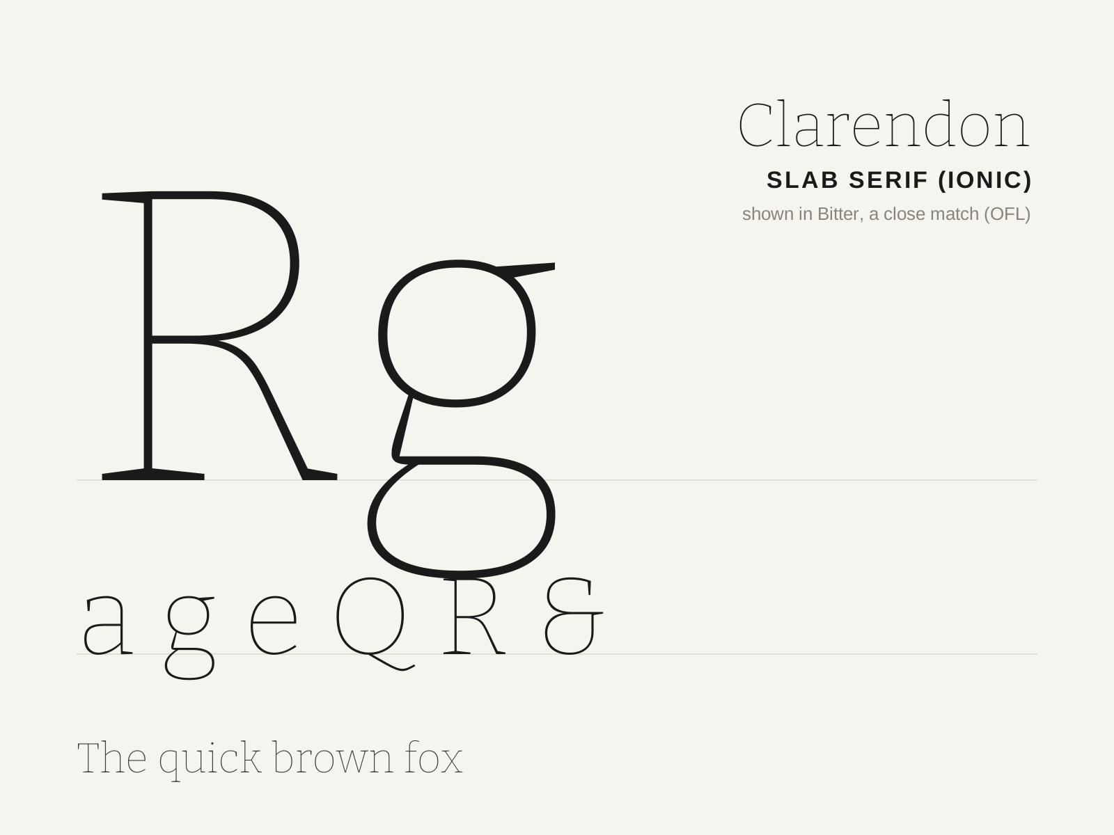
Clarendon
Robert Besley's 1845 bracketed slab serif — a sturdy, friendly 'Ionic' with curved brackets and ball terminals, designed to bold-face and emphasize text. The first registered typeface design.
- Heavy slab serifs with curved brackets
- Low stroke contrast, sturdy even weight
- Large x-height with broad, robust proportions
- Ball terminals on a, c, f, r
- Near-vertical stress, gently modulated strokes
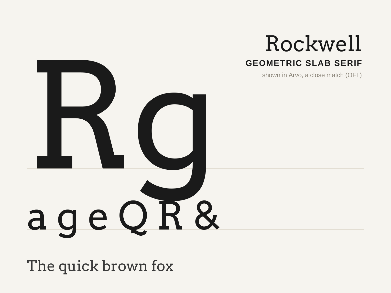
Rockwell
Monotype's 1934 geometric slab serif — blunt, unbracketed square serifs and near-monoline strokes built on circular, geometric forms. Bold, sturdy, and unmistakably mechanical.
- Blunt, unbracketed square serifs equal to stem weight
- Near-monoline strokes, very low contrast
- Geometric, near-circular bowls (O close to a circle)
- Pointed apex on the capital A, often above cap height
- Sturdy, even, mechanical proportions
At a glance
| Clarendon | Rockwell | |
|---|---|---|
| Era | 1845 | 1934 |
| Discipline | Typography | Typography |
| Region | England, London | England |
| Family | Serif | Serif |
| Formal traits | slab-serif, bracketed-serif, low-contrast, vertical-stress | slab-serif, unbracketed, monoline, geometric |
More comparisons
Advertisement