Rockwell vs Slab Serif
Rockwell evolved from Slab Serif — the geometric, unbracketed slab.
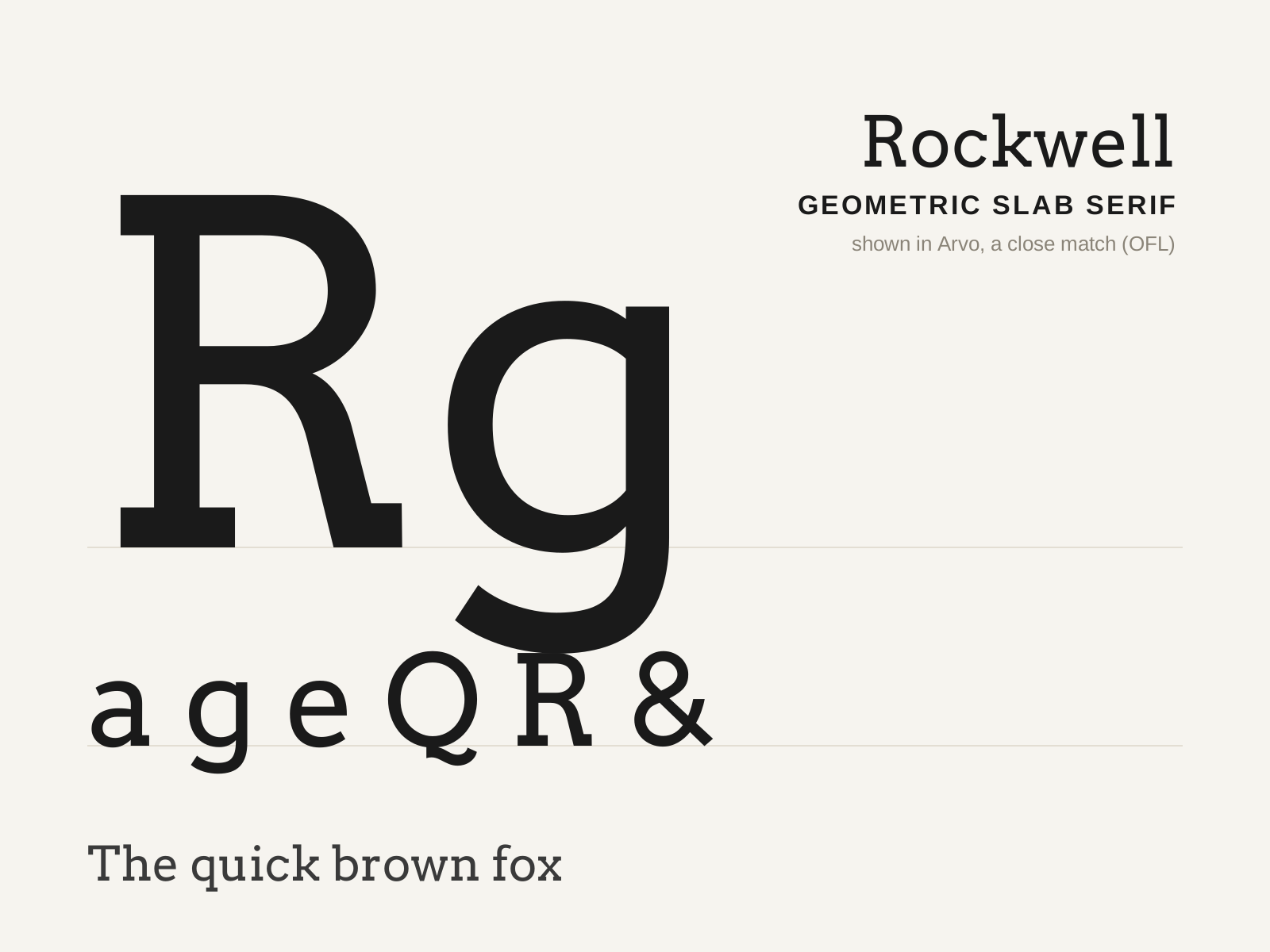
Rockwell
Monotype's 1934 geometric slab serif — blunt, unbracketed square serifs and near-monoline strokes built on circular, geometric forms. Bold, sturdy, and unmistakably mechanical.
- Blunt, unbracketed square serifs equal to stem weight
- Near-monoline strokes, very low contrast
- Geometric, near-circular bowls (O close to a circle)
- Pointed apex on the capital A, often above cap height
- Sturdy, even, mechanical proportions
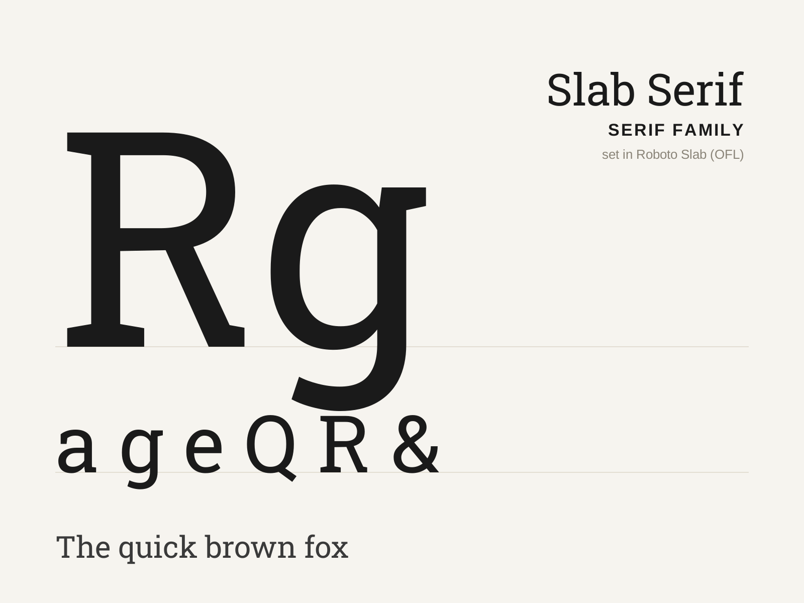
Slab Serif
Heavy, blocky serifs as thick as the stems, born for the bold demands of nineteenth-century advertising. Low contrast and squared-off, it shouts where the Didone whispers.
- Thick, square serifs nearly equal in weight to the stems
- Low stroke contrast, often near-monoline
- Bracketed (Clarendon) or unbracketed (geometric) serif joins
- Sturdy, even, mechanical proportions
- Large x-height with robust, blocky color
At a glance
| Rockwell | Slab Serif | |
|---|---|---|
| Era | 1934 | 1810s–1840s |
| Discipline | Typography | Typography |
| Region | England | England, United States |
| Family | Serif | Serif |
| Formal traits | slab-serif, unbracketed, monoline, geometric | slab-serif, low-contrast, monoline, vertical-stress |
More comparisons
Advertisement