Comic-Book Graphic Style vs Pulp Magazine Art
Comic-Book Graphic Style was influenced by Pulp Magazine Art — carried newsstand melodrama into the four-colour comic.
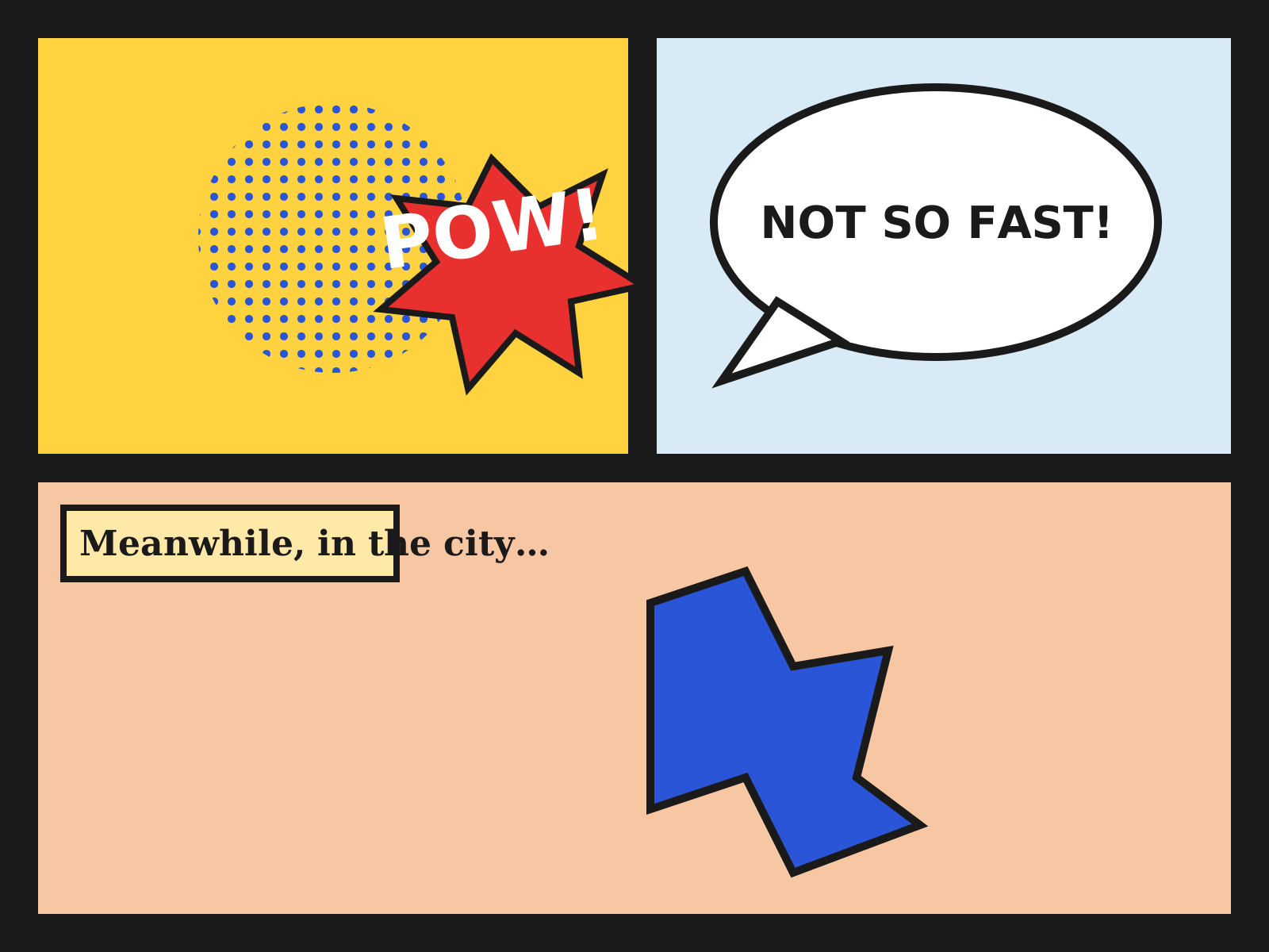
Comic-Book Graphic Style
The bold-outlined, dot-shaded look of newsstand comic books: gridded panels, speech balloons, sound-effect lettering, and flat four-color heroes. A sequential graphic language built for cheap, vivid mass printing.
- Bold black ink outlines around every form
- Flat four-color printing with Ben-Day dots
- Gridded panel layout with gutters
- Speech balloons, captions, and sound-effect lettering
- Dynamic, foreshortened action poses

Pulp Magazine Art
Lurid, fast-painted cover art for cheap pulp-paper magazines: damsels in peril, square-jawed heroes, ray-guns and revolvers under screaming logotypes. Sensational, high-contrast scenes built to grab a newsstand buyer in a half-second.
- Lurid, fast oil or gouache painting
- Melodramatic frozen-action scene with imperiled figure
- Clashing, oversaturated color and theatrical light
- Massive serif or slab logotype across the top
- Genre iconography: ray-guns, monsters, revolvers, rockets
At a glance
| Comic-Book Graphic Style | Pulp Magazine Art | |
|---|---|---|
| Era | 1938–1970s | 1920s–1950s |
| Discipline | Graphic Design | Graphic Design |
| Region | United States | United States |
| Family | Pop, Illustration | Illustration, Poster |
| Formal traits | bold-outline, ben-day-dots, flat-color, panel-grid | painterly, lurid, high-contrast, melodramatic |
More comparisons
Advertisement