Comic-Book Graphic Style vs Pop Art Graphic Design
Pop Art Graphic Design was influenced by Comic-Book Graphic Style — lifted Ben-Day dots and panels into fine art and back.
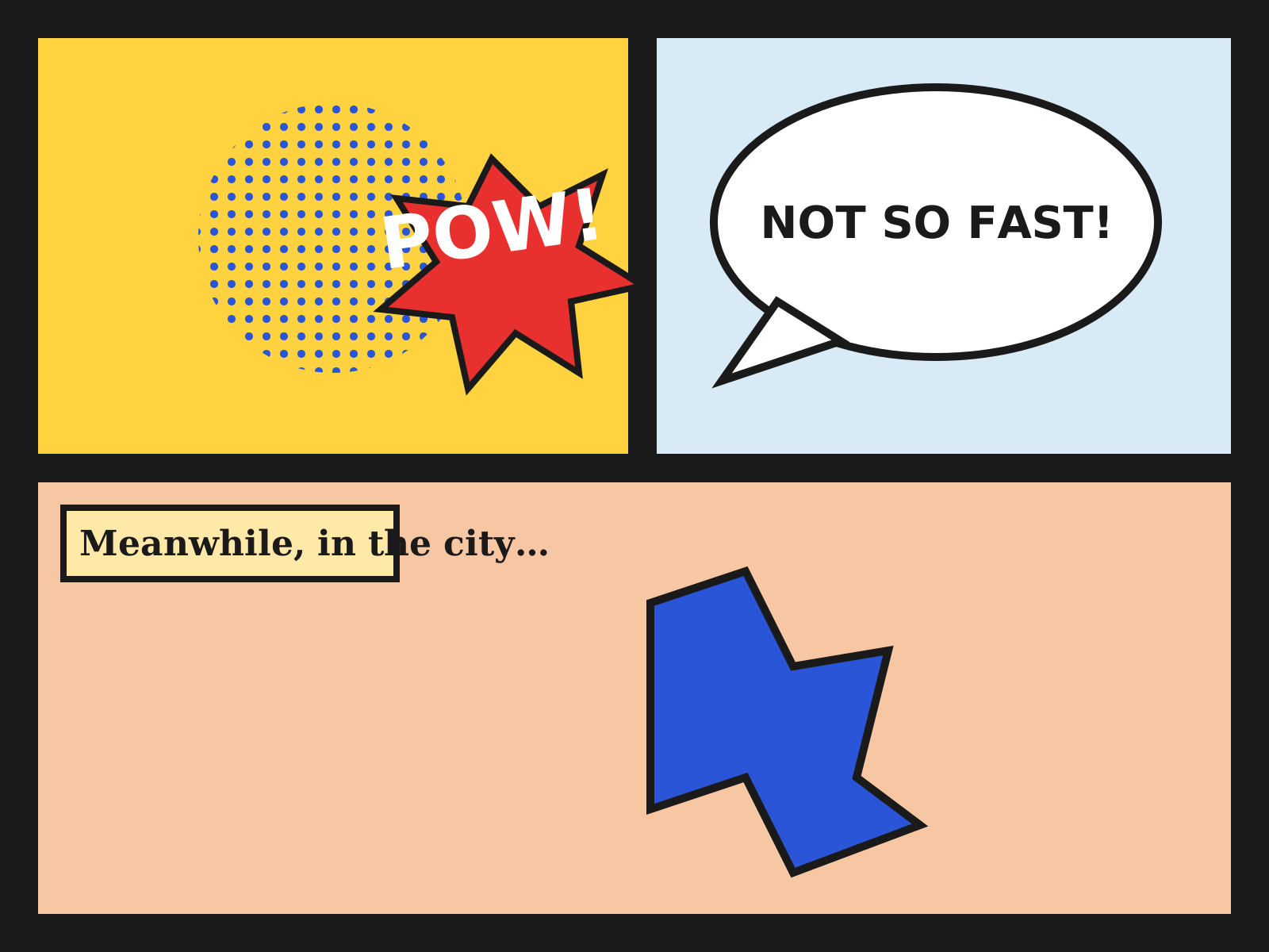
Comic-Book Graphic Style
The bold-outlined, dot-shaded look of newsstand comic books: gridded panels, speech balloons, sound-effect lettering, and flat four-color heroes. A sequential graphic language built for cheap, vivid mass printing.
- Bold black ink outlines around every form
- Flat four-color printing with Ben-Day dots
- Gridded panel layout with gutters
- Speech balloons, captions, and sound-effect lettering
- Dynamic, foreshortened action poses
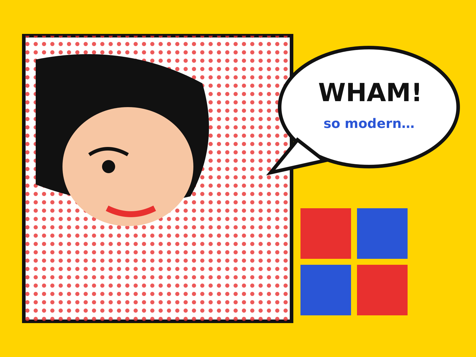
Pop Art Graphic Design
Commercial and mass-media imagery elevated to art: soup cans, comic panels, and movie stars in flat, bold color and mechanical Ben-Day dots. Brash, ironic, and unmistakably of the consumer age.
- Mechanical Ben-Day / halftone dot patterns
- Flat hard-edged areas of bold color
- Heavy black comic-style outlines
- Appropriated consumer and celebrity imagery
- Silkscreen repetition and grid arrangements
At a glance
| Comic-Book Graphic Style | Pop Art Graphic Design | |
|---|---|---|
| Era | 1938–1970s | 1950s–1970s |
| Discipline | Graphic Design | Graphic Design |
| Region | United States | United States, United Kingdom |
| Family | Pop, Illustration | Pop |
| Formal traits | bold-outline, ben-day-dots, flat-color, panel-grid | ben-day-dots, flat-color, bold-outline, repetition |
More comparisons
Advertisement