Concrete Poetry vs Futurist Typography
Concrete Poetry was influenced by Futurist Typography — draws on Futurist free typography and spatialised words.
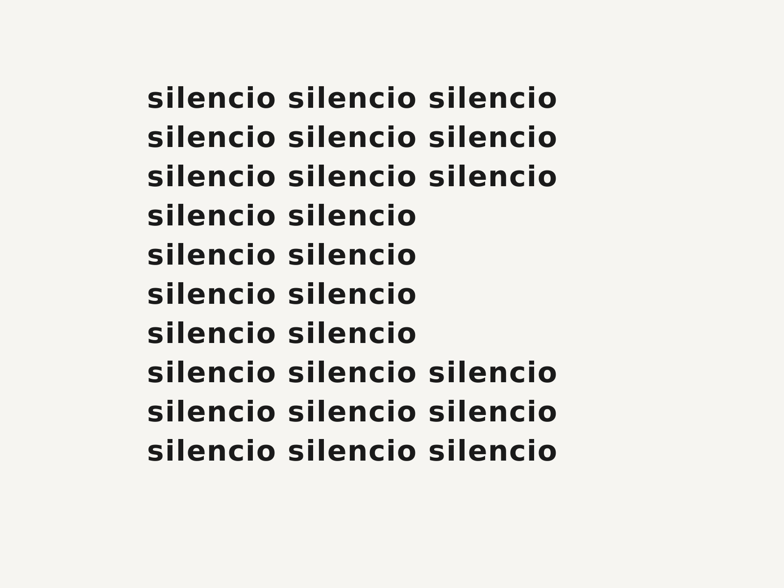
Concrete Poetry
An international postwar movement in which the visual arrangement of words on the page becomes the poem's meaning—typography as spatial, structural art.
- Spatial arrangement of words as the carrier of meaning
- Single words repeated, gridded, or fragmented into shapes
- Clean sans-serif type and generous white space
- Mathematical symmetry and structural layout
- Reading fused with looking—the page as visual field

Futurist Typography
The explosive typographic wing of Italian Futurism, in which words were 'set free' — letters of every size, weight, and angle hurled across the page to convey speed, noise, and the dynamism of the machine age.
- Multiple typefaces, sizes, and weights mixed on one page
- Letters set on diagonals, curves, and free trajectories
- Onomatopoeic, pictorial use of words to mimic sound
- Abolition of the centered, justified column
- Dynamic asymmetry expressing speed and noise
At a glance
| Concrete Poetry | Futurist Typography | |
|---|---|---|
| Era | c.1952–1970 | 1909–1939 |
| Discipline | Graphic Design | Graphic Design |
| Region | Brazil, Switzerland, Germany, United Kingdom | Italy |
| Family | Experimental Type, Avant-Garde | Avant-Garde, Modernism |
| Formal traits | spatial-typography, gridded, sans-serif, white-space | asymmetric, diagonal-dynamism, mixed-type, expressive-lettering |
More comparisons
Advertisement