c.1952–1970 · Brazil, Switzerland, Germany, United Kingdom
Concrete Poetry
Also known as Concrete poetry, visual poetry, poesia concreta
An international postwar movement in which the visual arrangement of words on the page becomes the poem's meaning—typography as spatial, structural art.
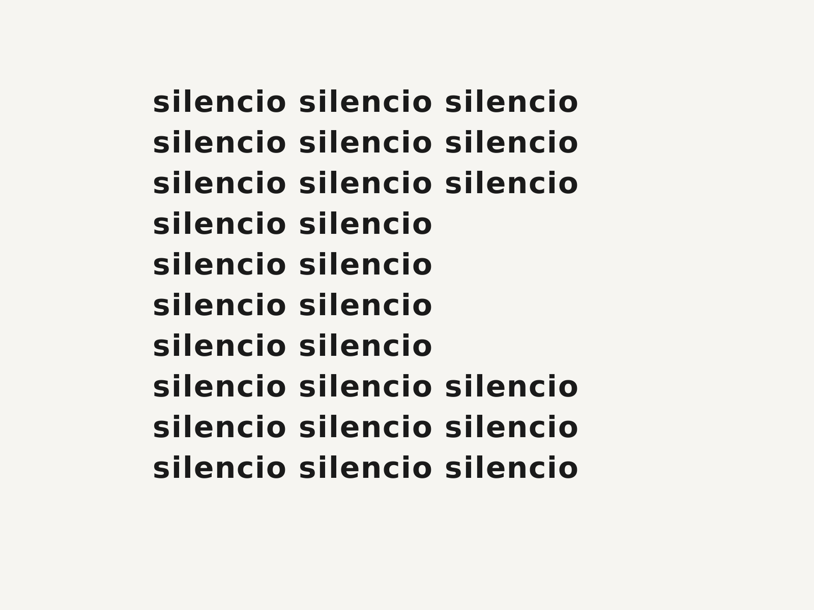
Original specimen, not a historical artifactOriginal specimen in the Concrete Poetry style. Owned; source: Design Style Book (original).
About the style
Concrete poetry is the international tendency, crystallised around 1952–55 by Brazil's Noigandres group and Switzerland's Eugen Gomringer, in which a poem's form is its content: words, letters, and spaces are arranged spatially so the layout itself carries meaning. Drawing on Mallarmé, Futurist parole in libertà, and the rational clarity of the contemporaneous Swiss Style, practitioners treated the page as a structured field, repeating, fragmenting, and gridding single words into shapes, columns, and patterns. The typical look is austere and typographic—clean sans-serif type, generous white space, mathematical symmetry—though playful and ideogrammatic variants abound. By making reading also an act of looking, concrete poetry became a bridge between literature and graphic design, influencing experimental typography, exhibition layout, and later digital and kinetic text art.
Notable examples
- ▸Eugen Gomringer, 'Silencio' / Constellations (1953–54)
- ▸Noigandres group (Augusto & Haroldo de Campos, Décio Pignatari), Pilot Plan for Concrete Poetry (1958)
- ▸Ian Hamilton Finlay, Poor.Old.Tired.Horse and concrete works (1960s)
Anatomy of Concrete Poetry
The numbered markers call out the design elements that define this style. Hover or tap a marker to see its breakdown.
Original specimen, not a historical artifactOriginal specimen in the Concrete Poetry style. Owned; source: Design Style Book (original).
A few words are scattered or clustered across the page so their positions and gaps, not just their definitions, generate the meaning.
A single word repeats in a tight grid, shifting or omitting letters so pattern and disruption become the poem's argument.
Letters are massed into a silhouette or figure, fusing what the word says with the picture it forms on the page.
Generous empty field around sparse type, in the Swiss manner, makes silence and interval active elements of the composition.
How Concrete Poetry connects
Styles form a network, not a tree. Explore the direct neighbours below — click any to travel the map one hop at a time.
- Influenced by
Hover or tap a style to preview it.
Influenced by Futurist Typography — draws on Futurist free typography and spatialised words
Influenced by Swiss Style — adopts the clean sans-serif grid and structural white space
Compare side by side
Describe it like this
Prompt-ready vocabulary for describing or re-creating the Concrete Poetry look. Tap a word to collect it in Designdeas.
Get copy-ready Concrete Poetry AI prompts →