Frutiger vs Myriad
Myriad was influenced by Frutiger.
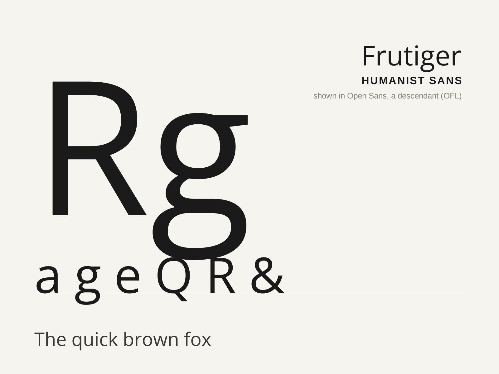
Frutiger
Adrian Frutiger's 1976 humanist sans, drawn for the signage of Charles de Gaulle Airport — engineered for instant legibility at speed and distance, and the model for a generation of wayfinding type.
- Exceptionally open apertures on c, e, a, s
- Clearly varied letter widths for character distinction
- Generous x-height with subtly flared terminals
- Slight stroke modulation, humanist not monoline
- Curved, splayed R leg and pointed A apex
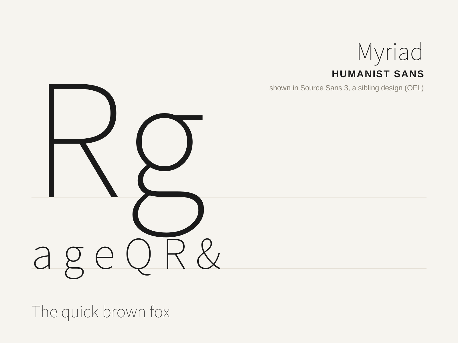
Myriad
Robert Slimbach and Carol Twombly's 1992 humanist sans for Adobe — a clean, warm, highly adaptable face best known as Apple's corporate typeface from 2002 to 2015.
- Humanist proportions with varied letter widths
- Open apertures and a distinctive slanted-tail y
- Generous x-height with gentle stroke modulation
- Clean, neutral-leaning contemporary forms
- Splayed-leg R and pointed A apex
At a glance
| Frutiger | Myriad | |
|---|---|---|
| Era | 1976 | 1992 |
| Discipline | Typography | Typography |
| Region | France, Switzerland | United States |
| Family | Sans-serif | Sans-serif |
| Formal traits | humanist, open-aperture, high-x-height, legibility-optimized | humanist, open-aperture, high-x-height, modest-contrast |
More comparisons
Advertisement