Frutiger vs Verdana
Verdana was influenced by Frutiger.
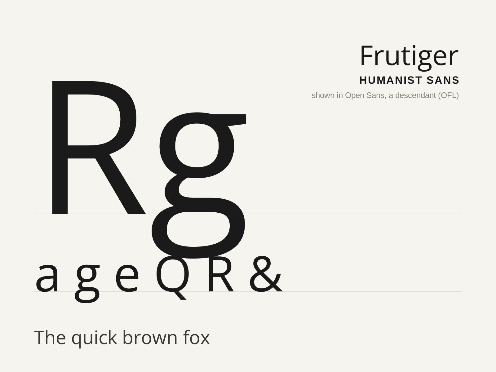
Frutiger
Adrian Frutiger's 1976 humanist sans, drawn for the signage of Charles de Gaulle Airport — engineered for instant legibility at speed and distance, and the model for a generation of wayfinding type.
- Exceptionally open apertures on c, e, a, s
- Clearly varied letter widths for character distinction
- Generous x-height with subtly flared terminals
- Slight stroke modulation, humanist not monoline
- Curved, splayed R leg and pointed A apex
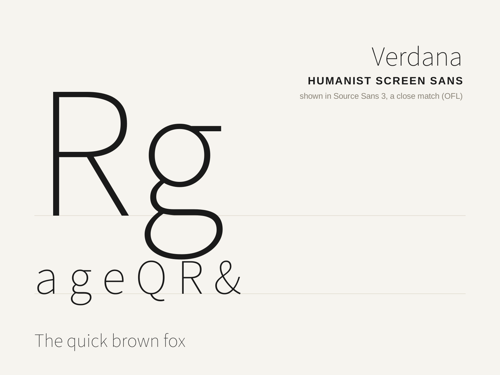
Verdana
Matthew Carter's 1996 humanist sans, engineered pixel-by-pixel for Microsoft to stay legible at tiny sizes on low-resolution screens — generously wide, loosely spaced, and built for the early Web.
- Generously wide proportions and loose spacing
- Very high x-height for small-size legibility
- Open apertures and unambiguous, distinct characters
- Humanist modulation tuned to the pixel grid
- Clearly differentiated I, l, 1 to avoid confusion
At a glance
| Frutiger | Verdana | |
|---|---|---|
| Era | 1976 | 1996 |
| Discipline | Typography | Typography |
| Region | France, Switzerland | United States, United Kingdom |
| Family | Sans-serif | Sans-serif |
| Formal traits | humanist, open-aperture, high-x-height, legibility-optimized | humanist, high-x-height, screen-optimized, open-aperture |
More comparisons
Advertisement