Frutiger vs Frutiger Aero
Frutiger Aero is the cross-discipline counterpart of Frutiger — named for the humanist Frutiger type that defined its clean interfaces.
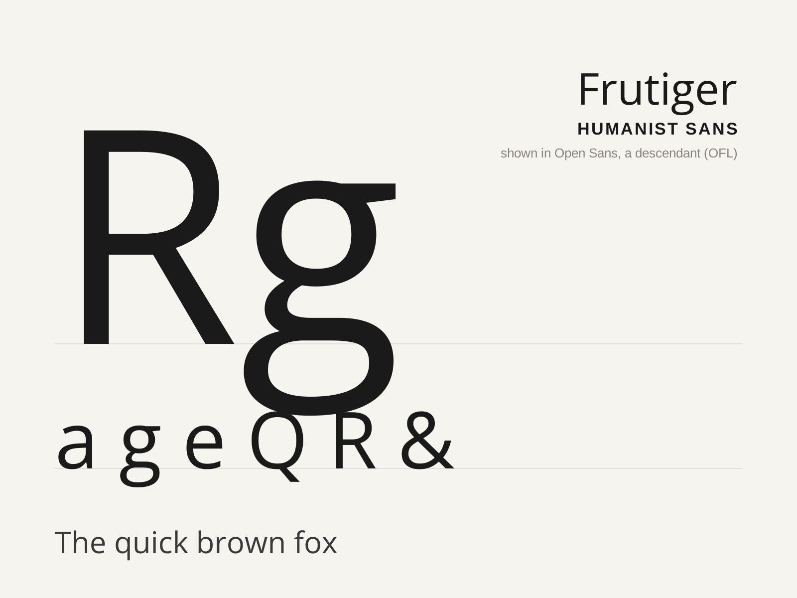
Frutiger
Adrian Frutiger's 1976 humanist sans, drawn for the signage of Charles de Gaulle Airport — engineered for instant legibility at speed and distance, and the model for a generation of wayfinding type.
- Exceptionally open apertures on c, e, a, s
- Clearly varied letter widths for character distinction
- Generous x-height with subtly flared terminals
- Slight stroke modulation, humanist not monoline
- Curved, splayed R leg and pointed A apex

Frutiger Aero
The glossy, optimistic techno-naturalism of the mid-2000s—water droplets, bubbles, lush green grass, blue skies, and clean Frutiger type over a backdrop of Windows Vista-era sheen.
- Glossy skeuomorphic glass and gel surfaces
- Nature motifs: water droplets, bubbles, grass, skies
- Clean humanist Frutiger/Myriad typography
- Auras, lens flares, and shiny highlights
- Optimistic tech-meets-nature imagery
At a glance
| Frutiger | Frutiger Aero | |
|---|---|---|
| Era | 1976 | 2004–2013 |
| Discipline | Typography | Graphic Design |
| Region | France, Switzerland | Global |
| Family | Sans-serif | UI/Interface, Vernacular/Pop |
| Formal traits | humanist, open-aperture, high-x-height, legibility-optimized | glossy, skeuomorphic, nature-motif, clean-type |
More comparisons
Advertisement