Garamond vs Minion
Minion was influenced by Garamond — draws on sixteenth-century French old-style models.
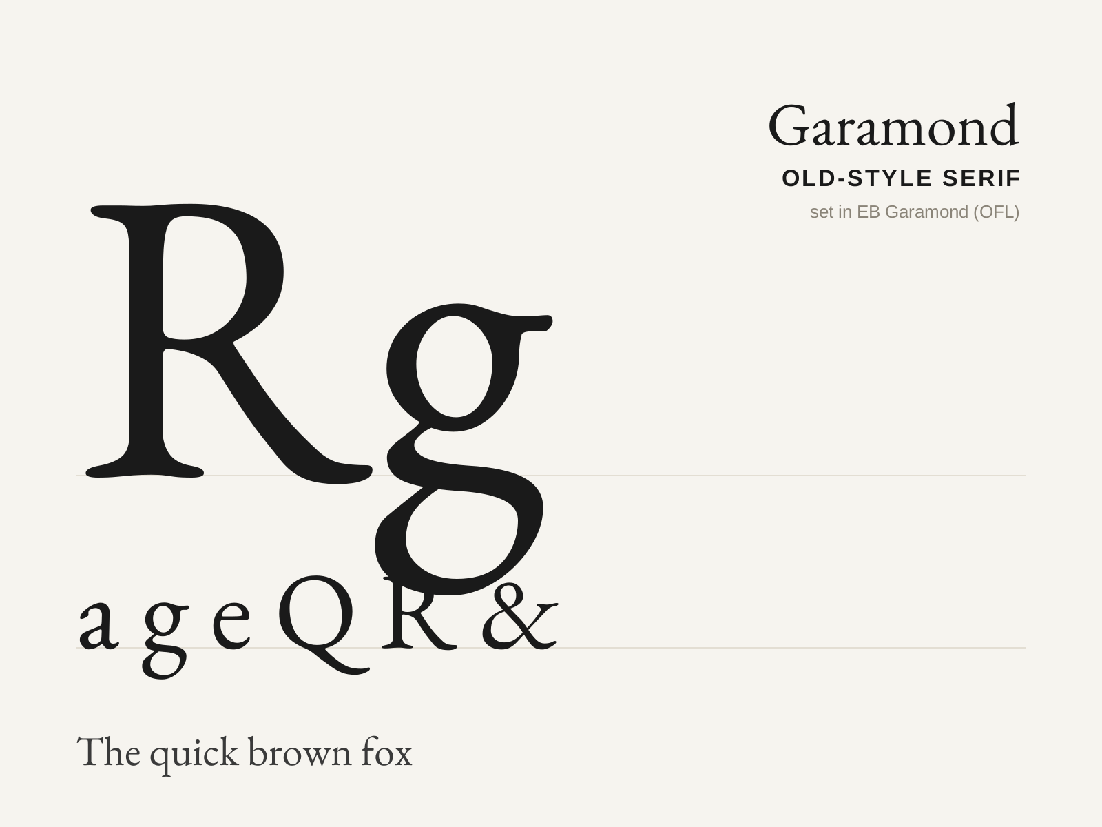
Garamond
Claude Garamond's sixteenth-century French old-style — the most refined Garalde of all and arguably the most enduring book type in the Latin alphabet. Pen-warm, even-colored, and effortlessly readable.
- Moderate, gently modulated stroke contrast
- Inclined (oblique) axis of stress
- Elegantly bracketed serifs, slanted on the ascenders
- Small x-height with graceful, long ascenders
- Small eye in the lowercase 'e', open apertures

Minion
Robert Slimbach's 1990 digital old-style serif for Adobe — a clean, neutral Renaissance-inspired text face engineered for the page and screen, and a default workhorse of professional publishing.
- Old-style serif structure with moderate contrast
- Gently bracketed serifs of even, restrained cut
- Angled humanist stress inherited from the pen
- Balanced, neutral proportions tuned for clean body text
- Optical size masters from caption to display
At a glance
| Garamond | Minion | |
|---|---|---|
| Era | 1530s–1540s | 1990 |
| Discipline | Typography | Typography |
| Region | France, Paris | United States |
| Family | Serif | Old-style Serif, Humanist Serif |
| Formal traits | old-style, bracketed-serif, oblique-stress, moderate-contrast | old-style, bracketed-serif, moderate-contrast, neutral |
More comparisons
Advertisement