Grotesque Sans-serif vs Impact
Impact was influenced by Grotesque Sans-serif.
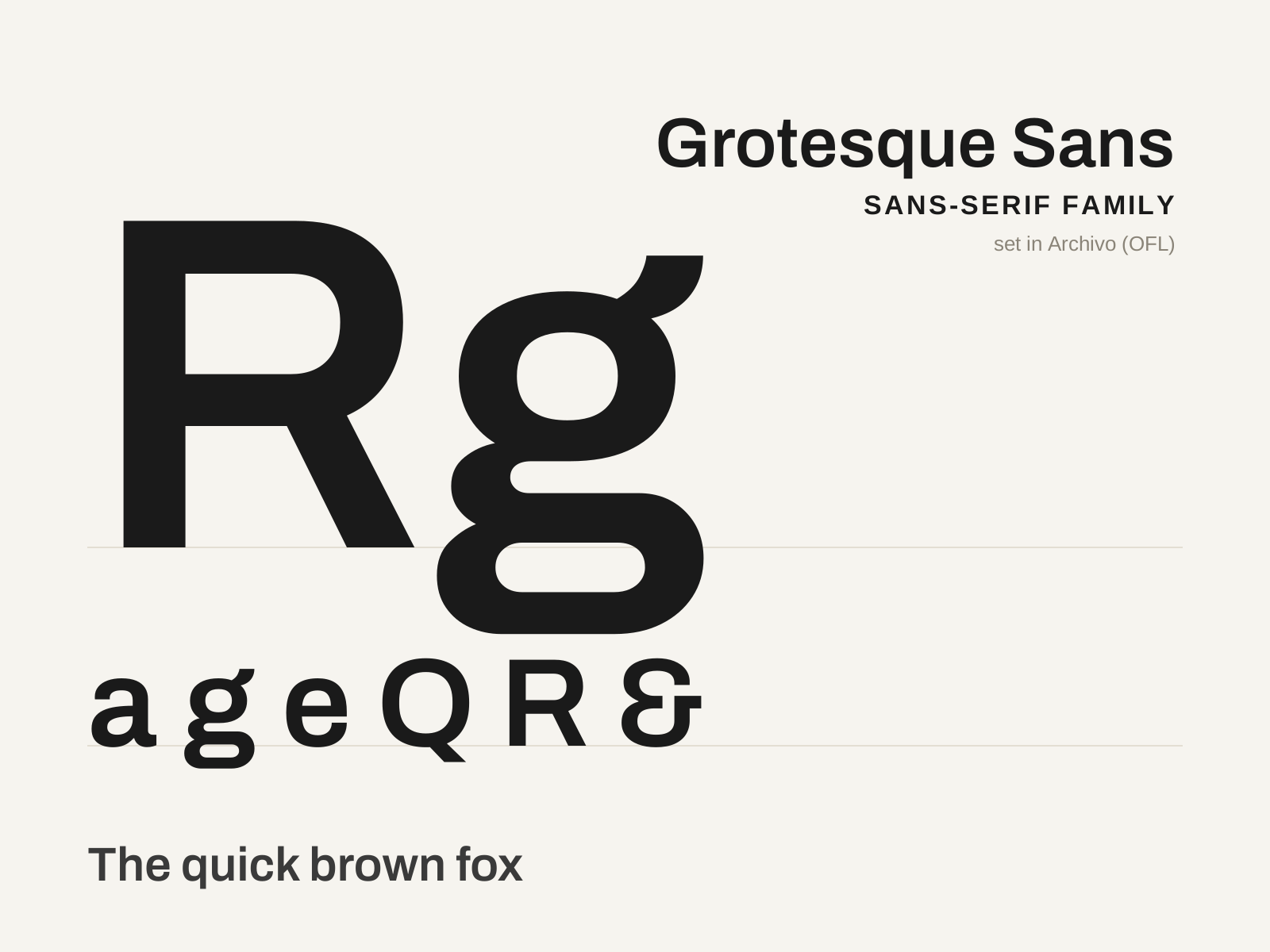
Grotesque Sans-serif
The first family of sans-serif type — the blunt, slightly irregular nineteenth-century 'grotesques' that gave Victorian advertising its loud display voice. Sturdy and a touch awkward, they are the ancestral stock from which every later sans descends.
- Low but perceptible stroke contrast, not fully monoline
- Squared-off, slightly compressed curves
- Modest, often closed aperture on c, e, a, s
- Capitals of visibly uneven width and a slight irregularity
- Spurred capital G, frequently with a double-story g
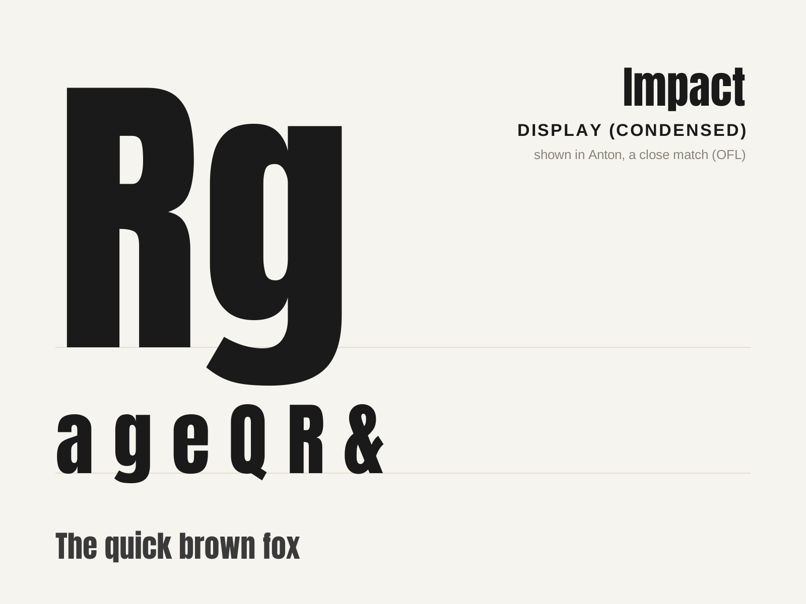
Impact
A heavy, extremely condensed sans-serif from 1965, engineered to cram maximum black weight into minimum width for headlines that shout. The internet's default meme caption font.
- Extremely condensed, narrow letter proportions
- Heavy, near-uniform stroke weight
- Very tight letterspacing creating dense blocks
- Minimal internal counters
- Squared, no-nonsense sans-serif terminals
At a glance
| Grotesque Sans-serif | Impact | |
|---|---|---|
| Era | 1810s–1900s | 1965–present |
| Discipline | Typography | Typography |
| Region | England, Germany, United States | United Kingdom, Global |
| Family | Sans-serif | Display |
| Formal traits | grotesque, low-contrast, closed-aperture, double-story-g | condensed, heavy-weight, sans-serif, display |
More comparisons
Advertisement