Grotesque Sans-serif vs Neo-grotesque Sans-serif
Neo-grotesque Sans-serif evolved from Grotesque Sans-serif — the mid-century rationalization of the Victorian grotesque.
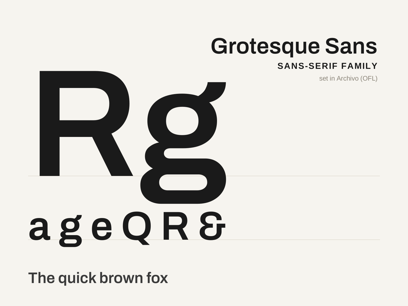
Grotesque Sans-serif
The first family of sans-serif type — the blunt, slightly irregular nineteenth-century 'grotesques' that gave Victorian advertising its loud display voice. Sturdy and a touch awkward, they are the ancestral stock from which every later sans descends.
- Low but perceptible stroke contrast, not fully monoline
- Squared-off, slightly compressed curves
- Modest, often closed aperture on c, e, a, s
- Capitals of visibly uneven width and a slight irregularity
- Spurred capital G, frequently with a double-story g
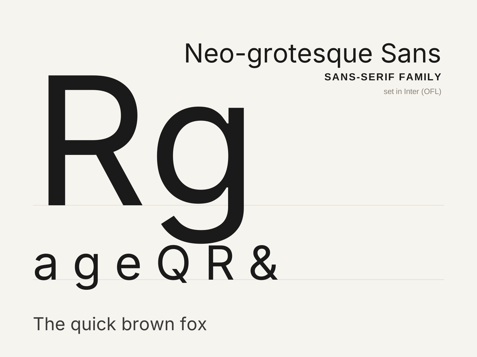
Neo-grotesque Sans-serif
The mid-century rationalization of the grotesque — the neutral, even, tightly fitted sans of Swiss modernism, engineered to disappear so the message could speak. Helvetica and Univers are its archetypes.
- Even, near-monoline strokes with minimal contrast
- High x-height with tight, even spacing
- Terminals sheared on strict horizontals and verticals
- Closed aperture and studied neutrality
- Curved, tucked R leg and gently squared bowls
At a glance
| Grotesque Sans-serif | Neo-grotesque Sans-serif | |
|---|---|---|
| Era | 1810s–1900s | 1950s–1960s |
| Discipline | Typography | Typography |
| Region | England, Germany, United States | Switzerland, Germany, France |
| Family | Sans-serif | Sans-serif |
| Formal traits | grotesque, low-contrast, closed-aperture, double-story-g | neo-grotesque, monoline, neutral, high-x-height |
More comparisons
Advertisement