Pop Art Graphic Design vs Streetwear Graphics
Streetwear Graphics was influenced by Pop Art Graphic Design.
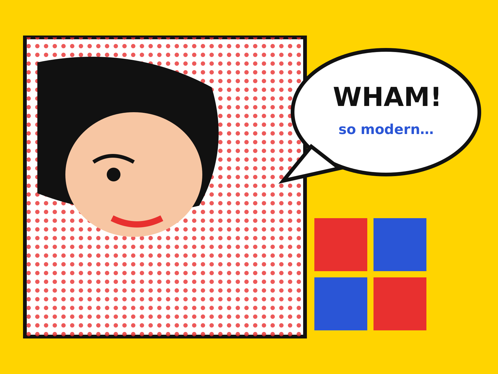
Pop Art Graphic Design
Commercial and mass-media imagery elevated to art: soup cans, comic panels, and movie stars in flat, bold color and mechanical Ben-Day dots. Brash, ironic, and unmistakably of the consumer age.
- Mechanical Ben-Day / halftone dot patterns
- Flat hard-edged areas of bold color
- Heavy black comic-style outlines
- Appropriated consumer and celebrity imagery
- Silkscreen repetition and grid arrangements

Streetwear Graphics
The bold wordmarks, box logos, and parody appropriation of streetwear—where a red rectangle, a borrowed font, and drop-culture scarcity become design language.
- Bold wordmarks in heavy sans-serif type
- Box-logo lockups (text in a colored rectangle)
- Parody and bootleg logo appropriation
- Limited 'drop' scarcity and collaboration
- Minimal, high-impact brand graphics
At a glance
| Pop Art Graphic Design | Streetwear Graphics | |
|---|---|---|
| Era | 1950s–1970s | 1990s–present |
| Discipline | Graphic Design | Graphic Design |
| Region | United States, United Kingdom | United States, Japan, Global |
| Family | Pop | Vernacular/Pop, DIY/Subculture |
| Formal traits | ben-day-dots, flat-color, bold-outline, repetition | bold-wordmark, box-logo, appropriation, minimal |
More comparisons
Advertisement