Punk Graphic Design vs Swiss Style
Punk Graphic Design arose as a reaction against Swiss Style — an anti-professional revolt against slick corporate modernism.
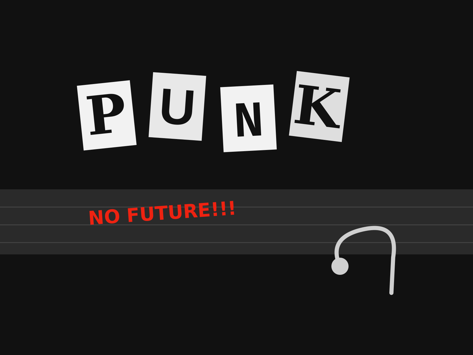
Punk Graphic Design
The aggressive do-it-yourself aesthetic of punk, built from ransom-note lettering, photocopied collage, torn paper, and a deliberate rejection of professional polish.
- Ransom-note lettering cut from newspapers and magazines
- High-contrast photocopied (Xerox) texture and grain
- Torn paper edges and visible glue-and-scissors collage
- Hand-scrawled marker text and defaced imagery
- Deliberately crude, anti-professional layouts
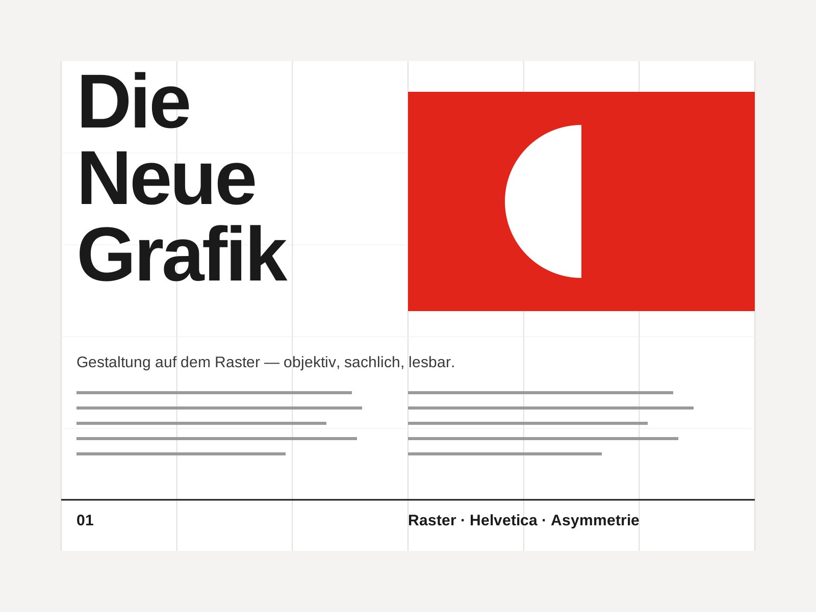
Swiss Style
The mid-century gospel of objective design — mathematical grids, flush-left ragged-right sans-serif type (Helvetica, Akzidenz-Grotesk), generous white space, and photography in place of illustration.
- Mathematical modular grid underlying every element
- Neo-grotesque sans-serif type (Helvetica, Akzidenz-Grotesk)
- Flush-left, ragged-right text setting
- Asymmetric layout balanced by generous white space
- Objective photography instead of illustration
At a glance
| Punk Graphic Design | Swiss Style | |
|---|---|---|
| Era | c. 1976–1984 | 1950s–1970s |
| Discipline | Graphic Design | Graphic Design |
| Region | United Kingdom, United States | Switzerland, Germany, International |
| Family | Vernacular/Pop, DIY/Subculture | Modernist, International |
| Formal traits | cut-and-paste, ransom-note, photocopy, high-contrast | grid-based, sans-serif, asymmetric, minimal |
More comparisons
Advertisement