Grunge Graphic Design vs Punk Graphic Design
Grunge Graphic Design was influenced by Punk Graphic Design — inherited punk's distressed, anti-professional, cut-up energy.
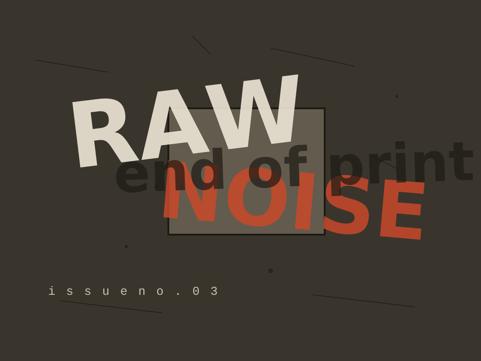
Grunge Graphic Design
The deconstructed, anti-legible typography of the 1990s, where text was layered, distressed, and shattered into texture in defiance of every readability rule.
- Layered, overlapping type pushed to near-illegibility
- Scanned grime, distressed textures, and photocopied dirt
- Shattered or abandoned grids and chaotic composition
- Torn, fragmented letterforms that bleed and overlap
- Expressive, intuitive layout over readability
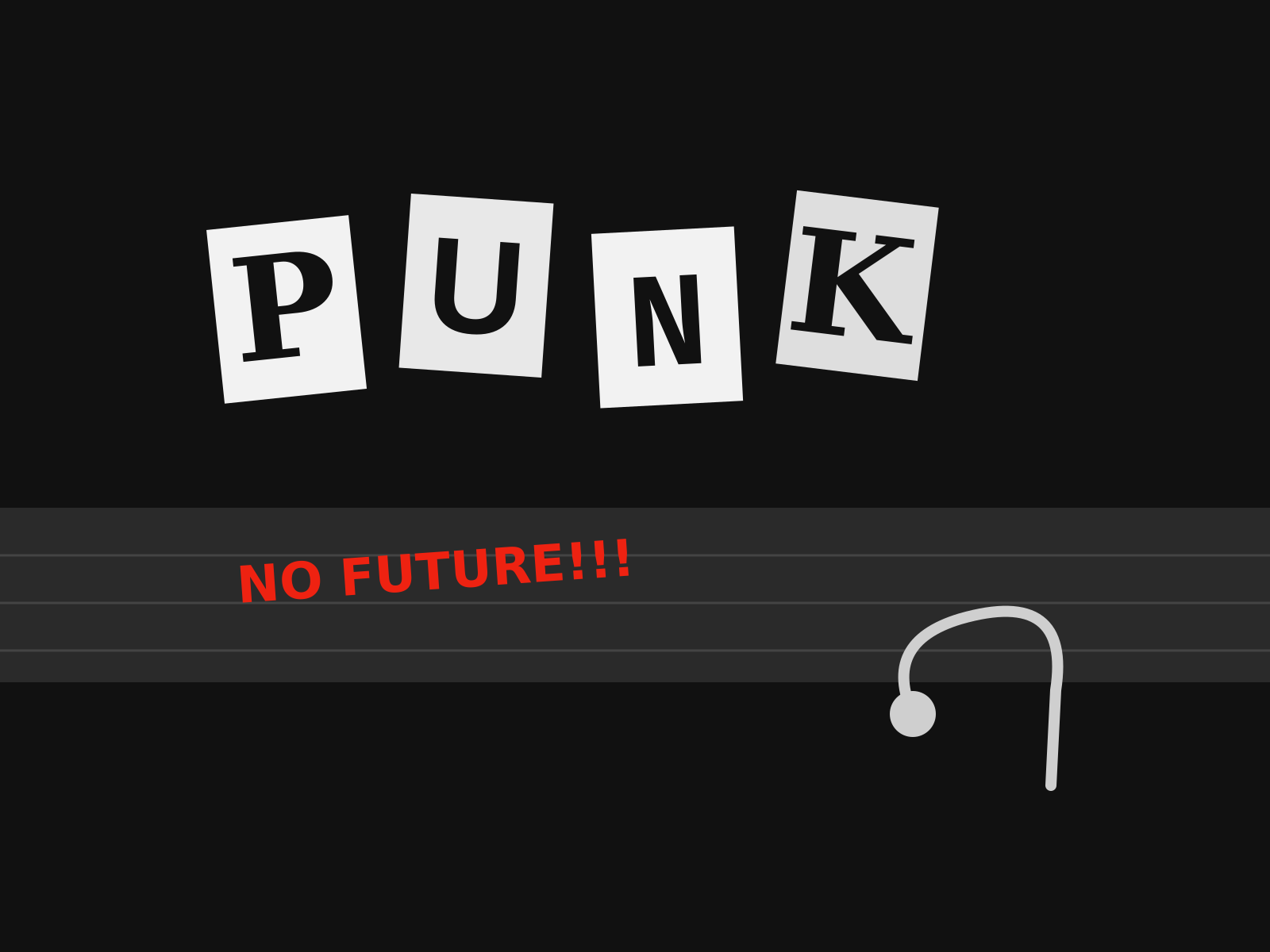
Punk Graphic Design
The aggressive do-it-yourself aesthetic of punk, built from ransom-note lettering, photocopied collage, torn paper, and a deliberate rejection of professional polish.
- Ransom-note lettering cut from newspapers and magazines
- High-contrast photocopied (Xerox) texture and grain
- Torn paper edges and visible glue-and-scissors collage
- Hand-scrawled marker text and defaced imagery
- Deliberately crude, anti-professional layouts
At a glance
| Grunge Graphic Design | Punk Graphic Design | |
|---|---|---|
| Era | c. 1990–1999 | c. 1976–1984 |
| Discipline | Graphic Design | Graphic Design |
| Region | United States, United Kingdom | United Kingdom, United States |
| Family | Postmodern, Digital | Vernacular/Pop, DIY/Subculture |
| Formal traits | distressed, layered, grid-breaking, anti-legible | cut-and-paste, ransom-note, photocopy, high-contrast |
More comparisons
Advertisement