Punk Graphic Design vs Trash Polka
Trash Polka is the cross-discipline counterpart of Punk Graphic Design — raw collage, smears, and torn-type chaos.
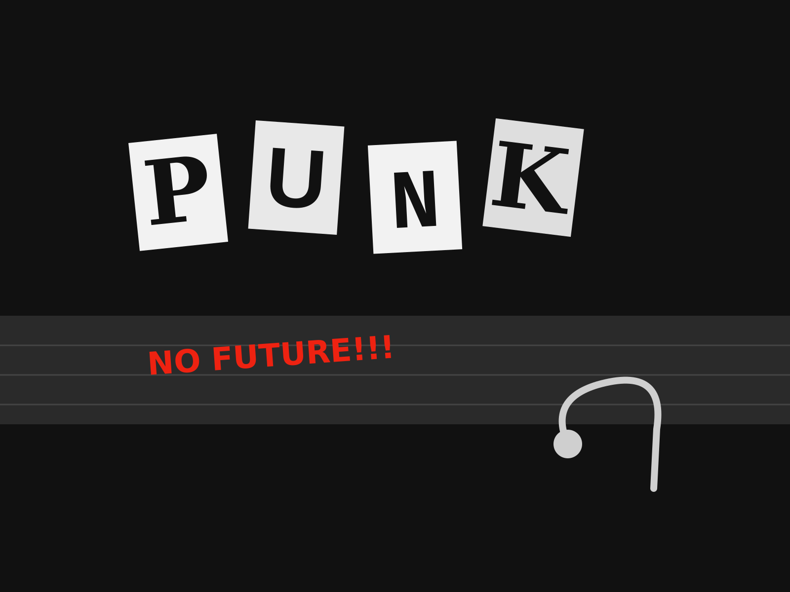
Punk Graphic Design
The aggressive do-it-yourself aesthetic of punk, built from ransom-note lettering, photocopied collage, torn paper, and a deliberate rejection of professional polish.
- Ransom-note lettering cut from newspapers and magazines
- High-contrast photocopied (Xerox) texture and grain
- Torn paper edges and visible glue-and-scissors collage
- Hand-scrawled marker text and defaced imagery
- Deliberately crude, anti-professional layouts

Trash Polka
A bold red-black-white collage style mixing photorealistic imagery with brush smears, typography, and graphic shapes.
- Strict red, black, and skin palette
- Photorealism mixed with abstraction
- Brush smears and ink splatter
- Collage of type and geometry
- Sharp graphic bars and shapes
At a glance
| Punk Graphic Design | Trash Polka | |
|---|---|---|
| Era | c. 1976–1984 | 2000s–present |
| Discipline | Graphic Design | Tattoo |
| Region | United Kingdom, United States | Germany, Würzburg |
| Family | Vernacular/Pop, DIY/Subculture | Illustrative, Realism |
| Formal traits | cut-and-paste, ransom-note, photocopy, high-contrast | red and black, collage, high contrast, abstract |
More comparisons
Advertisement