c.1945–1960 · France
Lettrism
Also known as Lettrisme, Isou's Lettrist movement, hypergraphics
Isidore Isou's postwar French avant-garde that reduced art to the letter itself, filling pages with invented signs, glyphs, and 'hypergraphic' fields of pure notation.
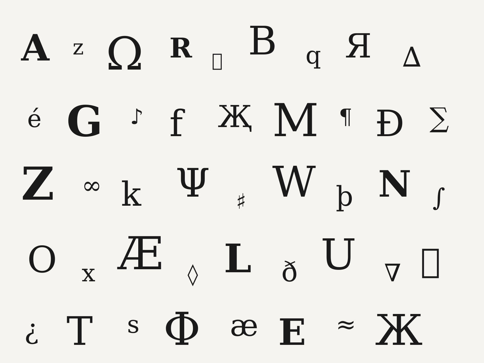
Original specimen, not a historical artifactOriginal specimen in the Lettrism style. Owned; source: Design Style Book (original).
About the style
Lettrism is the avant-garde founded in Paris in 1945 by Isidore Isou, which proposed that art should be rebuilt from its smallest unit—the letter, or more broadly any sign. In poetry this meant compositions of phonemes and invented sounds; on the page it produced 'hypergraphics', dense fields combining alphabets, pictograms, mathematical marks, musical notation, and freshly invented glyphs into a single expanded writing system. Lettrist works dissolve the boundary between text and image: canvases, posters, and books teem with hand-drawn signs arranged for visual rhythm rather than legible meaning, often in stark black ink on white. The movement fed directly into later experiments with concrete poetry and the Situationist International (several members crossed over), and its insistence on the autonomous, image-like letter prefigured much later typographic and asemic-writing art.
Notable examples
- ▸Isidore Isou, Introduction à une nouvelle poésie et à une nouvelle musique (1947)
- ▸Gabriel Pomerand, Saint Ghetto des Prêts (1950)
- ▸Maurice Lemaître, hypergraphic novels and posters (1950s)
Anatomy of Lettrism
The numbered markers call out the design elements that define this style. Hover or tap a marker to see its breakdown.
Original specimen, not a historical artifactOriginal specimen in the Lettrism style. Owned; source: Design Style Book (original).
The whole surface is packed edge to edge with mixed signs, valued as visual rhythm rather than a sentence to be read.
Freshly designed marks sit beside real letters, expanding writing into a private alphabet with no fixed meaning.
Mathematical symbols, musical staves, and pictograms intermingle, asserting that any sign is legitimate raw material for art.
Every mark is drawn by hand in stark ink, giving the field a restless, gestural energy distinct from set type.
How Lettrism connects
Styles form a network, not a tree. Explore the direct neighbours below — click any to travel the map one hop at a time.
- Evolved from
- Influenced by
Hover or tap a style to preview it.
Evolved from Dada Graphic Design — pushes Dada's sound poetry to the level of the pure letter and sign
Influenced by Futurist Typography — builds on Futurist parole in libertà
Compare side by side
Describe it like this
Prompt-ready vocabulary for describing or re-creating the Lettrism look. Tap a word to collect it in Designdeas.
Get copy-ready Lettrism AI prompts →