Futurist Typography vs Lettrism
Lettrism was influenced by Futurist Typography — builds on Futurist parole in libertà.

Futurist Typography
The explosive typographic wing of Italian Futurism, in which words were 'set free' — letters of every size, weight, and angle hurled across the page to convey speed, noise, and the dynamism of the machine age.
- Multiple typefaces, sizes, and weights mixed on one page
- Letters set on diagonals, curves, and free trajectories
- Onomatopoeic, pictorial use of words to mimic sound
- Abolition of the centered, justified column
- Dynamic asymmetry expressing speed and noise
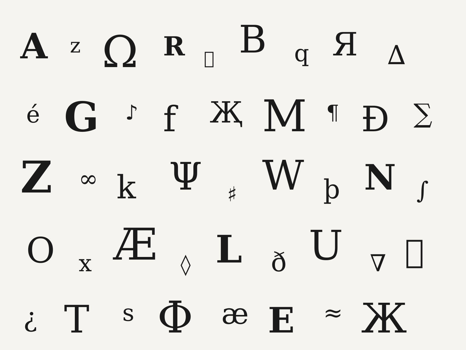
Lettrism
Isidore Isou's postwar French avant-garde that reduced art to the letter itself, filling pages with invented signs, glyphs, and 'hypergraphic' fields of pure notation.
- Reduction of art to the letter and the invented sign
- Hypergraphics combining alphabets, pictograms, and notation
- Dense all-over fields of marks prized for visual rhythm
- Dissolution of the boundary between text and image
- Hand-drawn glyphs, often stark black on white
At a glance
| Futurist Typography | Lettrism | |
|---|---|---|
| Era | 1909–1939 | c.1945–1960 |
| Discipline | Graphic Design | Graphic Design |
| Region | Italy | France |
| Family | Avant-Garde, Modernism | Avant-Garde, Experimental Type |
| Formal traits | asymmetric, diagonal-dynamism, mixed-type, expressive-lettering | sign-based, all-over-field, hand-drawn-glyph, monochrome |
More comparisons
Advertisement