Dada Graphic Design vs Lettrism
Lettrism evolved from Dada Graphic Design — pushes Dada's sound poetry to the level of the pure letter and sign.

Dada Graphic Design
The anarchic, anti-art graphic language of Dada, which invented photomontage and ransom-note typography — slicing apart mass-media photographs and mixed type to mock a civilization that had marched into world war.
- Photomontage from cut-up press photographs and headlines
- Ransom-note typography mixing clashing fonts and sizes
- Chance-based, deliberately disordered composition
- Satirical, anti-establishment content
- Mechanomorphic drawing and mass-media collage
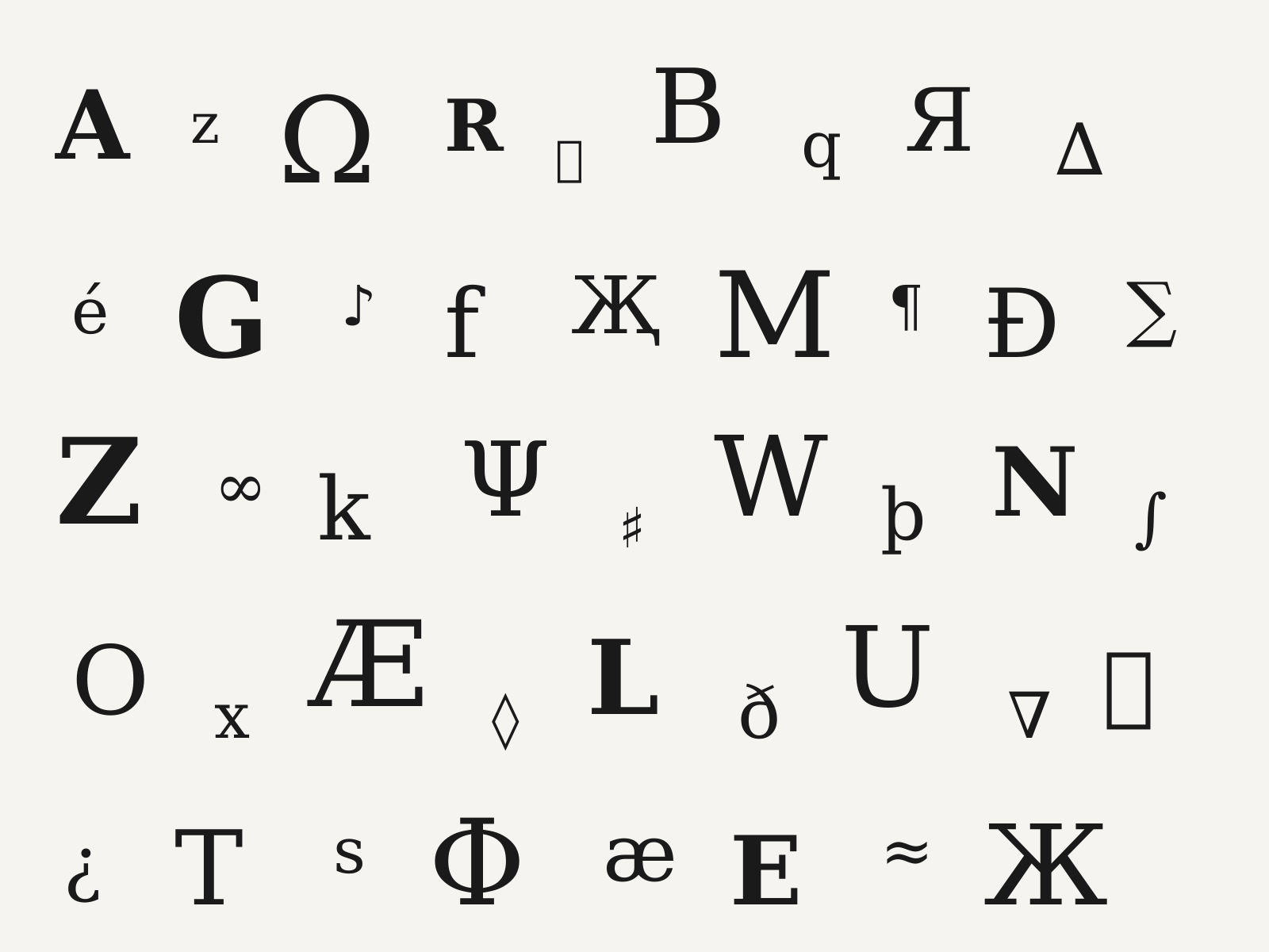
Lettrism
Isidore Isou's postwar French avant-garde that reduced art to the letter itself, filling pages with invented signs, glyphs, and 'hypergraphic' fields of pure notation.
- Reduction of art to the letter and the invented sign
- Hypergraphics combining alphabets, pictograms, and notation
- Dense all-over fields of marks prized for visual rhythm
- Dissolution of the boundary between text and image
- Hand-drawn glyphs, often stark black on white
At a glance
| Dada Graphic Design | Lettrism | |
|---|---|---|
| Era | 1916–1924 | c.1945–1960 |
| Discipline | Graphic Design | Graphic Design |
| Region | Switzerland, Germany, France | France |
| Family | Avant-Garde, Modernism | Avant-Garde, Experimental Type |
| Formal traits | photomontage, collage, mixed-type, anti-compositional | sign-based, all-over-field, hand-drawn-glyph, monochrome |
More comparisons
Advertisement