Arial vs Helvetica
Arial evolved from Helvetica — the metric-compatible substitute that occupies Helvetica's exact widths.
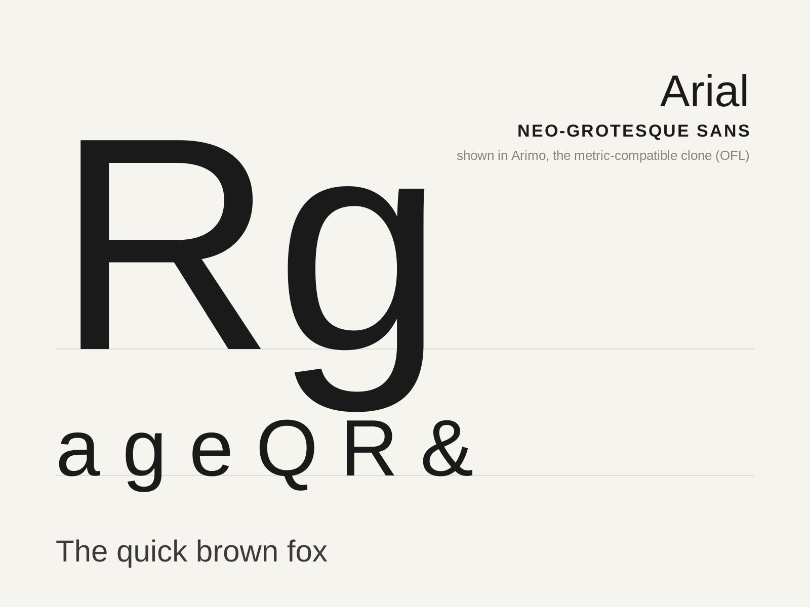
Arial
Monotype's 1982 metric-compatible substitute for Helvetica — drawn to occupy the exact same widths so it could swap in without reflowing text, and shipped on every Windows PC since. A neo-grotesque defined by what it imitates.
- Metric-compatible with Helvetica — identical character widths
- Stroke terminals cut on a slight angle, not strict horizontal/vertical
- Capital R with a straighter, splayed leg
- Capital G without a spur
- High x-height and closed aperture in the neo-grotesque mold
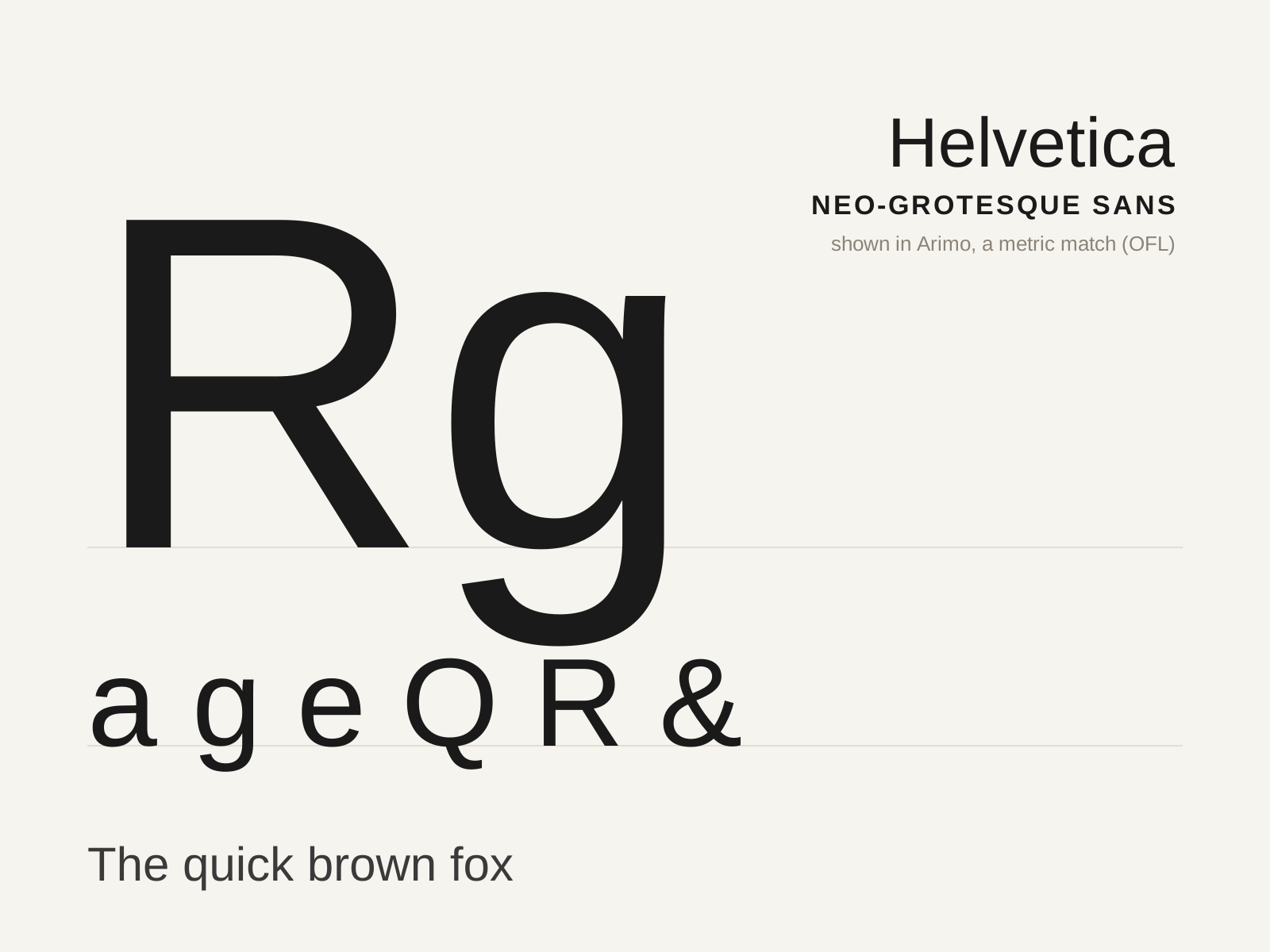
Helvetica
The defining neo-grotesque sans — Max Miedinger and Eduard Hoffmann's 1957 face engineered for neutral, even, almost invisible text, and the typographic voice of postwar corporate modernism.
- Even, monoline strokes with minimal contrast
- High x-height and tight, fitted spacing
- Horizontally/vertically sheared stroke terminals
- Curved, tucked tail on the capital R
- Studied neutrality — no expressive 'voice'
At a glance
| Arial | Helvetica | |
|---|---|---|
| Era | 1982 | 1957 |
| Discipline | Typography | Typography |
| Region | United Kingdom, United States | Switzerland |
| Family | Sans-serif | Sans-serif |
| Formal traits | neo-grotesque, monoline, helvetica-substitute, high-x-height | neo-grotesque, monoline, neutral, high-x-height |
More comparisons
Advertisement