Helvetica vs Swiss Style
Helvetica is the cross-discipline counterpart of Swiss Style — the literal voice of the Swiss style.
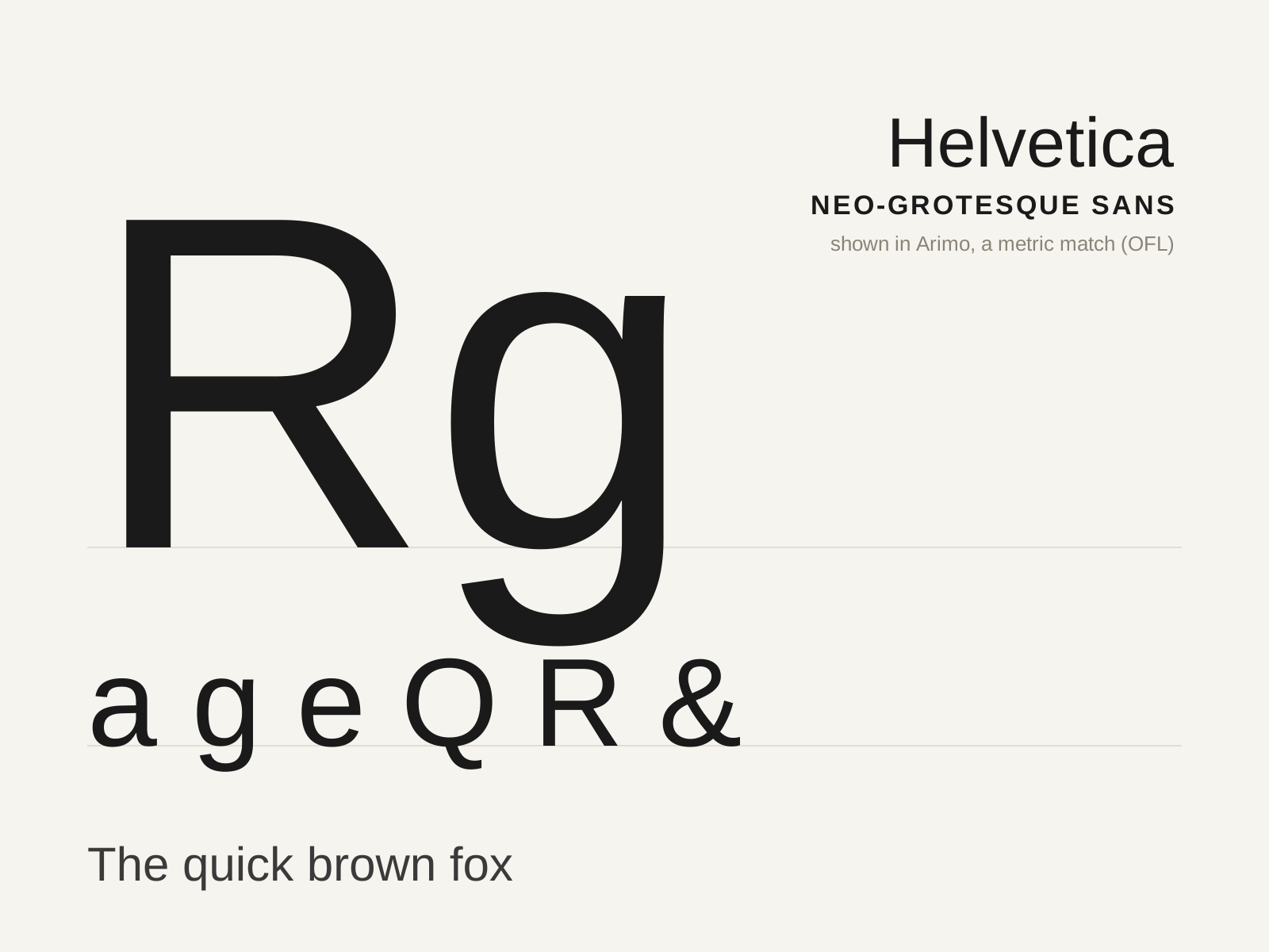
Helvetica
The defining neo-grotesque sans — Max Miedinger and Eduard Hoffmann's 1957 face engineered for neutral, even, almost invisible text, and the typographic voice of postwar corporate modernism.
- Even, monoline strokes with minimal contrast
- High x-height and tight, fitted spacing
- Horizontally/vertically sheared stroke terminals
- Curved, tucked tail on the capital R
- Studied neutrality — no expressive 'voice'
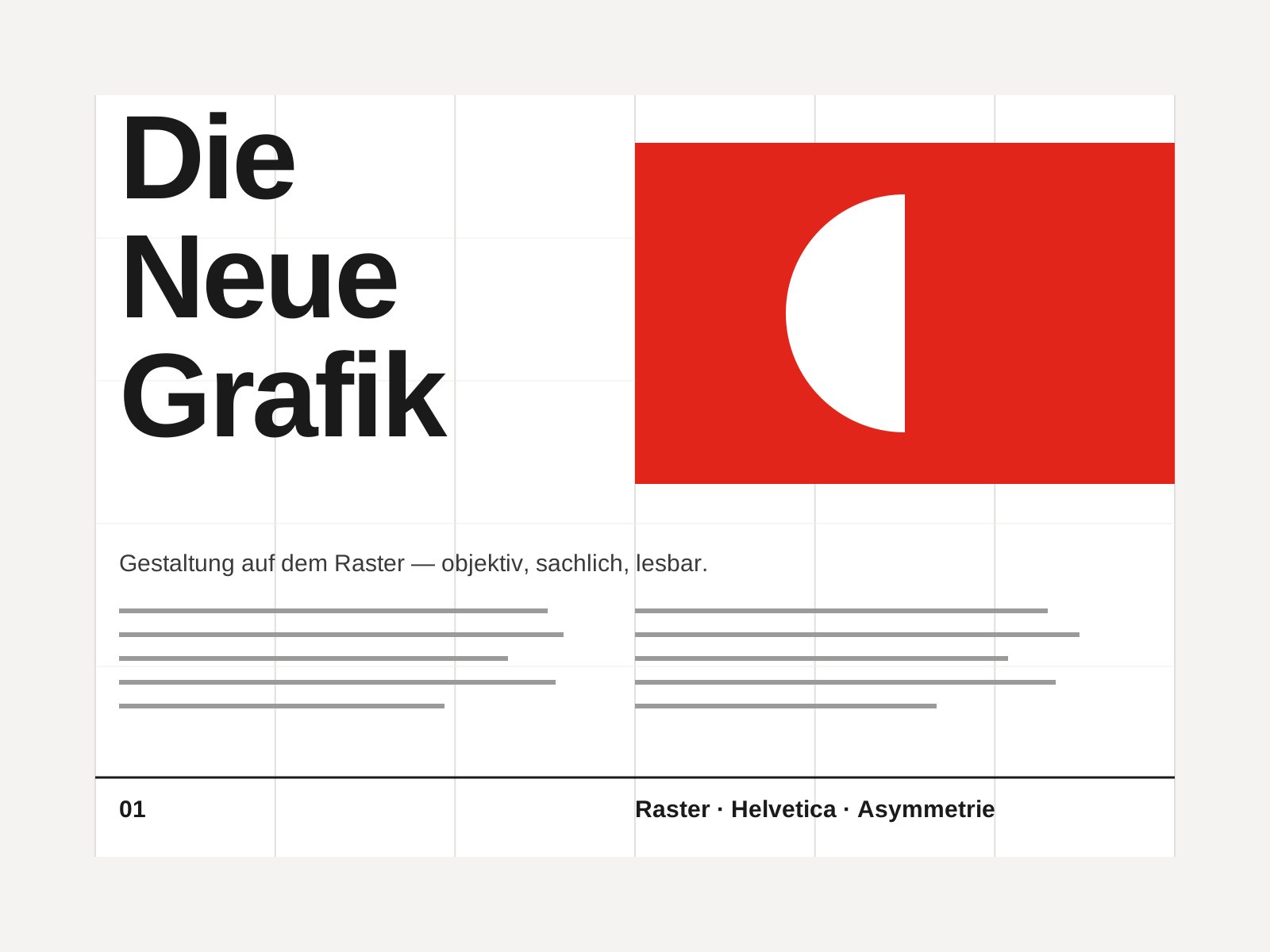
Swiss Style
The mid-century gospel of objective design — mathematical grids, flush-left ragged-right sans-serif type (Helvetica, Akzidenz-Grotesk), generous white space, and photography in place of illustration.
- Mathematical modular grid underlying every element
- Neo-grotesque sans-serif type (Helvetica, Akzidenz-Grotesk)
- Flush-left, ragged-right text setting
- Asymmetric layout balanced by generous white space
- Objective photography instead of illustration
At a glance
| Helvetica | Swiss Style | |
|---|---|---|
| Era | 1957 | 1950s–1970s |
| Discipline | Typography | Graphic Design |
| Region | Switzerland | Switzerland, Germany, International |
| Family | Sans-serif | Modernist, International |
| Formal traits | neo-grotesque, monoline, neutral, high-x-height | grid-based, sans-serif, asymmetric, minimal |
More comparisons
Advertisement