Futura vs Garalde (Old-style)
Futura arose as a reaction against Garalde (Old-style) — geometric construction set against the pen-formed serif.
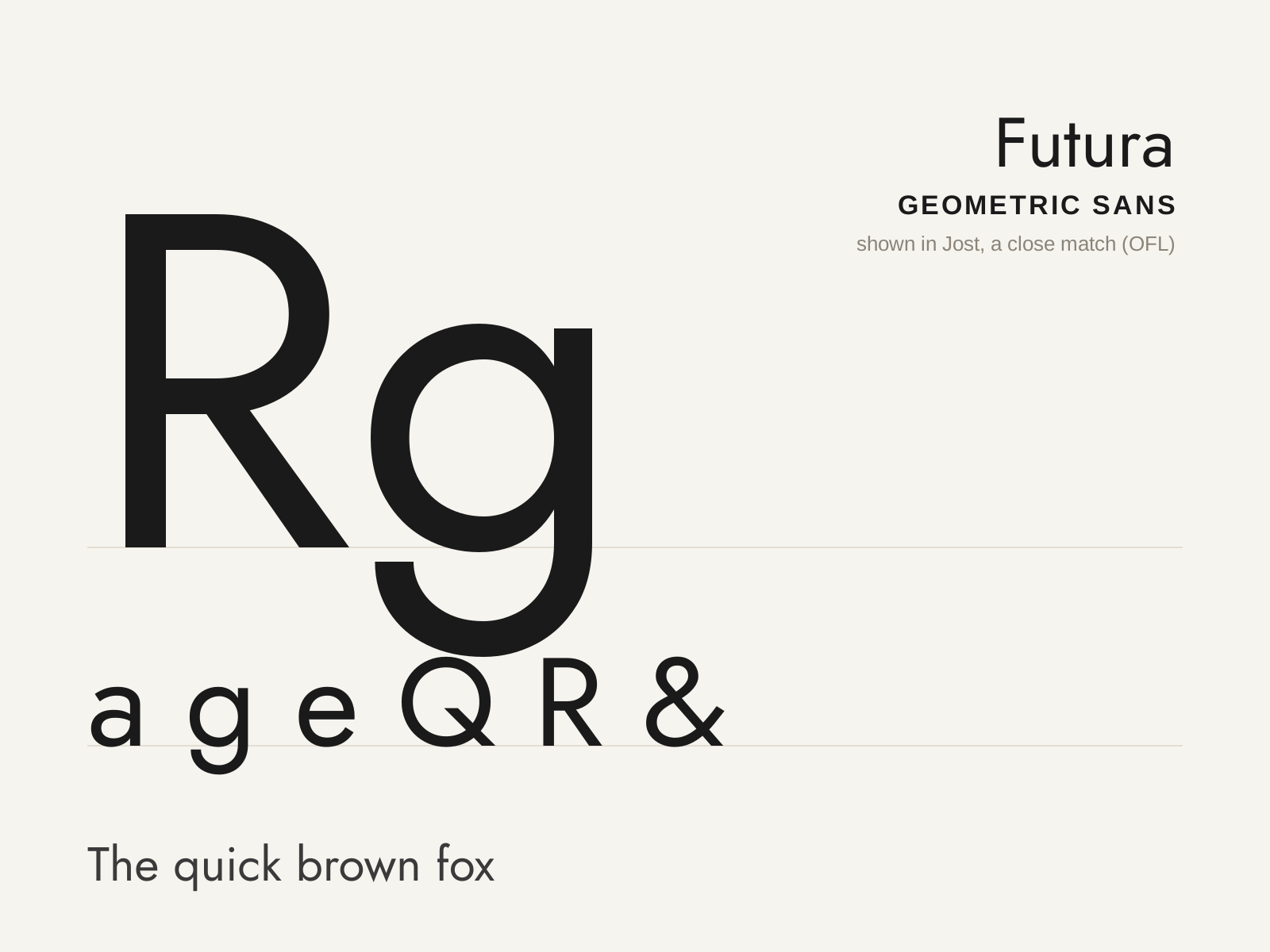
Futura
Paul Renner's 1927 geometric sans — letterforms built from near-perfect circles, triangles, and straight lines, the Bauhaus ideal of rational, modern type made commercial.
- Letterforms built from circles, triangles, and lines
- Near-perfect circular bowls (o, b, d, p, q)
- Single-story a and a simple, open-tailed g
- Sharply pointed apexes on A, M, N, V, W
- Long ascenders rising above the cap height
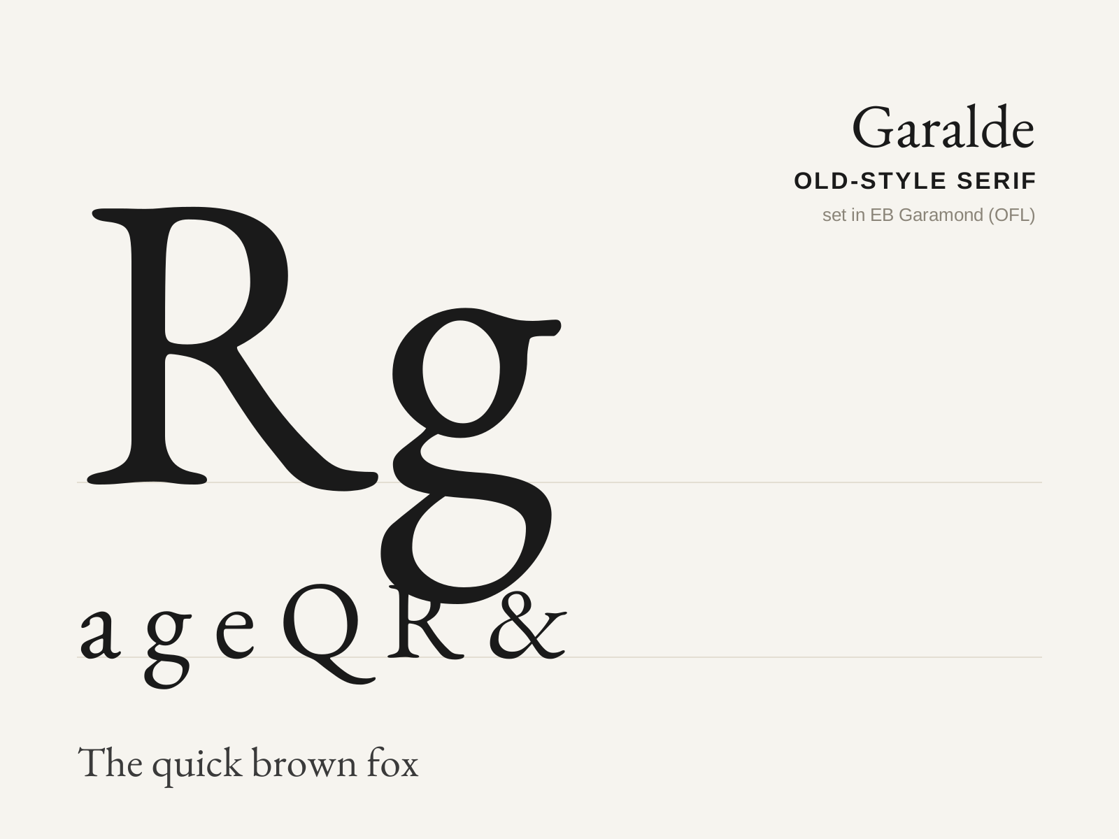
Garalde (Old-style)
The classic old-style serif — humanist roots refined by Aldus Manutius and the French punchcutters, with moderate stroke contrast, bracketed serifs, and an inclined stress that recalls the broad-nib pen.
- Moderate contrast between thick and thin strokes
- Fully bracketed serifs flowing into the stems
- Angled (oblique) stress, from the broad-nib pen
- Slanted, pen-formed serifs on the ascenders
- Even, warm text color tuned for long reading
At a glance
| Futura | Garalde (Old-style) | |
|---|---|---|
| Era | 1927 | 1490s–1700s |
| Discipline | Typography | Typography |
| Region | Germany | Italy, France |
| Family | Sans-serif | Serif |
| Formal traits | geometric, monoline, low-contrast, pointed-apex | old-style, bracketed-serif, moderate-contrast, calligraphic |
More comparisons
Advertisement