Blue Note Jazz Album Art vs Modernist Magazine Art Direction
Blue Note Jazz Album Art was influenced by Modernist Magazine Art Direction.
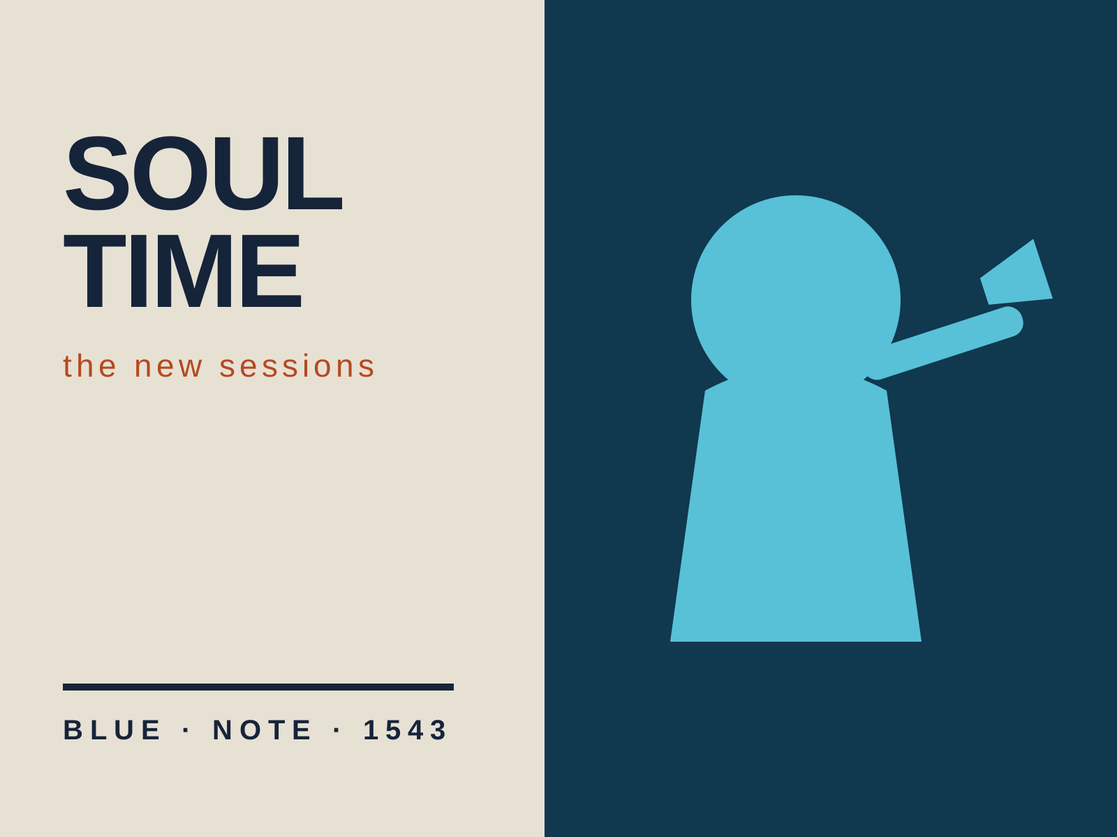
Blue Note Jazz Album Art
The cool, modern look of Blue Note jazz LP sleeves: duotone photographs, tightly cropped, set against bold sans-serif type and confident asymmetry. Restrained, sophisticated design that looked as modern as the music sounded.
- Duotone or single-tinted studio photography
- Bold modernist sans-serif typography
- Asymmetric layout with generous negative space
- Dramatic, tight photographic cropping
- Restricted two- or three-color palettes

Modernist Magazine Art Direction
Dynamic magazine art direction built on bold photography, expressive typography, and confident white space. Cinematic spreads that treat the page-turn as choreography rather than mere layout.
- Spread conceived as a cinematic, choreographed unit
- Bold, often full-bleed photography
- Generous, active white space
- Expressive, asymmetric typographic layout
- Dramatic scale contrast and cropping
At a glance
| Blue Note Jazz Album Art | Modernist Magazine Art Direction | |
|---|---|---|
| Era | 1950s–1960s | 1930s–1960s |
| Discipline | Graphic Design | Graphic Design |
| Region | United States | United States |
| Family | Modernist | Modernist |
| Formal traits | duotone, sans-serif, asymmetric, negative-space | asymmetric, negative-space, photographic, dynamic |
More comparisons
Advertisement