Modernist Magazine Art Direction vs The New Typography
Modernist Magazine Art Direction was influenced by The New Typography.

Modernist Magazine Art Direction
Dynamic magazine art direction built on bold photography, expressive typography, and confident white space. Cinematic spreads that treat the page-turn as choreography rather than mere layout.
- Spread conceived as a cinematic, choreographed unit
- Bold, often full-bleed photography
- Generous, active white space
- Expressive, asymmetric typographic layout
- Dramatic scale contrast and cropping
The New Typography
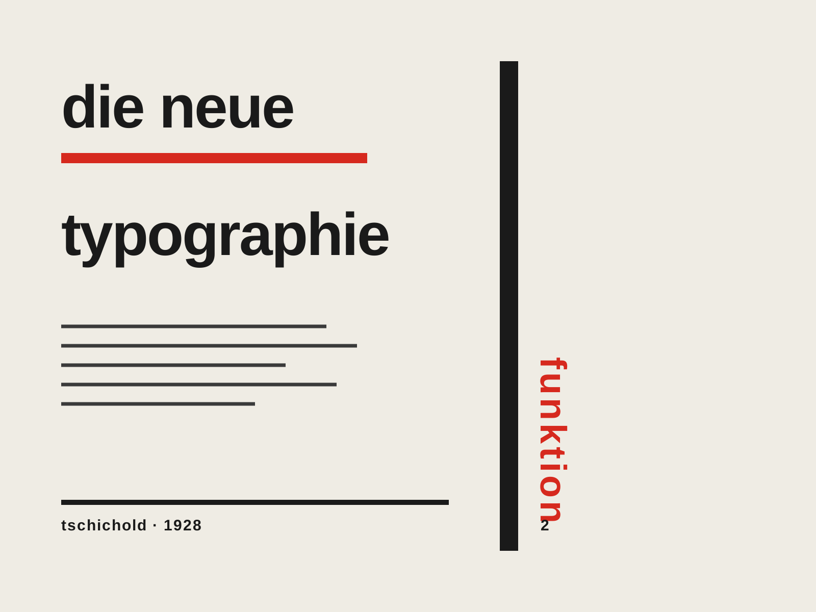
The rigorous modernist program codified by Jan Tschichold — asymmetric layouts, sans-serif type, and the functional grid presented not as art but as a rational set of rules for clear, efficient communication.
- Asymmetric, left-aligned layout replacing centered composition
- Sans-serif (grotesque) type as the modern standard
- Functional grid where every element earns its place
- Active white space and rules directing the eye
- Standardized formats and integration of photography
At a glance
| Modernist Magazine Art Direction | The New Typography | |
|---|---|---|
| Era | 1930s–1960s | 1925–1935 |
| Discipline | Graphic Design | Graphic Design |
| Region | United States | Germany, Switzerland |
| Family | Modernist | Modernism, Typography |
| Formal traits | asymmetric, negative-space, photographic, dynamic | asymmetric, sans-serif, grid-based, functional |
More comparisons
Advertisement