Modernist Magazine Art Direction vs Swiss Style
Modernist Magazine Art Direction is the cross-discipline counterpart of Swiss Style.

Modernist Magazine Art Direction
Dynamic magazine art direction built on bold photography, expressive typography, and confident white space. Cinematic spreads that treat the page-turn as choreography rather than mere layout.
- Spread conceived as a cinematic, choreographed unit
- Bold, often full-bleed photography
- Generous, active white space
- Expressive, asymmetric typographic layout
- Dramatic scale contrast and cropping
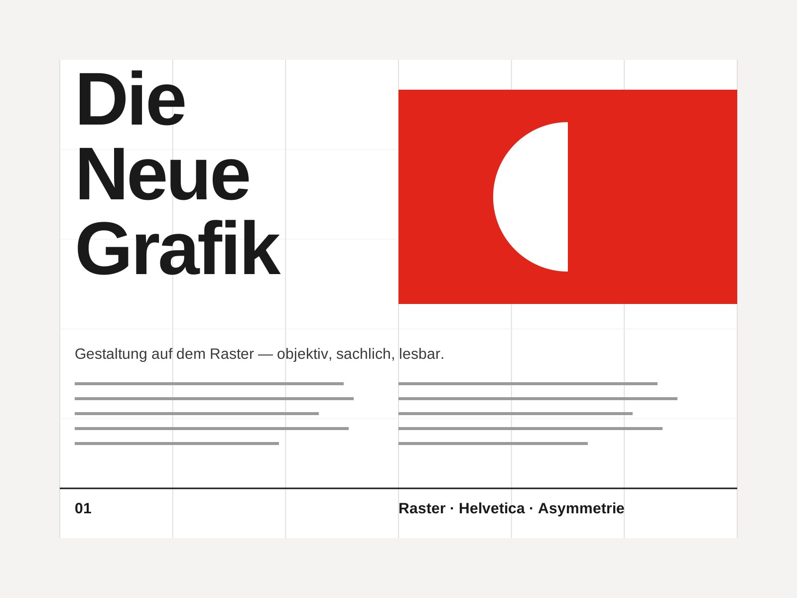
Swiss Style
The mid-century gospel of objective design — mathematical grids, flush-left ragged-right sans-serif type (Helvetica, Akzidenz-Grotesk), generous white space, and photography in place of illustration.
- Mathematical modular grid underlying every element
- Neo-grotesque sans-serif type (Helvetica, Akzidenz-Grotesk)
- Flush-left, ragged-right text setting
- Asymmetric layout balanced by generous white space
- Objective photography instead of illustration
At a glance
| Modernist Magazine Art Direction | Swiss Style | |
|---|---|---|
| Era | 1930s–1960s | 1950s–1970s |
| Discipline | Graphic Design | Graphic Design |
| Region | United States | Switzerland, Germany, International |
| Family | Modernist | Modernist, International |
| Formal traits | asymmetric, negative-space, photographic, dynamic | grid-based, sans-serif, asymmetric, minimal |
More comparisons
Advertisement