De Stijl Graphics vs ISOTYPE Pictography
ISOTYPE Pictography was influenced by De Stijl Graphics.

De Stijl Graphics
The radically reductive Dutch graphic language of De Stijl — strict horizontals and verticals, primary colors with black and white, and geometric letterforms built only from rectangles and the right angle.
- Strictly horizontal and vertical lines — no diagonals or curves
- Primary colors plus black, white, and grey only
- Letterforms constructed from rectangular elements
- Asymmetric balance within an orthogonal grid
- Flat rectangular fields of color as composition
ISOTYPE Pictography
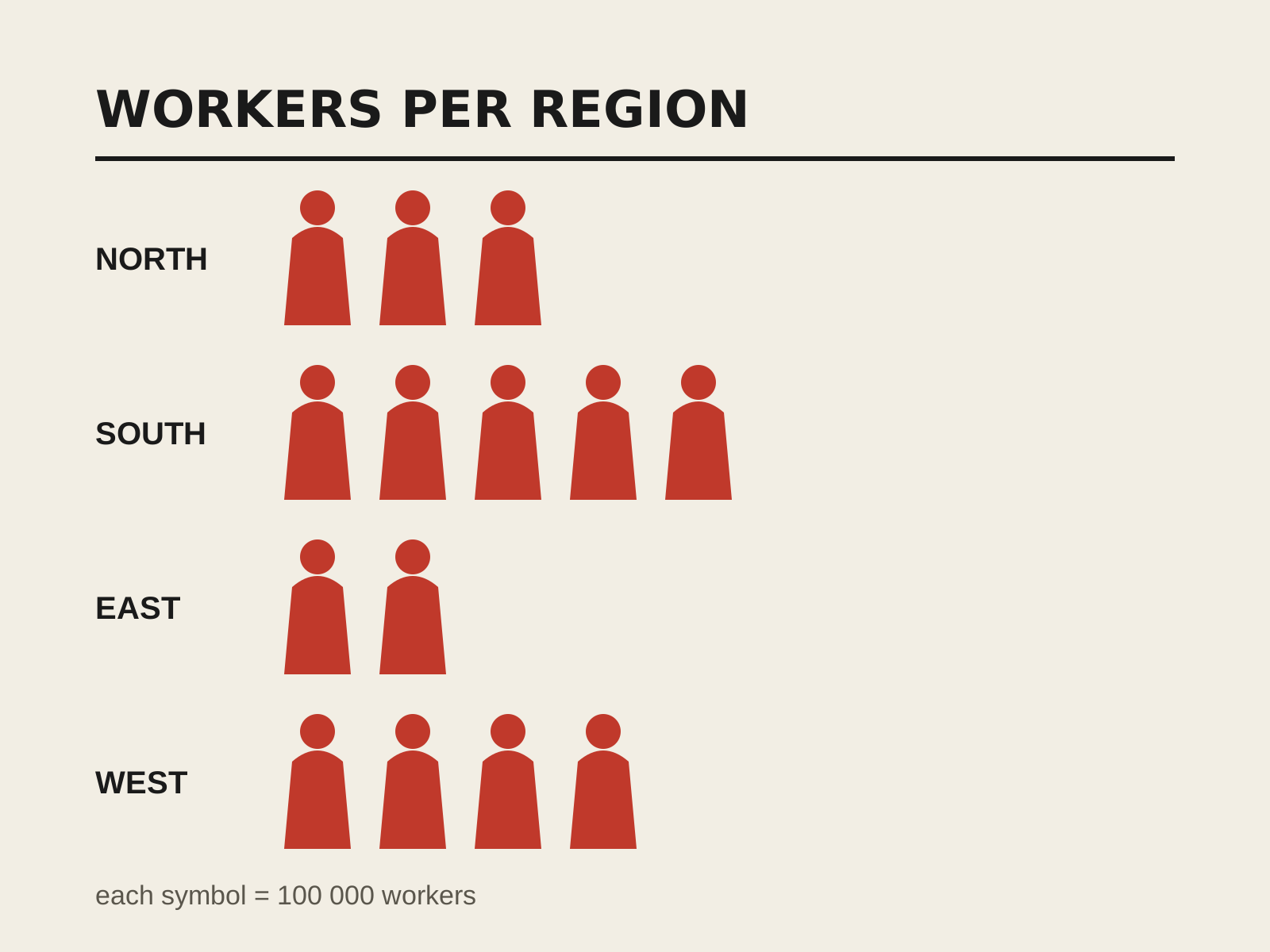
A system of pictorial statistics that conveys quantities by repeating simplified, standardized pictograms rather than scaling them. Clear, language-independent infographics built from a disciplined visual vocabulary.
- Quantity shown by repeating, not scaling, icons
- Standardized flat geometric silhouette pictograms
- Each symbol equals a fixed unit value
- Grid-based, comparable rows of icons
- Restrained, coded flat color
At a glance
| De Stijl Graphics | ISOTYPE Pictography | |
|---|---|---|
| Era | 1917–1931 | 1920s–1940s |
| Discipline | Graphic Design | Graphic Design |
| Region | Netherlands | Austria, United Kingdom |
| Family | Avant-Garde, Modernism | Systems/Wayfinding |
| Formal traits | orthogonal, geometric, primary-color, asymmetric | pictographic, flat-silhouette, grid-based, systematic |
More comparisons
Advertisement