Fluxus Graphic vs ISOTYPE Pictography
Fluxus Graphic was influenced by ISOTYPE Pictography — borrows the deadpan boxed-grid, diagrammatic logic.
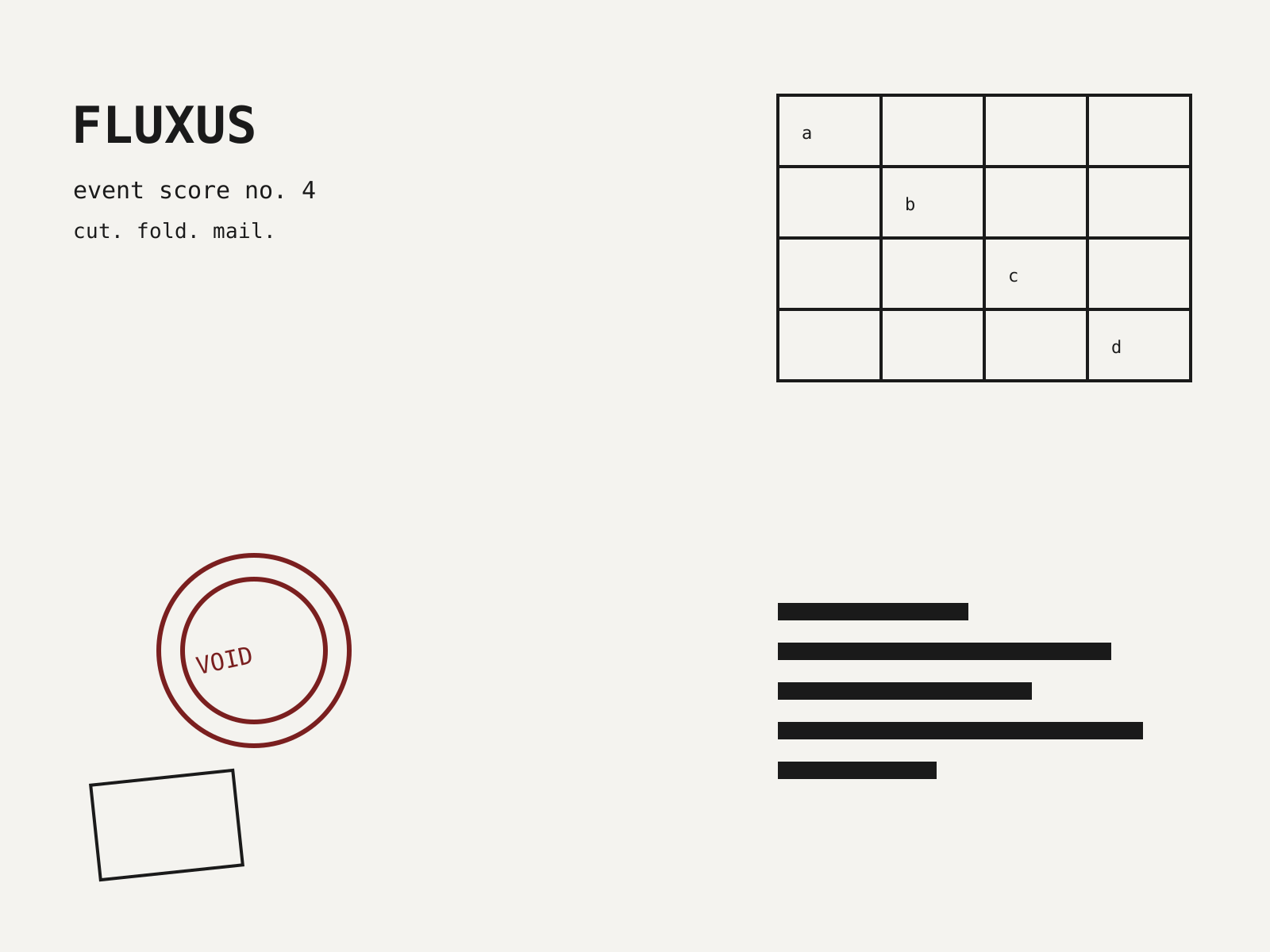
Fluxus Graphic
The deadpan, do-it-yourself print language of the Fluxus art network—event scores, mock catalogues, and boxed multiples that turned ephemera into the artwork itself.
- Typewriter, rubber-stamp, and condensed commercial-sans lettering
- Cheap black-and-white offset and mimeograph printing
- Grids of small boxed cells parodying forms and catalogues
- Event scores and instructions presented as the artwork
- Deadpan, anti-expressive bureaucratic layouts
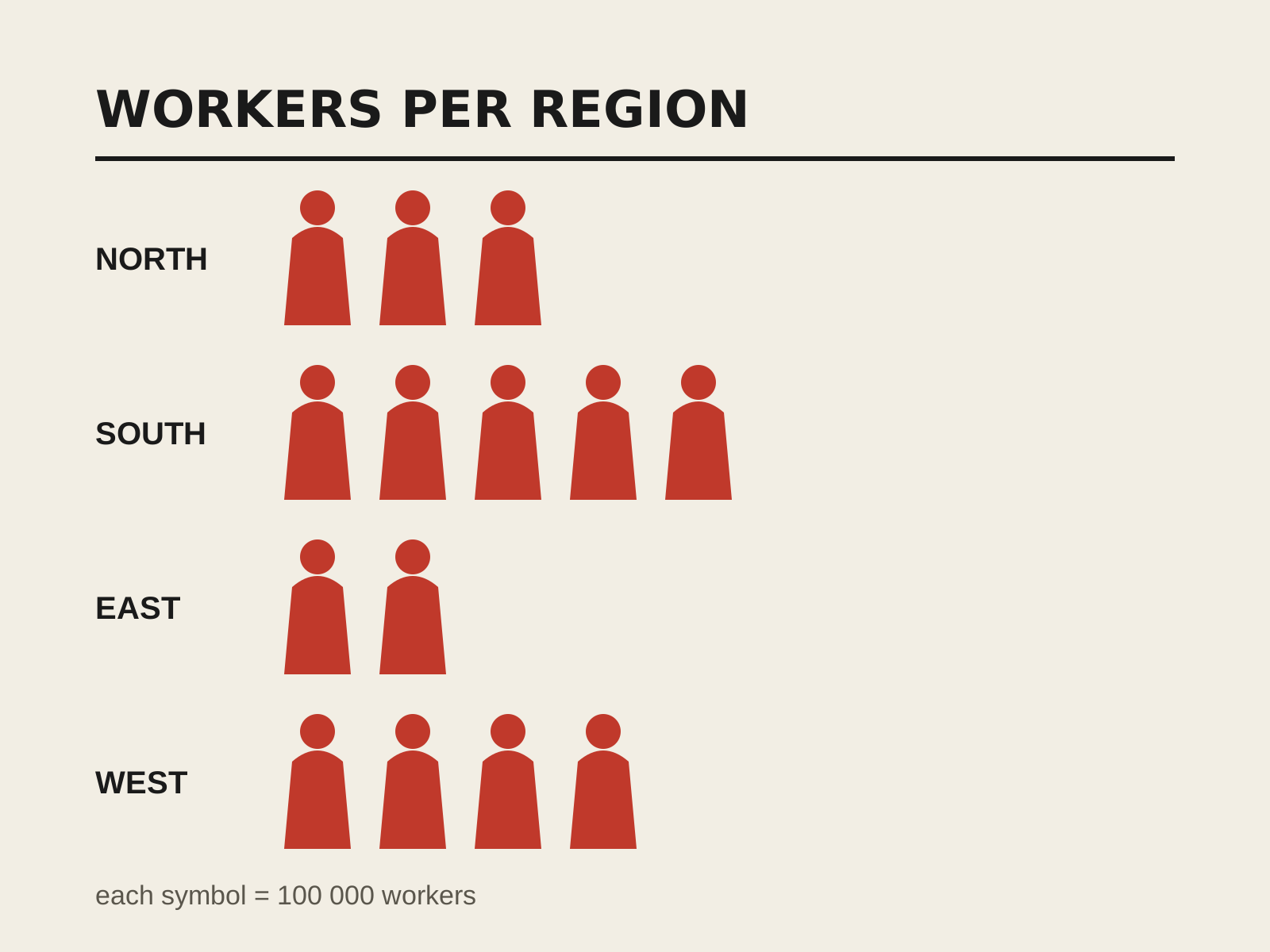
ISOTYPE Pictography
A system of pictorial statistics that conveys quantities by repeating simplified, standardized pictograms rather than scaling them. Clear, language-independent infographics built from a disciplined visual vocabulary.
- Quantity shown by repeating, not scaling, icons
- Standardized flat geometric silhouette pictograms
- Each symbol equals a fixed unit value
- Grid-based, comparable rows of icons
- Restrained, coded flat color
At a glance
| Fluxus Graphic | ISOTYPE Pictography | |
|---|---|---|
| Era | c.1962–1978 | 1920s–1940s |
| Discipline | Graphic Design | Graphic Design |
| Region | United States, Germany, Japan | Austria, United Kingdom |
| Family | Avant-Garde, DIY/Subculture | Systems/Wayfinding |
| Formal traits | typewriter-type, monochrome, grid-boxed, deadpan | pictographic, flat-silhouette, grid-based, systematic |
More comparisons
Advertisement