Display vs Impact
Impact evolved from Display — a condensed display sans.
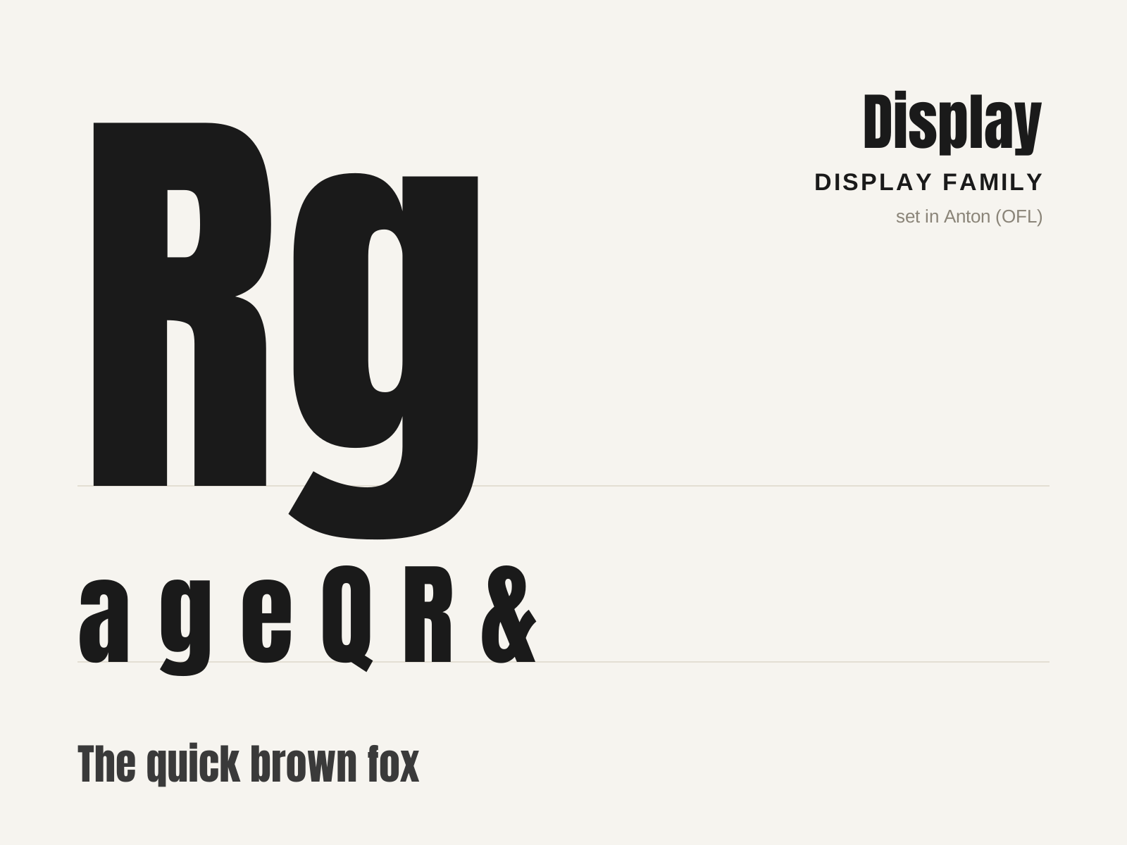
Display
The broad family of typefaces built for impact at large sizes — posters, headlines, logos — rather than readability in running text. Fat faces, slabs, condensed grotesques, and novelty designs all compete to grab the eye.
- Optimized for large sizes and short bursts of text
- Exaggerated weight, width, or contrast for impact
- Distinctive, attention-grabbing silhouettes
- Decorative treatments: inline, shadow, stencil, novelty
- Strong personality prioritized over text legibility
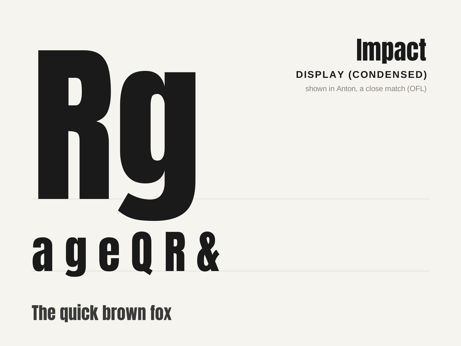
Impact
A heavy, extremely condensed sans-serif from 1965, engineered to cram maximum black weight into minimum width for headlines that shout. The internet's default meme caption font.
- Extremely condensed, narrow letter proportions
- Heavy, near-uniform stroke weight
- Very tight letterspacing creating dense blocks
- Minimal internal counters
- Squared, no-nonsense sans-serif terminals
At a glance
| Display | Impact | |
|---|---|---|
| Era | c. 1810–present | 1965–present |
| Discipline | Typography | Typography |
| Region | England, United States, Global | United Kingdom, Global |
| Family | Display | Display |
| Formal traits | display, heavy-weight, decorative, high-impact | condensed, heavy-weight, sans-serif, display |
More comparisons
Advertisement