Display vs Lobster
Lobster evolved from Display.
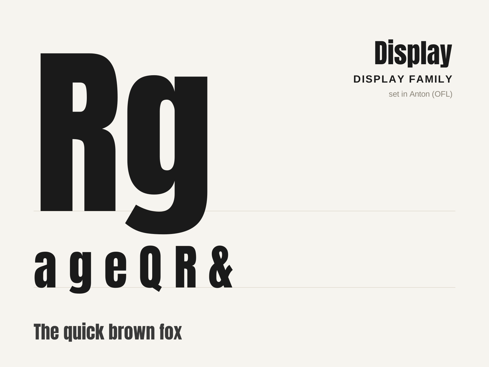
Display
The broad family of typefaces built for impact at large sizes — posters, headlines, logos — rather than readability in running text. Fat faces, slabs, condensed grotesques, and novelty designs all compete to grab the eye.
- Optimized for large sizes and short bursts of text
- Exaggerated weight, width, or contrast for impact
- Distinctive, attention-grabbing silhouettes
- Decorative treatments: inline, shadow, stencil, novelty
- Strong personality prioritized over text legibility
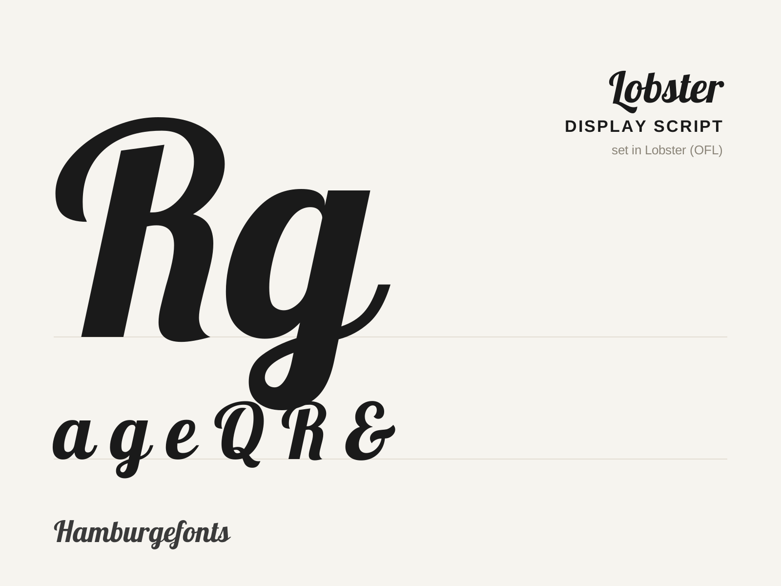
Lobster
A bold, connected display script from 2010 with retro signpainting flair, packed with contextual ligatures and alternates that mimic genuine hand-lettering. A free Google Font that became inescapable.
- Bold, connected script on a bouncing baseline
- Brush-like swelling stroke modulation
- Extensive contextual alternates and ligatures
- Generous swash capitals
- Retro signpainting and chrome-lettering flavor
At a glance
| Display | Lobster | |
|---|---|---|
| Era | c. 1810–present | 2010–present |
| Discipline | Typography | Typography |
| Region | England, United States, Global | Argentina, Global |
| Family | Display | Display |
| Formal traits | display, heavy-weight, decorative, high-impact | connected-script, brush, heavy-weight, display |
More comparisons
Advertisement