Display vs Wood-Type Poster
Wood-Type Poster is the cross-discipline counterpart of Display — the wood-type display letterforms of the same 19th-century jobbing trade.
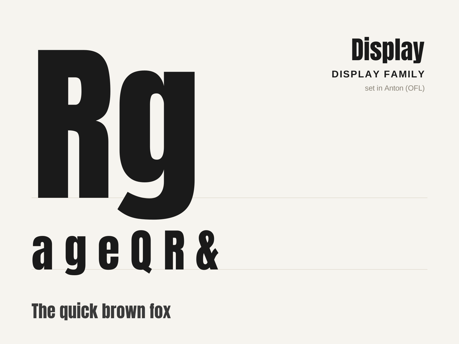
Display
The broad family of typefaces built for impact at large sizes — posters, headlines, logos — rather than readability in running text. Fat faces, slabs, condensed grotesques, and novelty designs all compete to grab the eye.
- Optimized for large sizes and short bursts of text
- Exaggerated weight, width, or contrast for impact
- Distinctive, attention-grabbing silhouettes
- Decorative treatments: inline, shadow, stencil, novelty
- Strong personality prioritized over text legibility
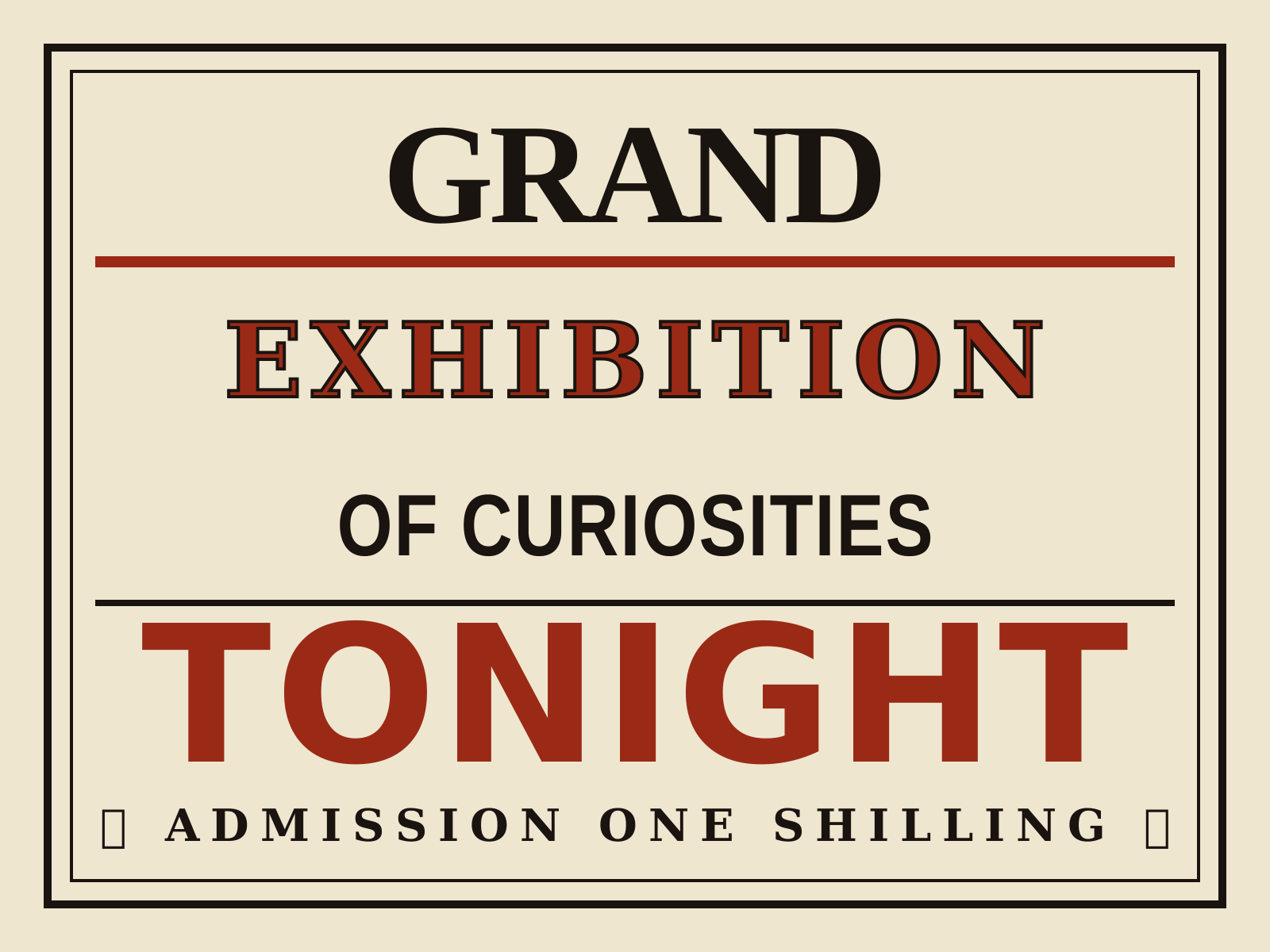
Wood-Type Poster
The shouting, oversized letterpress of 19th-century American broadsides, set in giant wood type for circus bills, playbills, and auctions. Each line is a different fat, slab, or shadowed face, stacked to fill the sheet with maximum noise.
- Oversized end-grain wood display type
- Centered, line-by-line stacked composition
- Each line a different fat, slab, or Tuscan face
- Bold woodcut or stereotype images
- Second-color (often red) emphasis runs
At a glance
| Display | Wood-Type Poster | |
|---|---|---|
| Era | c. 1810–present | 19th century |
| Discipline | Typography | Graphic Design |
| Region | England, United States, Global | United States, Britain |
| Family | Display | Pre-modern, Vernacular/Pop |
| Formal traits | display, heavy-weight, decorative, high-impact | wood-type, letterpress, high-contrast, mixed-typefaces |
More comparisons
Advertisement