Humanist (Venetian) Serif vs Trajan
Trajan was influenced by Humanist (Venetian) Serif.
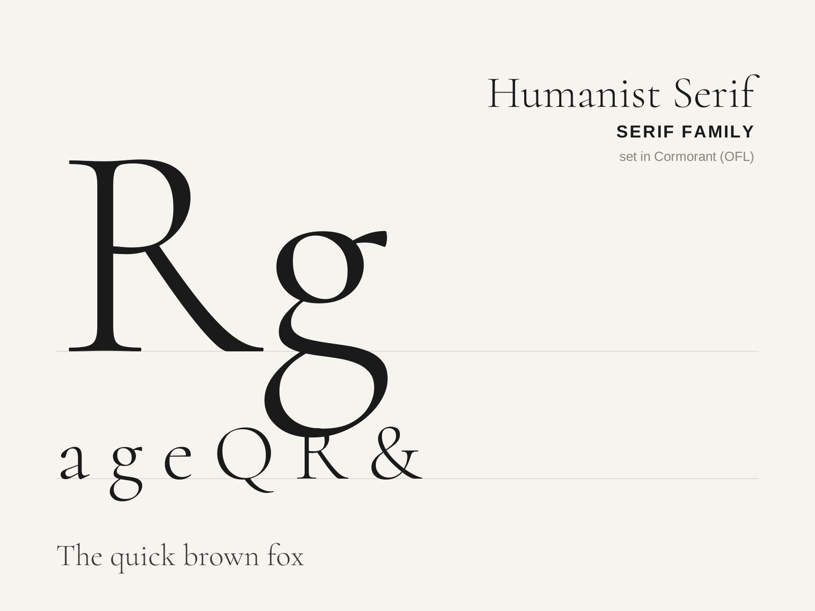
Humanist (Venetian) Serif
The earliest roman printing types, cut in Renaissance Italy to imitate the humanist scribal hand. Warm, sturdy, and unmistakably pen-formed, with a strongly slanted stress and a sloping crossbar on the lowercase e.
- Steeply inclined (oblique) axis of stress
- Low to moderate stroke contrast, heavy overall color
- Sloping bar on the lowercase 'e'
- Heavily bracketed, often blunt asymmetric serifs
- Short ascenders/descenders with sturdy, rounded proportions
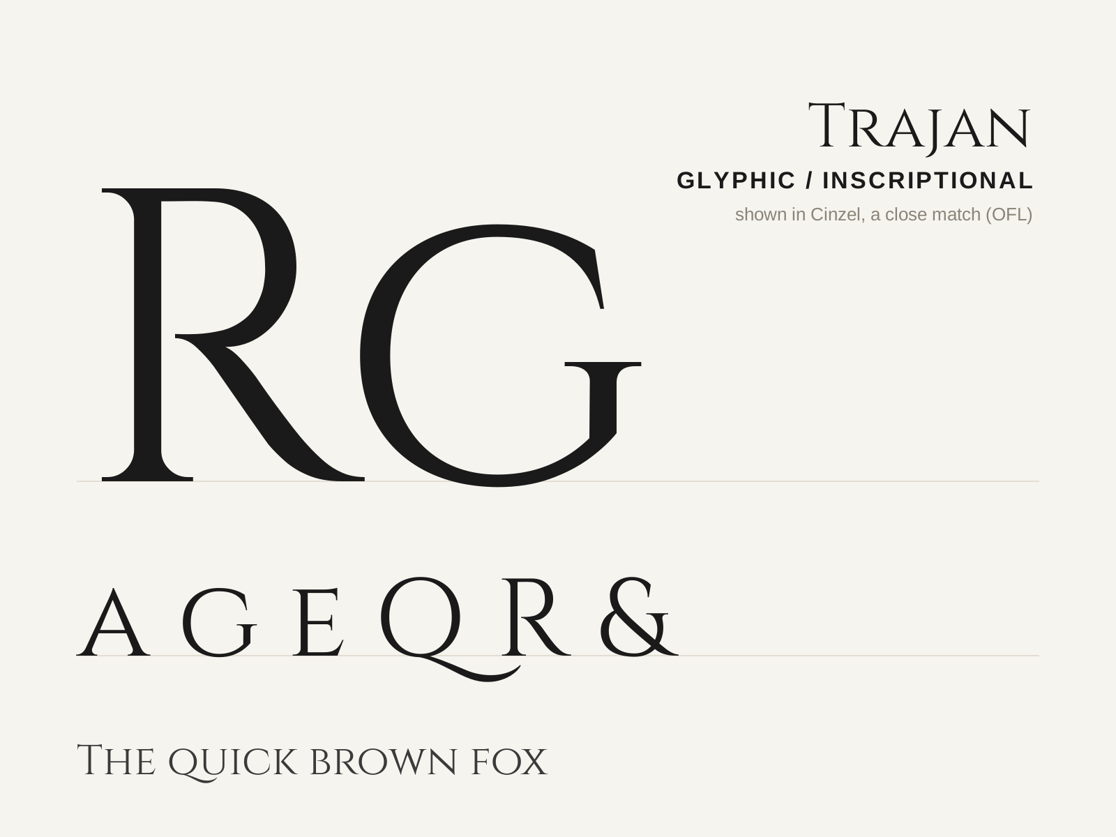
Trajan
Carol Twombly's 1989 all-capitals titling face, drawn after the Roman inscription at the base of Trajan's Column. Monumental, classical, and inescapable on film posters and book jackets.
- Capitals only — no lowercase
- Small, triangular, flaring (incised) serifs
- Moderate contrast with subtly modelled strokes
- Classical Roman inscriptional proportions
- Wide R with a long, gracefully curving leg
At a glance
| Humanist (Venetian) Serif | Trajan | |
|---|---|---|
| Era | 1460s–1490s | 1989 |
| Discipline | Typography | Typography |
| Region | Italy, Venice | United States |
| Family | Serif | Serif |
| Formal traits | humanist, old-style, bracketed-serif, oblique-stress | glyphic, incised, flared-terminal, low-contrast |
More comparisons
Advertisement