Glyphic (Inscriptional) Serif vs Humanist (Venetian) Serif
Glyphic (Inscriptional) Serif was influenced by Humanist (Venetian) Serif — the chiselled Roman inscriptional capital behind both.
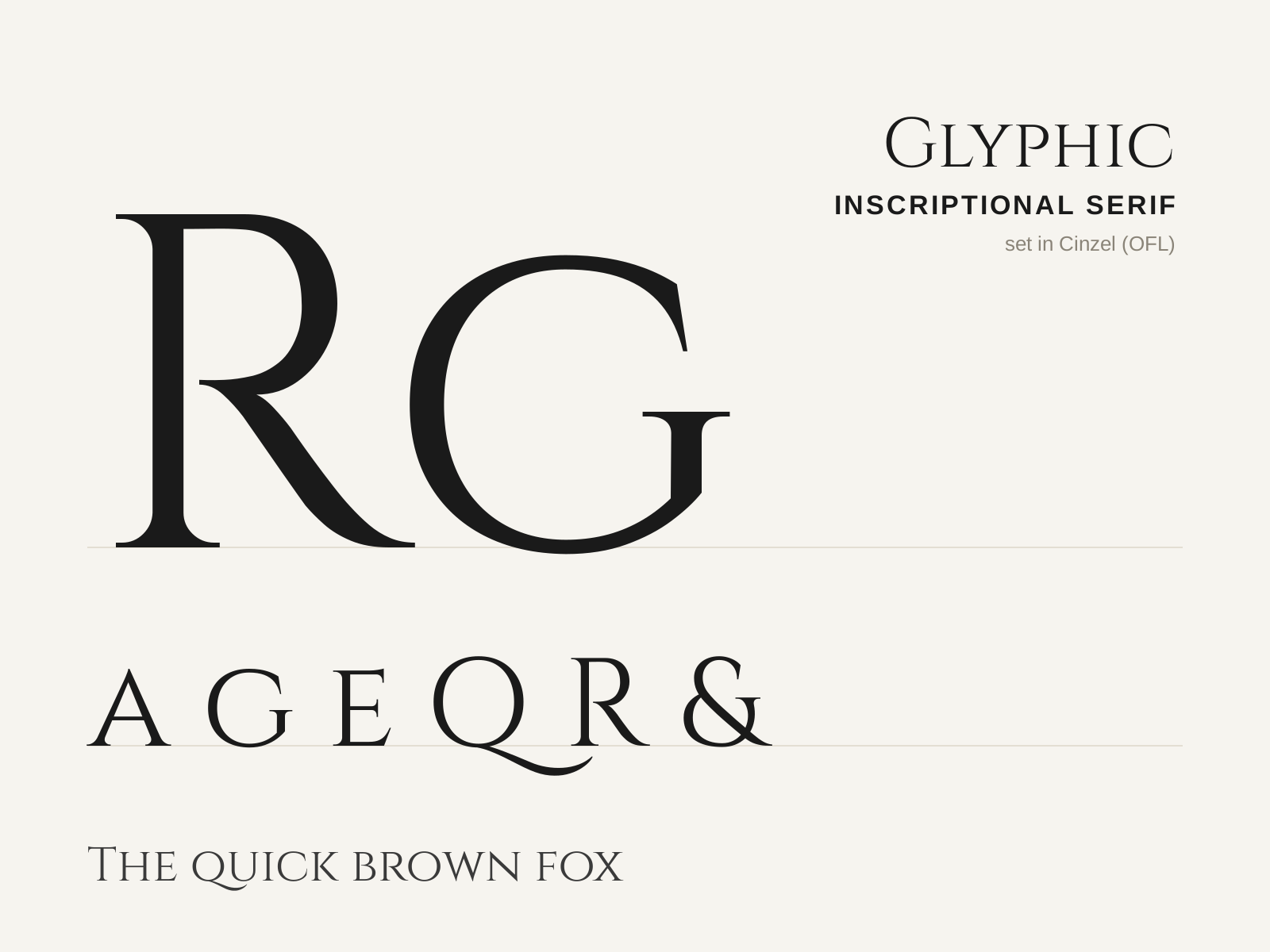
Glyphic (Inscriptional) Serif
Type that recalls letters chiselled in stone rather than written with a pen. Triangular, flaring serifs and a carved, monumental quality root it in the Roman inscriptional capital.
- Small, triangular, flaring serifs (incised, not slab)
- Moderate contrast with tapering stroke ends
- Carved, lapidary quality recalling stone-cut letters
- Classical Roman capital proportions
- Often capital-only, with minimal or no lowercase
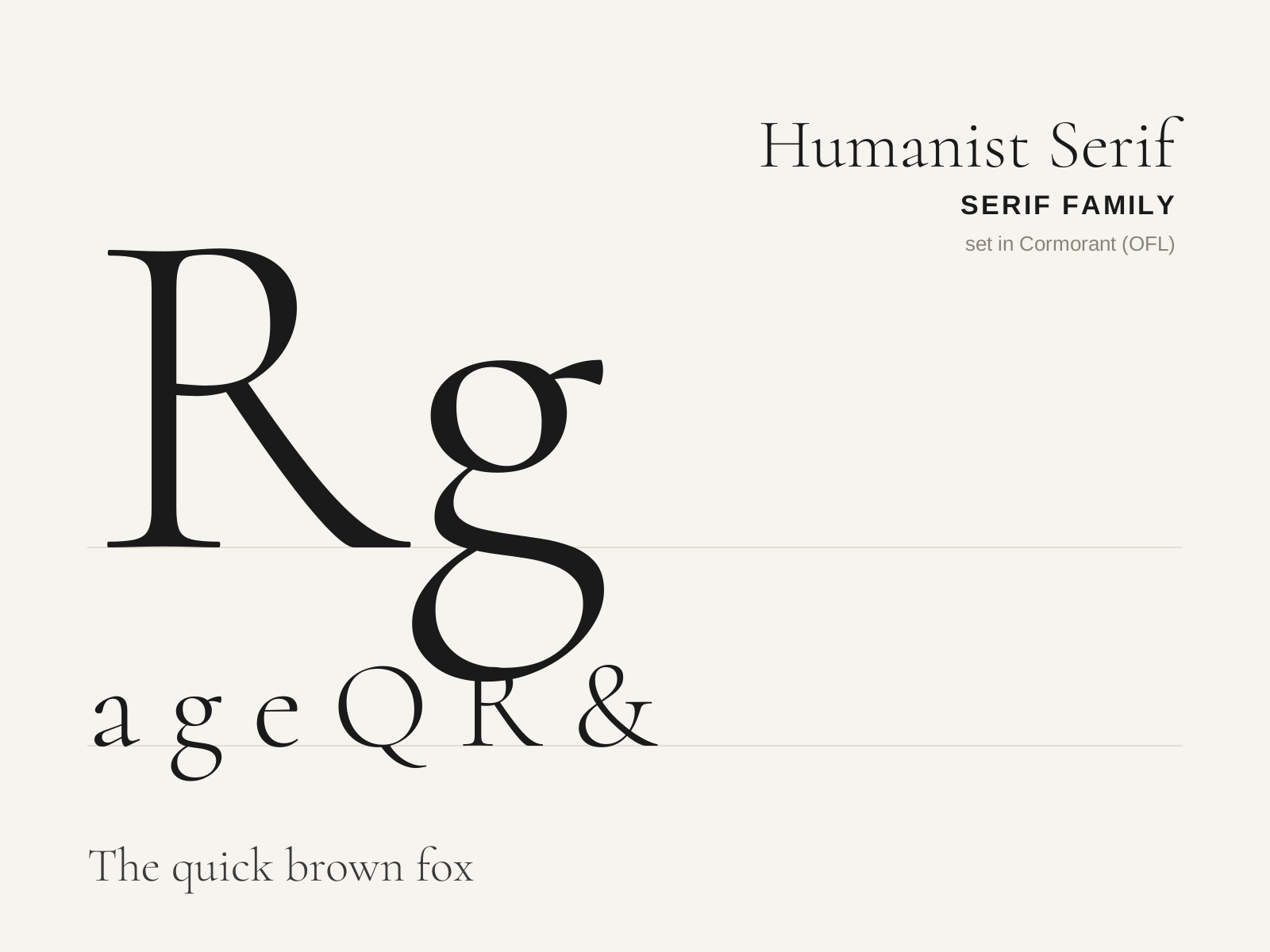
Humanist (Venetian) Serif
The earliest roman printing types, cut in Renaissance Italy to imitate the humanist scribal hand. Warm, sturdy, and unmistakably pen-formed, with a strongly slanted stress and a sloping crossbar on the lowercase e.
- Steeply inclined (oblique) axis of stress
- Low to moderate stroke contrast, heavy overall color
- Sloping bar on the lowercase 'e'
- Heavily bracketed, often blunt asymmetric serifs
- Short ascenders/descenders with sturdy, rounded proportions
At a glance
| Glyphic (Inscriptional) Serif | Humanist (Venetian) Serif | |
|---|---|---|
| Era | Roman antiquity; revived 1900s–present | 1460s–1490s |
| Discipline | Typography | Typography |
| Region | Ancient Rome, Europe, United States | Italy, Venice |
| Family | Serif | Serif |
| Formal traits | glyphic, incised, flared-terminal, low-contrast | humanist, old-style, bracketed-serif, oblique-stress |
More comparisons
Advertisement